
Monday, 11:10am
14 February 2011
Billion-dollar brainteaser
Gill Ross on David McCandless’s ‘beautiful’ Billion-Dollar-O-Gram
Great moments in information design (continued).
We have so much access to information now, writes Gill Ross. According to Kim Baer’s Information Design Workbook (Rockport, 2008), there are more than 3000 books published worldwide every day, and a week’s worth of The New York Times is estimated to contain more information than someone in the eighteenth century was likely to come across in a lifetime.
In his book Information Is Beautiful (Collins, 2009) journalist David McCandless creates simple yet distinctive visualisations with the minimum use of words to get straight to the point.
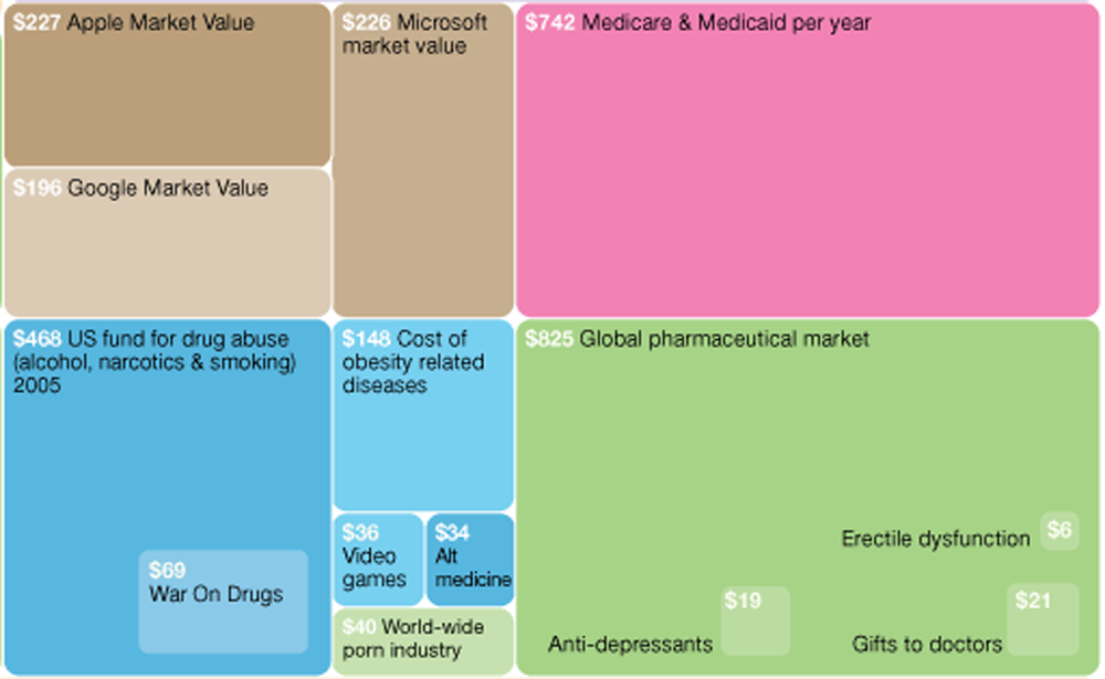
His Billion-Dollar-O-Gram (below) is a striking example of how to bring statistical data to life. ‘Billions spent on this. Billions spent on that. It’s all relative, right?’
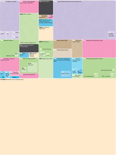
The Billion-Dollar-O-Gram invites the reader to compare global spending on complex issues and look at alternatives for using this finite capital. A ‘tapestry of raw information’, it provides a visual overview composed of rectangular shapes clustered into sections, and uses colour to categorise tiles in terms of spending, earning, giving, fighting, losing and ‘illin’’ (ie internet porn, illegal drugs, bribery).
Clustering tiles make it easy to compare, say, the progressive cost of the Iraq war with the overall cost to feed and educate every child on Earth for five years.
What is most intriguing is the simplicity of this approach in dealing with complex issues: the bigger the tile, the greater its value. It is an approach McCandless has used to great effect in later visualisations of BBC spending and the size of the UK budget deficit for the Guardian.co.uk Datablog, where users can check his data on an accompanying spreadsheet.
These, and updated versions of the Billion-Dollar-O-Gram, can all be viewed on the website informationisbeautiful.net: /the-billion-dollar-o-gram-2009 and visualizations/the-billion-dollar-o-gram-2009/
Debtris (below), a little animation based on the diagram, was commissioned and made for Charlie Brooker’s Screenwipe a year ago but never broadcast. The Tetris-like music was composed by Daniel Pemberton (known for Peep Show, Little Big Planet, etc.). McCandless, who showed the Debtris at the recent Design of Understanding conference says that ‘it is intended as a playful mind-bender’.
Gill Ross is a jewellery designer and illustrator based in Fife, Scotland.
For more of our Great Moments in Information Design series, see Going Overground by Lulu Pinney on the Eye blog, and the printed magazine.
Eye, the international review of graphic design, is published quarterly for professional designers and students. It’s available from all good design bookshops and online at the Eye shop, where you can buy subscriptions and single copies. For a taste of Eye 78, see Eye before you buy on Issuu, or the contents.