
Tuesday, 8:59am
1 November 2011
Blurred boundaries
The hybrid state of ‘Graphic Design: Now in Production’
The typeface Union, a synthesis of Helvetica and Arial, is ‘intended for situations where Helvetica seems too sophisticated and Arial too vulgar, or vice versa’, writes Steven McCarthy. This position, that of ‘both / and’ rather than ‘either / or’, sets the philosophical tone for ‘Graphic Design: Now in Production’, a new and revealing exhibition at Walker Art Center in Minneapolis.
Perhaps it is for this strangely familiar quality that Union is used for the show’s catalogue.
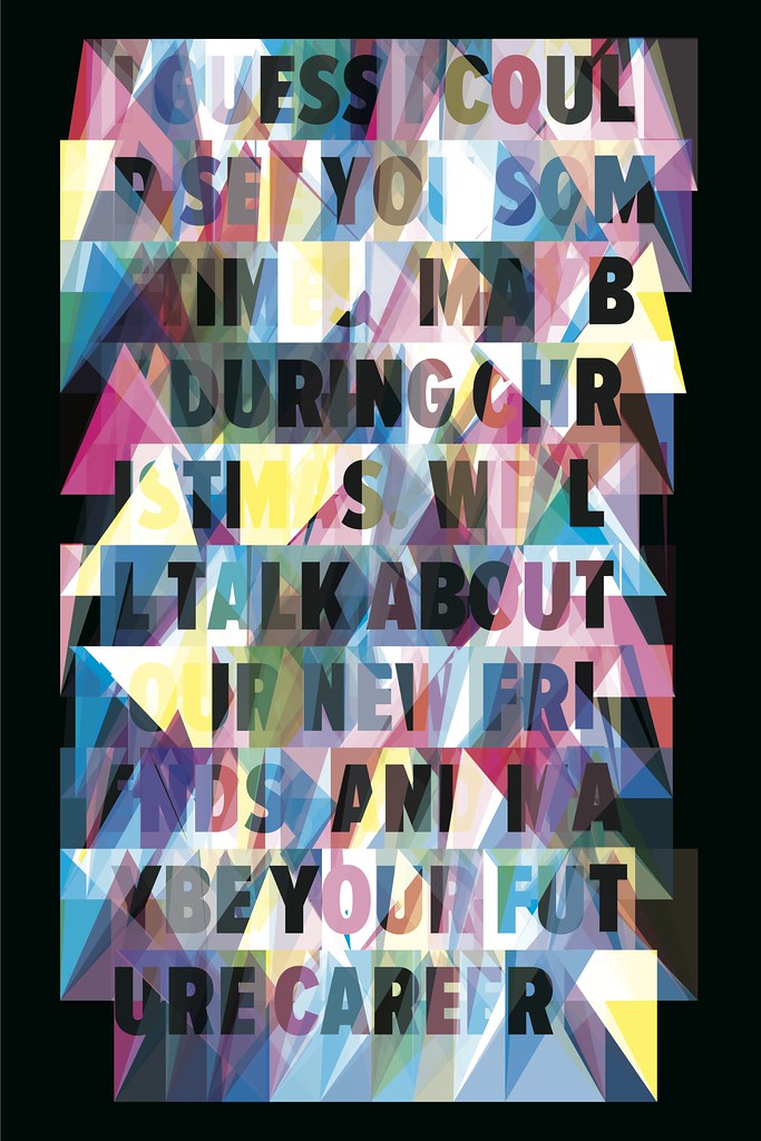
Top and below: Christopher Clark, Web Typography for the Lonely (2011).
The first major museum-based American graphic design exhibition in fifteen years, ‘Graphic Design: Now in Production’ is jointly curated by Andrew Blauvelt of the Walker Art Center in Minneapolis and Ellen Lupton of the Cooper-Hewitt National Design Museum in New York. They were assisted by Ian Albinson for selecting film title sequences, Jeremy Leslie for magazines, and Armin Vit and Bryony Gomez-Palacio for shaping the branding and identity category. Together they could be considered a curatorial ‘dream team’, with deep and broad knowledge of contemporary graphic design, and possessing complementary skills in designing, researching, writing, managing and producing.
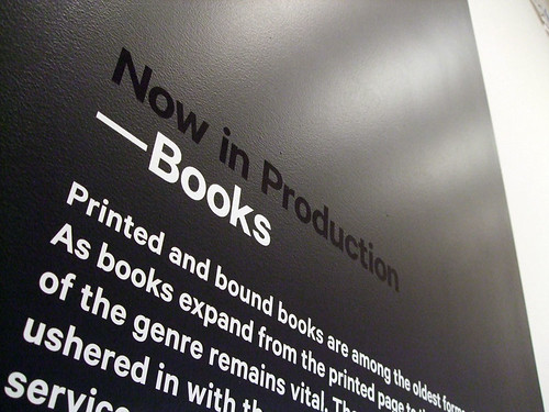
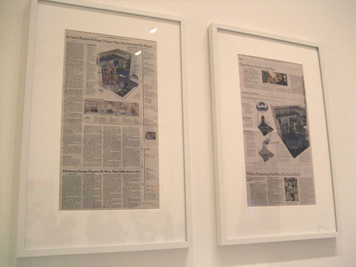
Above and below: Installation photographs, below image shows framed copies of the New York Times.
The collaborative nature of the exhibit, which includes opportunities for viewer participation, in-gallery shopping and ‘crowd-sourced’ content, signals something unique about this radically conceived, and yet – on the surface – conventionally presented, show. The traditional ‘content + context / curator = exhibition’ model has added the participation of designers as actors, and has invited the involvement of the public, inverting the viewing relationship in surprising ways. Wikipedia entries serve as captions in the catalogue, bloggers critique redesigned brands, and viewers physically activate a digital poster wall, generating a smartphone-readable QR code.
Largely drawn from the past decade, and primarily from American and northern European graphic designers, the exhibition content is organised along typical lines of formatting: posters, magazines, information graphics, books, film titling and other motion graphics, typography and typefaces, and branding and identity. While the individual works in each category are exemplary of the discipline’s most creative and celebrated producers, the division of works into such standard conventions – reinforced by chambers in the gallery – represents a missed opportunity, one actually advocated for in the Graphic Design: Now in Production catalogue.

Above: Peter Buchanan-Smith, Best Made American Felling Axes (2009).
Below: Metahaven, Uncorporate Identity (2010).

An exhibition this comprehensive begs viewers to find the voids: packaging design, environmental graphics, websites, and other quotidian forms seem missing, as the curators admit. (Where is Shepard Fairey’s Hope poster for Obama?) Perhaps the luscious designs from the progressive practices on display – no single object seems undeserving conceptually or aesthetically – best serve the curators’ visions: relational, participatory, open-sourced, and yet aggregated into standard classifications.
But closer inspection of ‘Graphic Design: Now in Production’ from within each category reveals some courageous and provocative choices. Metahaven’s specially commissioned Face State, a speculative identity program that addresses geo-political concerns, sits adjacent to Google’s ever-changing and sometimes irritatingly cute logo. Bloomberg Businessweek magazine is a few steps from Peet Pienaar’s Fluxus-like Afro Magazine, setting up numerous interpretations. It is in this interstitial space between works that viewers construct their own meaning, while reflecting on the curators’ intentions.
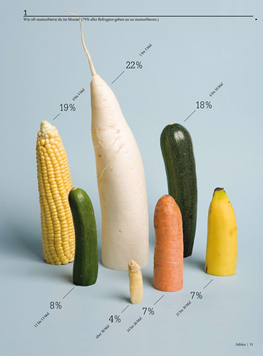
Above: Sarah Illenberger, information graphics for ‘The Truth about Sex’, published in Neon magazine (2008).
Below: Stefan Sagmeister, Casa da Musica
![Sagmeister_Casa_da_Musica_identity[1]](http://farm7.static.flickr.com/6228/6298710095_0302d20493.jpg)
James Goggin’s catalogue essay expresses this ‘both / and’ nature well: ‘This slightly ambiguous position, a distinctly in-between discipline that is both everywhere and nowhere, is to our benefit, allowing graphic design to talk without boundaries to a wider audience while also enabling us to infiltrate and use the systems of other disciplines when desired and where relevant.’
Blauvelt, Lupton and their colleagues’ choices bubble up, an emergent landscape of exotic trees and flowers – simultaneously objects, formats and processes. In this regard, the Graphic Design: Now in Production exhibition succeeds as hybrid state: both simple and complex, radical and traditional, challenging and affirming. It achieves this quality not through compromise, but through an expansive notion of exhibition curation as a dynamic, probing and inclusive process.
A longer version of this review will appear in Eye 82.
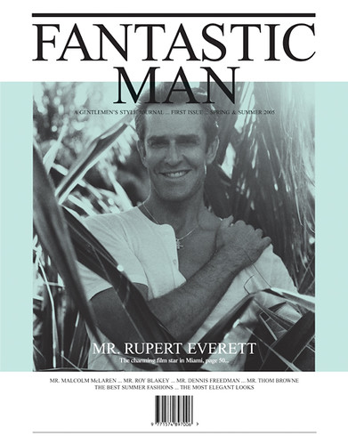
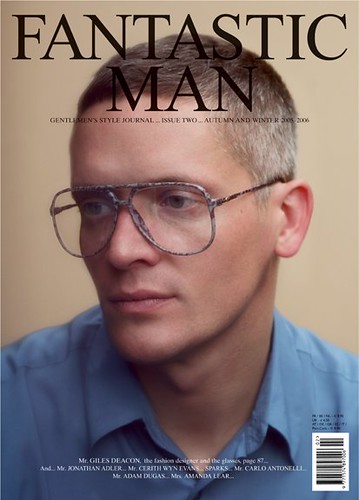
Above and below: Jop van Bennekom, Fantastic Man (2005). Issues #1 (above) and #2 (below). See ‘No muscles, no tattoos’ in Eye 59.
22 October 2011 > 22 January 2012
Graphic Design: Now in Production
Walker Art Center
1750 Hennepin Avenue
Minneapolis
Minnesota 55403
USA
www.walkerart.org
Eye is the world’s most beautiful and collectable graphic design journal, published quarterly for professional designers, students and anyone interested in critical, informed writing about graphic design and visual culture. It is available from all good design bookshops and online at the Eye shop. Eye 81 is out tomorrow.