
Thursday, 9:57pm
6 May 2010
The cover that never was
Is Chris Ware’s rejected cover for Fortune 500 right on the money?
The world of graphic design is full of images that never were, writes John L. Walters, buried in blogs, and the footnotes to design or cultural history.
The Beatles’ ‘butcher’ LP cover for ‘Yesterday’ and Today, book covers rejected by their authors (think Nabokov’s Lolita) and, closer to home, the 39 alternative Eye 72 covers that Jay Prynne designed in a spare moment.
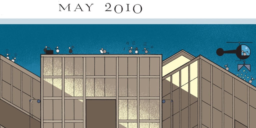
But when the design and illustration history of our current time comes to be written, few will ignore the rejected May 2010 Fortune 500 cover by Chris Ware. In view of today’s reports of panic on Wall Street and uncertainty in Europe, Ware’s satirical vision looks right on the money.

This is the annual issue of the business title that publishes its list ranking the top 500 US companies by revenue. In earlier eras, this regular edition provided an opportunity for strong illustrative and conceptual covers by Leo Lionni, Walter Allner, Chermayeff & Geismar and others – see spd.org on ‘The Fortune 500 cover legacy’ published 13 April. There’s also an interesting, somewhat poignant Facebook album of covers from 1956-2010 compiled by Linda Rubes.)
In the future we may learn a little more about the commissioning and briefing process that led to the image, but Mr Ware is reluctant to do more than call the whole thing a ‘non-controversy’, adding that he’d ‘rather politely demur and leave it to vanish into the electric ether.’
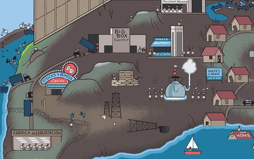
Which is exactly where you will find this magnificent cover picture. Click on our Flickr page to see a larger version, and enjoy the details, from the partygoers, cocktails and ’copters on the roof (top), right down to the ‘Toxic Asset Acres’, the Miami ‘Conned O’ and the ‘Fábrica d’exploitación’ (above). Enjoy.
Thanks to Drawn and Quarterly, and the Society of Publication Designers, spd.org who have also published a blog about the actual cover. With art direction by John Korpics, it features a sunny cover by illustrator Daniel Pelavin.
John L. Walters, editor of Eye, London
Eye, the international review of graphic design, is a quarterly journal you can read like a magazine and collect like a book. It’s available from all good design bookshops and at the online Eye shop, where you can order subscriptions, single issues and classic collections of themed back issues.