
Monday, 5:00pm
23 January 2012
Type Tuesday
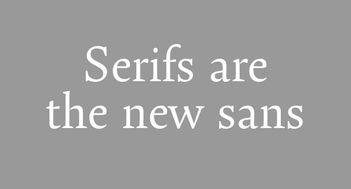
Quirky ligatures and swash characters: serifs are the new sans
Are we living in a golden age of type? This is a time of consolidation. Established foundries are revisiting libraries that were perhaps hastily digitised in the early rush prompted by postscript, and releasing OpenType versions wrote Catherine Dixon in Eye 71.
New designs are calmly considered and updated replete with the 'accessories' (true italics, non-lining figures, language extensions, etc.) increasingly expected by the market.
At its best, this trend results in significant improvements to beloved ‘classics’. At its worst, there is homogenisation. International font browsing is easy, with more foundries represented online, especially the smaller outfits.
And at the same time, the revival reigns, with obscure source material providing quirky ligatures and swash characters that bring a distinctive additional flair.
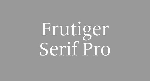
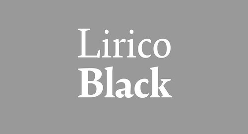
Serifs are the new sans – or at least on the upswing (Frutiger serif, above, is one of the more calculated pitches to sell the idea of a serif / sans serif ‘matched pair’ in place of the hit 'single'). The newest and most formally intriguing serif in a while is OurType's Lirico (2008, below), designed by the German calligrapher Hendrick Weber, which is definitely on my 'to try' list.
Another font on my list is Samba (below) by the Brazilians Tony and Caio de Marco. Though it is distributed by Linotype, it speaks to the ‘opening up’ of the global type market – and it is fun. The uncompromisingly eccentric and beautiful expert variant cleverly marks this character font as something altogether more accomplished.

Catherin Dixon is a freelance designer and writer who teaches at Central Saint Martins.
Type Tuesday is our weekly column on typography and type design, featuring a mixture of brand new articles and material from the extensive Eye archive. For more Type Tuesday articles, click here.
This article was first published in Eye 71, a typography special. Back issues still available.
Eye is the world’s most beautiful and collectable graphic design journal, published quarterly for professional designers, students and anyone interested in critical, informed writing about graphic design and visual culture. It’s available from all good design bookshops and online at the Eye shop, where you can buy subscriptions, back issues and single copies of the latest issue. Eye 81, has the theme of ‘Designers and clients’; Eye 82 will be on press next week.