
Thursday, 6:00am
14 January 2016
Warning cries
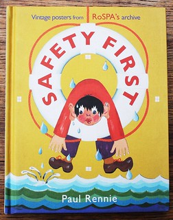
Safety First, Vintage Posters from RoSPA’s Archive
Paul Rennie, Saraband, £16.99Paul Rennie casts new light on RoSPA’s safety posters. Review of Safety First by Clare Walters
The Royal Society for the Prevention of Accidents (RoSPA) employed many of the best designers of the twentieth century to make its safety posters.
These included Tom Eckersley, Abram Games, Edward McKnight Kauffer and Hans Schleger (aka Zéro), writes Clare Walters.
Yet as Paul Rennie points out in his introduction to book Safety First, the poster campaigns of London Transport, Shell-Mex and BP Ltd, the General Post Office (GPO), the Empire Marketing Board and the large railway companies are generally better known.
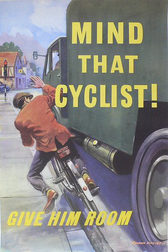
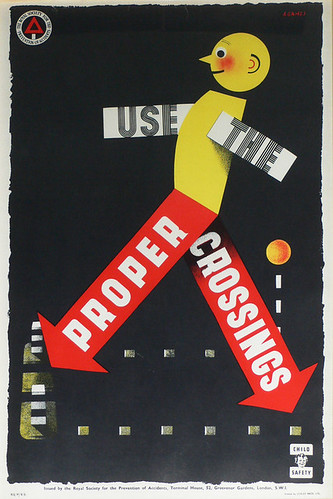
Roland Davies, 1960s. All posters courtesy RoSPA.
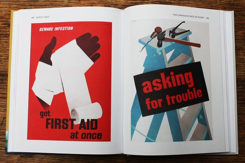
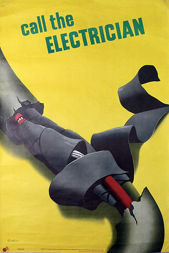
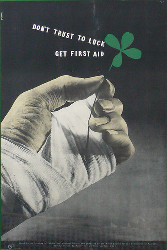
Top: spread from Paul Rennie’s Safety First showing two Leonard Cusden RoSPA posters about First Aid and home and workplace safety.
RoSPA’s origins date back to 1916, when its earliest predecessor – the London ‘Safety First’ Council (LSFC) – was formed to educate the public of the new danger of road accidents, frequently caused by First World War military vehicles. Other cities followed London’s lead and, in 1923, all the various safety campaigns were united through the National ‘Safety First’ Association (NSFA). But, by the time the Second World War was in full swing and manufacturing was high on the agenda, the reduction in industrial accidents became part of the war effort. So, in 1941, the organisation was granted both royal patronage, being re-named RoSPA, and government funding under Ernest Bevin’s Ministry of Labour and National Service.
Although road and industrial safety messages have always been at the heart of RoSPA’s remit, over the years it has also campaigned for safety in agriculture, on the railways, in the construction industry, in leisure activities, particularly around water and cycling, and also in the home. Many of its campaigns have been aimed directly to children, mostly notably the 1960 and 70s Tufty Club and Green Cross Code.
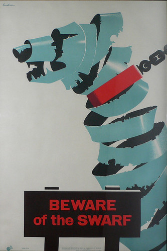
Leonard Cusden, ‘Beware of the Swarf’, 1951.
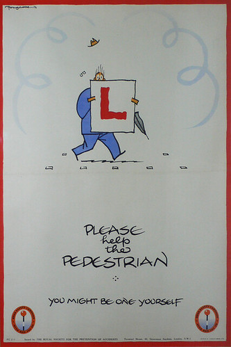
Cyril Kenneth Bird (aka ‘Fougasse’), date not known.
In part, RoSPA’s success has been due to its continued use of humour in its posters – an approach that dates back to the 1930s and the conviction of Cyril Kenneth Bird (aka ‘Fougasse’) that an appeal through wit was more effective than one through stern admonition. Rennie writes that Fougasse believed a successful strategy was one of ‘attraction, persuasion and action’.
Abram Games, 1930s.
Rennie also points out that many of the posters display influences from both Surrealism and European Modernism, as several of their makers were émigré designers from Europe. In addition, one of the panel members who helped select the designs was the celebrated Ashley Havinden, the Crawfords ad executive who had worked in Berlin during the 1920s and who had personal knowledge of progressive designs of the Bauhaus.
Leonard Cusden, 1940s or 50s.
G. R. Morris, 1940s.
Safety First is packed with images of posters, focusing on the mid-century period from the 1930s to the 60s, so it is fun just to flick through and enjoy them. But the text is equally worthy of note. The final chapter will be of particular interest to Eye readers, since it not only lists biographical details of many of the designers who contributed posters to RoSPA, but also gives technical explanations of the printing processes involved.
In our current era of high-tech printing, Rennie’s clear description of how the ‘two-colour photo-mechanical offset-litho’ process actually worked is fascinating, as are his outlines of the way the artwork was presented and how the finished posters were trimmed and folded so they could fit into standard-sized envelopes.
For anyone interested in the development of poster design in the UK, and twentieth-century British cultural history, Safety First is a must-read.
Cover of Safety First (Saraband, 2015, £16.99) adapted from a poster reading ‘Learn to Swim’, late-1960s.
Clare Walters, journalist, author of children’s picturebooks, London
Eye is the world’s most beautiful and collectable graphic design journal, published quarterly for professional designers, students and anyone interested in critical, informed writing about graphic design and visual culture. It is available from all good design bookshops and online at the Eye shop, where you can buy subscriptions and single issues.