
Winter 2016
A breath of fresh air
In postwar Milan, Swiss designer Lora Lamm brought flair and humour to her work for clients in industry and retail, capturing the optimistic spirit of the times
The career of Swiss graphic designer Lora Lamm has spanned 60 years, but she is best known for her ten years of glorious work in Milan, from 1953 to 1963, when she designed packaging, posters and invitations for La Rinascente, Pirelli and Elizabeth Arden, among others. Her work still looks fresh and authentic today and there is renewed appreciation of her approach to illustration – so much so, it is sometimes directly copied.
Lamm’s own style mixes typography with illustration, collage and photography, organising the space in an airy yet rigorous way, where everything serves the purpose of communicating clearly and elegantly, with optimism and humour. This approach was part of the brief, at least for Pirelli and department store La Rinascente, her main employers in those years, but it is also a reflection of Lamm’s own personality.
In her Milan heyday, Lamm was admired by peers such as Heinz Waibl, yet for much of her subsequent career she was forgotten by the design world. Why should this be? She is a reserved person and was not fully part of the Milan ‘gang’. She says: ‘I was working for Rinascente by day, and working for other clients by night; on holidays I went back to the Alps.’ Also, it was not easy in the 1950s for a young, single, foreign girl to join a crowd of male friends for bar evenings and design banter. In 1960 AGI (Alliance Graphique Internationale) refused her membership.
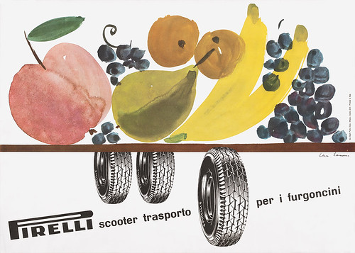
Newspaper advertisement for Pirelli Scooter trasporto per i furgoncini [Scooter transport for vans], ca. 1960.
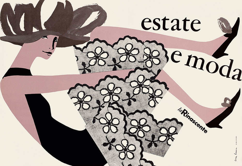
Top: Detail from summer fashion poster, Estate e moda, for La Rinascente department store, 1958.
Perhaps another reason she was ignored was that she chose not to teach, feeling that teaching requires precise skills and a lot of time; she preferred to be ‘just’ a good designer. Or is it only with some distance one can see clearly who stands the test of time?
Her career did not stop when she returned to Switzerland. From 1963 to 2003 Lamm was a partner at Frank Thiessing’s studio in Zurich, designing for clients in fields as diverse as pharmaceuticals, textiles, aerospace and food. She had consciously moved away from the distinctive style of her Milan decade, and from the city itself, feeling it was time to move on. However she agrees there was something in the air in 1950s Milan: postwar reconstruction brought hopefulness, a will to live and to do good things.
Recruited by businesses such as Pirelli, La Rinascente, Olivetti, Necchi and many others, Swiss and Italian designers based in Milan engaged in open experimentation, which resulted in a friendly revolution and competition and gave rise to unique designs. This was before the Milanese school became synonymous with the work of Massimo Vignelli and Bob Noorda, and before the strict typographic choices of Neue Grafik and Neue Typographie were imposed. The story is a scenario more complex than the successful union of Swiss rigour and Italian creativity.
The distinct style known as the stile milanese did not happen overnight. The integration of Swiss design into the cradle of the Italian postwar renaissance has seeds going back to 1936, when the Swiss pavilion curated by Max Bill for the Milan VI Triennale was widely admired. It introduced to Italy the idea that one person could combine typographic, photographic and drawing skills in their work. Swiss designers also looked to their Italian colleagues, whose work was covered by Swiss design magazines in the 1930s and 40s (Graphis and more).
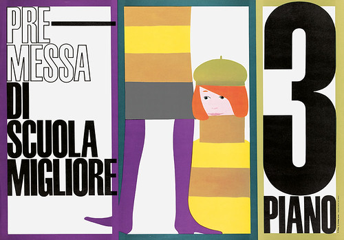
Premessa di schola migliore, poster for La Rinascente, 1961.
Lamm herself says: ‘It was funny, we arrived in Milan and everyone thought we were some sort of prophets, but I thought the Italians were already very good.’ She admired Bruno Munari, Erberto Carboni, Armando Testa, Franco Grignani, Ilio Negri, Piero Fornasetti, Giulio Confalonieri, Alberto Longoni and Bruno Danese.
When she arrived in Milan in 1953 – fresh from the Kunstgewerbeschule Zürich where she had studied with Johannes Itten and Ernst Keller – the leading light for the design community was Max Huber. To this day La Rinascente still uses the logo he designed.
Lamm, young and keen, was the right person in the right place at the right time. Even so, she says, she had to move three times before finding her ideal ‘greenhouse’ in La Rinascente, where she started as a junior and ended up as art director. The enlightened management recruited young talented people, no matter where they came from, giving them the freedom to experiment. Giorgio Armani started there as a shy young product designer at around the same time. Munari designed toys. Graphically, La Rinascente was coming to the end of a long period in which Marcello Dudovich had designed for them. Viewed today next to Lamm’s and Huber’s designs, his work looks as if it were made at least a century earlier.
Lamm also looked with great interest across the Atlantic, absorbing influences via Communication Arts magazine and the Art Directors Annual, as well as magazines from Vogue to the New Yorker and Harper’s Bazaar. She exchanged professional compliments with Andy Warhol, then a designer for Macy’s and, in her words, ‘good at drawing’.
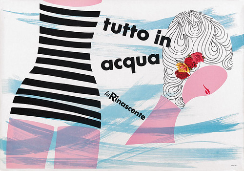
Tutto in acqua, La Rinascente, 1955.
Diverse audiences, from the professional tyre user to the casual department store browser, and items as different as hot water bottles, climbing shoes, blankets and carpets allowed Lamm to experiment with various solutions, but in all her designs the message comes across immediately. Lamm would start with the concept or object she had to communicate, producing an A6 sketch in pencil and gouache. She would move on to collage, followed by photo-composition and lettering, blowing up images and offset printing in photogravure on a large grid. Sometimes she left pencil marks on the final artwork, giving the image an immediate feel.
Using very different typography each time – from sans serifs, grotesques and even woodblocks, to Bodoni and other serifs – allowed for even more freshness and freedom. Yet a strong, disciplined focus remains constant. The eye must be caught, the message must reach the mind clearly and quickly, often in an amusing, optimistic way.
When Lamm left Milan, Frank Thiessing, (whom she later married) suggested she bring the posters and materials she had designed back to Switzerland. Today her work is safely stored and curated by the Museum für Gestaltung in Zurich.
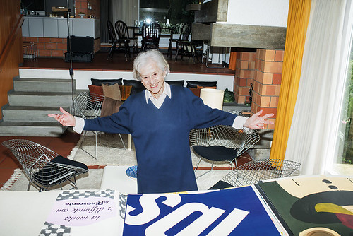
Portrait of Lora Lamm, 2013, by Lukas Wassmann. Courtesy Apartamento no. 14, 2014.
Chiara Medioli, marketing director, Fedrigoni and Fabriano, London and Verona
First published in Eye no. 93 vol. 24, 2017
Eye is the world’s most beautiful and collectable graphic design journal, published quarterly for professional designers, students and anyone interested in critical, informed writing about graphic design and visual culture. It is available from all good design bookshops and online at the Eye shop, where you can buy subscriptions, back issues and single copies of the latest issue. You can see what Eye 93 looks like at Eye before You Buy on Vimeo.