
Summer 2017
A house that type built
Type foundry House Industries – the subject of a hefty new monograph and a retrospective exhibition near Detroit – champions the joyful vulgarity of United States graphic arts. Jason Godfrey and Dan Adams pay tribute
The Process is the Inspiration (Watson-Guptill), the lavish new volume about House Industries, overflows with inky relish. The text recounts the story behind this prolific company with panache and candour. In 1993, designers Andy Cruz and Rich Roat gave up their day jobs to launch what they called Brand Design Company. They also started a separate company, which they named House Industries, to make and sell their own typefaces, a novel venture in the early 1990s. House quickly took up all their time. When type design maestro Ken Barber joined Cruz and Roat in 1996, he completed the triumvirate that still lies at the heart of the foundry.Fonts and typography underpin all their projects, but House had ambitions. From their base in Yorklyn, Delaware, approximately halfway between Washington DC and New York, House produced wooden blocks, furniture, clothing, bicycles, clocks, ceramics and textiles, all sold with a flair for self-publicity.
Later, they turned their attention to Japanese design, working with ceramic and textile companies on new products.
House’s graphic language is eclectic but peculiarly American; they are champions of commercial art like punk flyers, custom car flame jobs and lettering legends such as Ed ‘Big Daddy’ Roth. Yet they have also become custodians of United States Modernism, fostering relationships that led to projects based on the work of Alexander Girard, Charles and Ray Eames and Richard Neutra.
But it is one thing to admire typographic treasures such as the Photo-Lettering One Line catalogue. It is another thing altogether to seek out Photo-Lettering Inc. (PLINC) art director Ed Benguiat and founder Ed Rondthaler, buying more than 10,000 original typeface celluloid negatives (which will eventually perish). The House team spent eight years turning the original type library into a digital tool that enables designers to order and buy lines of type in a manner that replicates photo-typesetting of old.
House Industries also made a full length documentary film about Benguiat, and dedicated a family of typefaces to him. The Ed Benguiat Font Collection could even be bundled with a ‘life-like statuette’ of the veteran designer (who turns 90 this year).
Jason Godfrey, designer, writer, London
---
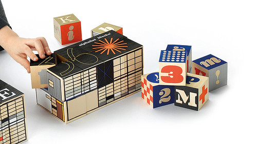
Eames House alphabet blocks set featuring letters and numbers from the typeface family Eames Century Modern, 2010.
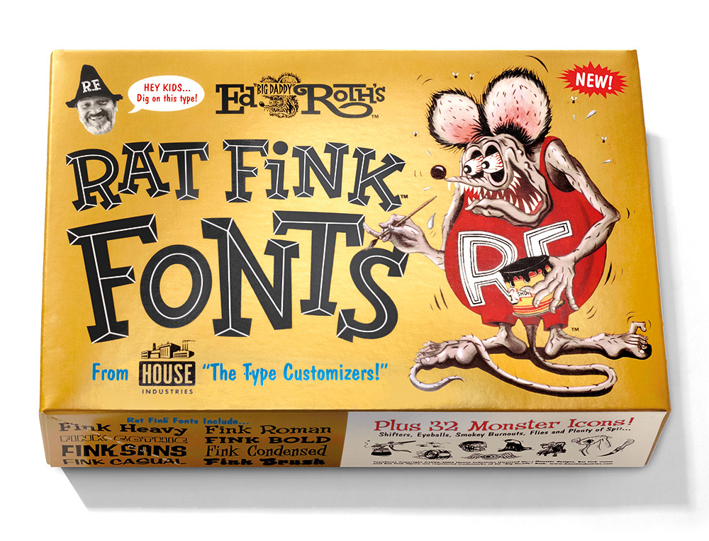
Top: Model kit-inspired Rat Fink Fonts box, House Industries’ set of fonts based on the hand-lettering of artist and cartoonist Ed ‘Big Daddy’ Roth, 1996.
My project of amassing a box full of House Industries ephemera – and another of brightly decorated wooden blocks, packaging and die-cut displays – began with Emigre magazine no. 38. House Industries had been given the cover and many inside pages to showcase their very singular ‘Pop-Art Baroque’ interpretation of late twentieth-century American commercial graphics. The studio’s output immediately struck a chord with someone who had fed hungrily on a diet of US comic books, 1950s and ’60s magazines and advertising, Banana Splits, kitschy Hollywood movies and posters, 1980s skateboard graphics and hot-rod culture – an apparently bottomless pit of vibrant, unabashed, joyful vulgarity. Here was a wonderful homage to those both known and unknown in the field of North American graphic arts – lettering artists such as Doyald Young, Tom Carnese and Herb Lubalin, advertising lettering artists and copywriters, pinstripers, commercial illustrators and custom-car artisans. As a European graphic designer forced to conceal his early influences under a cloak of more po-faced international graphics, I was keen to discover – and buy – more. Their skill at marketing their wares was as impressive as the work.
Among the rash of computer-driven, ‘groundbreaking’ graphic design of the mid-1990s, here was a group of designers who were willing to invest time and energy in rediscovering and rekindling a graphic design practice that appeared lost, or at least forgotten – exuberant hand-lettered headlines, snappy two-colour printing, illustration made with ink on paper, and characterful headline fonts. In a world now seemingly full again of highly skilled young lettering artists and sign-writing revivalists, we can see that House Industries were well ahead of the curve.
House’s output is not mere pastiche of graphic design bygones – it comes with a good deal of humour and irony attached. The House founders accompany their graphic work with a wonderfully knowing, self-deprecating copywriting style. While they celebrate – clearly with great affection – the rich feast of US postwar graphics, they also make great fun of the over-confident copywriting hokum that much of that period had to offer, often sending themselves up in the process.
In addition, the House products are beautifully packaged. As a designer, one takes a vicarious delight in their attention to details of material and finish. They give a tactile pleasure similar to that experienced digging through flea markets and getting excited about the particular type of brown cardboard used for an old box.
The joy of the House products is integral to their whole design practice. It is evident that a great deal of effort is put into thorough explorations of (and collaborations with) subjects and people that really interest them – the quality of the output reflects the sincerity of that interest. As House Industries’ interests have broadened and perhaps matured, they have sought to collaborate with the estates of designers and architects who might be considered a little more highbrow than their earlier influences but are no less integral to postwar United States culture. They bring to all their collaborations powerful pop-art sensibilities, holding up a mirror to the great traditions of late twentieth-century US popular graphic design.
Dan Adams, graphic designer, London
---
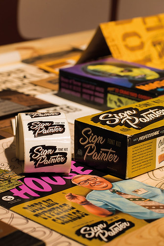
House Industries products including typefaces and other merchandise.
Trash from the past in the house of ford
House Industries is now the subject of a substantial exhibition at the Henry Ford Museum of American Innovation in Dearborn, Michigan, a fifteen-minute drive from Detroit. ‘House Industries: A Type of Learning’, which the museum describes as ‘multisensory’, runs until 4 September 2017. Curated by Marc Greuther, the show features typefaces, merchandise (far right) and other House Industries products alongside artefacts that have inspired House progenitors Rich Roat, Andy Cruz and Ken Barber. These include an original Apple I computer from 1976, furniture by Charles and Ray Eames, a 1932 Ford and a replica of the 1963 twin-Ford-engined Mysterion car (below, left) designed by hot-rod artist Ed ‘Big Daddy’ Roth (1932-2001).
From House Industries’ own studio there are silkscreens, stencils, paints, work for clients such as Hermès, John Mayer, Muji and Uniqlo and the neon sign they designed for the television chat show Jimmy Kimmel Live!
One area of the exhibition focuses on Monohara, their relatively recent venture into the world of ceramics and dinnerware. The brand name is a Japanese word that translates roughly as ‘trash-pit next to the climbing kiln’. The exhibit’s caption reads ‘Trash from the past can be a treasure trove for the future,’ a slogan that could be applied to many other items of obsessive interest to House’s restless founders.
John L. Walters, editor of Eye, London
First published in Eye no. 94 vol. 24, 2017

Eye is the world’s most beautiful and collectable graphic design journal, published quarterly for professional designers, students and anyone interested in critical, informed writing about graphic design and visual culture. It is available from all good design bookshops and online at the Eye shop, where you can buy subscriptions, back issues and single copies of the latest issue. You can see what Eye 94 looks like at Eye before You Buy on Vimeo.