Winter 2011
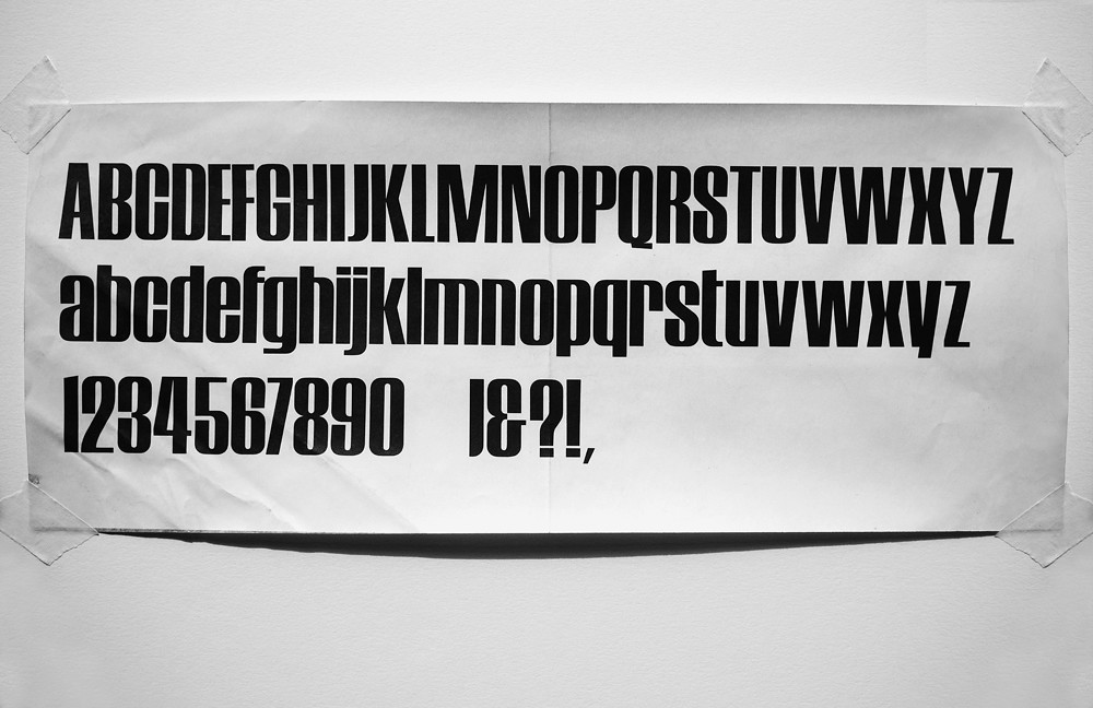
Carter’s battered stat

‘All that remains of the Private Eye typeface design is a battered stat of the type,’ writes Matthew Carter. ‘Nick Luard [then co-owner] wanted to change Private Eye into a glossy magazine and asked me to design it. I realized that this was a hopeless idea once I had met Christopher Booker, Richard Ingrams and Willie Rushton. I made a nameplate, pasted up from the capitals of a typeface that I had previously designed. The same face was used by Alan Fletcher in a logo for Viners, a Sheffield cutlery company, whose packaging he designed. It was used for headings in the magazine Movie that Ian Cameron edited and designed.
I used the Private Eye nameplate plus three words in the same typeface for a poster I did with Willie Rushton – “Private Eye is watching you” which I signed Layton O’Ward (after the Layton Awards for advertising design). I’m not exactly sure when I did the typeface (a piece of nameless juvenilia), but I was paid for the Viners job in August 1961 so it must have been done by then. I could only find a battered stat of the type (above); the drawings may not have survived.’
Matthew Carter, type designer, Cambridge, Massachusetts, US
First published in Eye no. 82 vol. 21 2012
Eye is the world’s most beautiful and collectable graphic design journal, published quarterly for professional designers, students and anyone interested in critical, informed writing about graphic design and visual culture. It is available from all good design bookshops and online at the Eye shop, where you can buy subscriptions and single issues.

