
Summer 2017
Expressive geometry
Kabel, Rudolf Koch’s eccentric, geometric 1920s typeface, has been revived as a 21st century type family by Marc Schütz. By Madeleine Morley, with extracts from Gerald Cinamon’s book about Koch
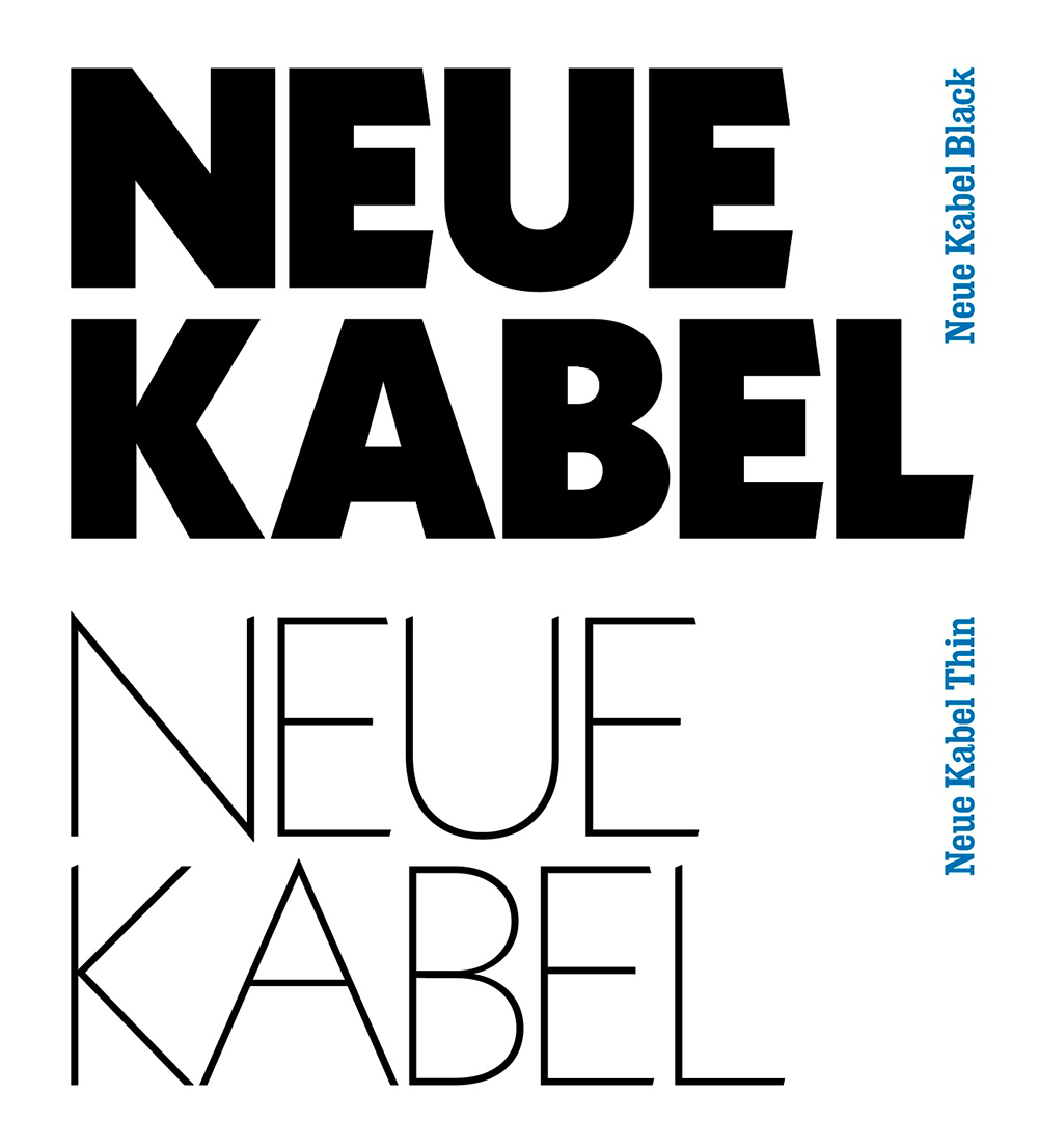
Four years ago, when designer Marc Schütz was teaching a class at the Offenbach University of Art and Design, his students decided to use the typeface Kabel (1927) for the text of the school’s annual report. This was an affectionate nod to the history of the institution, where the typeface’s designer Rudolf Koch (1874-1934) had taught while working for the local Klingspor Type Foundry. Schütz found that the available digital versions of the sans serif – including a 1975 adaptation by the International Typeface Corporation (ITC) – were unsuitable for the scope of the student project. Among other distortions, ITC Kabel’s dramatically increased x-height made it unsuitable for dense blocks of editorial text. And while in the original version Koch had created different designs for small text and display sizes, all sizes of ITC Kabel were derived from the display font. So Schütz set about designing an update for his students – a project that developed into the ambitious concept of a Neue Kabel type family.
In the late 1920s, German type foundries were competing to create a font that would best signify the style of the times; a sans serif devoid of decadent ornament, something stringently geometric that would fulfil Modernism’s demand for functionalism. It is believed that when the Klingspor Foundry heard that the Bauer Type Foundry, only a few miles away in Frankfurt am Main, was developing Futura, designed by Paul Renner, it commissioned Koch to design a rival. So Koch made Kabel: a name that connoted communication, connectivity, and the criss-crossing wires of city trams.
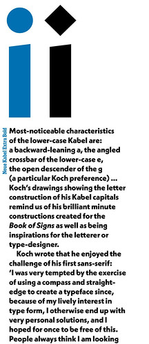
It is interesting that Klingspor should ask Koch to design a geometric typeface as he was a blackletter expert. His earliest typefaces, including Deutsche Schrift (1908-10) and Maximilian Antiqua (1913-14), were richly detailed and steeped in the German tradition. However the popular Neuland (1923) demonstrated another side. Kabel’s sibling typefaces Zeppelin (1929) and Prisma (1928-31, see sidebar, p.62) extended its Modernist traits. Yet while Kabel is predominately geometric, its eccentricities reveal Koch’s unwavering expressionistic and humanist instincts: the crossbar of the ‘e’ sits at an eye-catching diagonal, angled with the poetic, alert drama of a blackletter character.
Klingspor included a sketch of capital letters drawn on a grid in the type specimen for Kabel when it was released in 1927, highlighting the typeface’s supposed geometric conception. However, these capital letters do not belong to the Kabel family at all; … the sketch was merely a clever piece of marketing used to emphasise the notion of rationality underpinning the typeface.
Kabel is a typeface of conflicting sensibilities, encompassing two opposing ideologies: it markets itself on the Modern aesthetic, but it is simultaneously steeped in the forms of an expressionistic past.
In revising Kabel, Schütz has faced the same push and pull: the project is a historical endeavour in its exploration of Koch’s design process, and a project rooted in the now, as Schütz has reconsidered the font for a contemporary context. ‘I was interested in how the design would look if the font was conceived today, with the technology that we have and the demand for a huge set of fonts, styles, and extensions,’ he says. ‘It’s strange … I can’t think of any other typeface as well known as Kabel that hasn’t gone through a revival. Maybe it’s because the design is too eccentric.’
To capture its contradictory essence, Schütz focused on the letters that were ‘special’ to Koch. He’s created several OpenType features: the typeface can work for a project with a full on Art Deco look by implementing the extreme characters – like the ‘e’ with the sharply raked crossbar – or it can feel more contemporary through more subdued characters that reduce the overtly retro feel. Schütz says such flexibility is central to the playful personality of the typeface itself.
Koch’s options for certain characters are demonstrated in the original type specimen, where diamond dots and square dots alternate from page to page.
Schütz describes how the elegance of Kabel’s original rhythm was also lost in ITC’s version of the design, especially when it comes to the criss-crossing, uppercase ‘W’ and its stem endings – which changed between diagonal and flat depending on the weight in the original, but are consistently diagonal in ITC Kabel. ‘In Neue Kabel, the criss-crossing form of the “W” is available as an OpenType feature, because I considered it too retro in default text usage,’ says Schütz. ‘[It is] one of the ways in which I adjusted the typeface in order to improve readability and interpolation.’
In the article ‘Why we need a new Kabel’ for FontShop.com, Ferdinand Ulrich (see also ‘From punch-cutters to number-crunchers’) explained Schütz’s revision by tracing versions of Kabel over the years, showing the ways that changing technologies have contributed to alterations in the design, and consequent breaks in Koch’s original concept. Ulrich positions Schütz’s creation as a vital act of conservation. If it is about preserving and re-creating the old for our current technological context and needs, then now is the right time to update Kabel, because we can, and we can do so better than before.
Yet the initial student project that spurred Neue Kabel had a very specific, local purpose, steeped in the tradition of the University. What does Kabel have to offer outside of the realm of historical projects? Its ‘reduced’ default characters certainly make for a distinct and attractive sans serif, but its curves and lines are nonetheless distinctly of its time. It was a typeface that looked in two directions, gesturing towards streamlined Modernism, but not as mechanistic as Futura.
Paul Renner wrote of Koch: ‘Rudolf Koch is the best master of lettering of our time. His type represents more than an impulsive expressionist movement; his type forms are deeply experienced and understood in every essence of their relationships.’
‘Kabel carries many contradictory characteristics,’ says Schütz. ‘This peculiar character – the mix of constructed geometry on one hand and a calligraphic humanist feel on the other – goes well with multi-faceted subjects such as fashion and culture. In my opinion it’s the reworked rhythm and proportions that make it applicable today.’
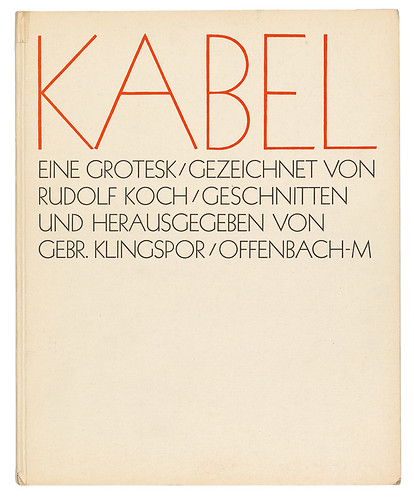
Cover from a specimen book designed by Koch in 1927, all set in the original light weight of Kabel. The title announces ‘a grotesque drawn by Rudolf Koch / cut and edited by the Klingspor Brothers’.
Top: Design: Marc Schütz of Schultzschultz in Frankfurt am Main, founded in 2007 by Schütz and fellow graphic designer Ole Schulte.
First published in Eye no. 94 vol. 24, 2017
Madeleine Morley, writer, Berlin
---
Extracts from Gerald Cinamon’s book about Rudolf Koch
Rudolf Koch, a genius of lettering and the design of typefaces, was a paradox in his own time. He worked as a medievalist, with ink on parchment – or with woodblocks – using biblical texts, often in a cold attic studio, he and his assistants using methods of the Middle Ages to apply letterforms to pages, to bookbindings, to woven and embroidered material, to objects in metal and wood. As did his admired William Morris, Koch looked back in history to find a new path forward, ‘to begin again’. At the same time he worked for one of the most progressive typefoundries in Europe, designing types for 20th-century machines, for 20th-century designers and printers, for 20th-century readers. For these he produced memorable and elegant Roman typefaces, yet he was a life-long advocate and fervent champion of the German black-letter.
[…]
Portion of an extract from Gerald Cinamon’s book Rudolf Koch: Letterer, Type Designer, Teacher (Oak Knoll Press and The British Library, 2000), set in Neue Kabel Extra Bold designed by Marc Schütz after the original design by Rudolf Koch.
Gerald ‘Jerry’ Cinamon, author, designer, London
---
Prisma and Prismaset
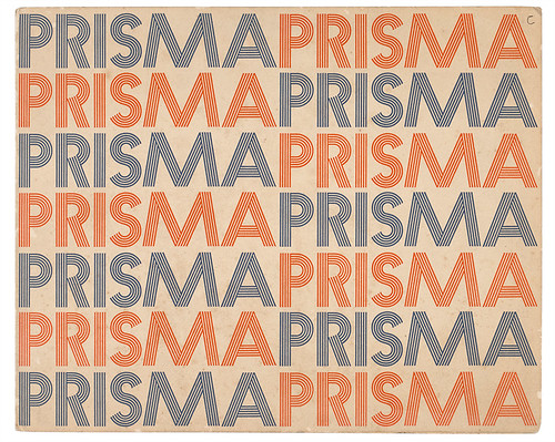
In the early 2000s, when designer James Goggin was working on an exhibition catalogue for the Gagosian Gallery, he adapted Rudolf Koch’s display typeface Prisma with the help of Swiss type designer Laurenz Brunner. Prisma, a caps-only, multi-line display face based on Kabel, was originally released as a metal font by Klingspor in 1930. Though it was never released for photosetting, the typeface was revived by Letraset in the 1970s, resulting in its widespread use on album sleeves and book covers of that time. However Goggin’s new version was solid, not multi-line, resulting in an eccentric but likeable new font.
[…]
Example from Klingspor’s original Prisma specimen, early 1930s.
John L. Walters, editor of Eye, London
Read the full version in Eye no. 94 vol. 24, 2017
Eye is the world’s most beautiful and collectable graphic design journal, published quarterly for professional designers, students and anyone interested in critical, informed writing about graphic design and visual culture. It is available from all good design bookshops and online at the Eye shop, where you can buy subscriptions, back issues and single copies of the latest issue. You can see what Eye 94 looks like at Eye before You Buy on Vimeo.