
Summer 2001
Face lift: new cuts at The Times
When technological developments at The Times demanded a change in the newspaper’s typography, a brand new typeface was commissioned, prompting a new analysis of the font’s long and complex history
In the past 70 years, Britain’s ‘newspaper of record’, The Times, has used three specially commissioned typefaces. Included among these is what is arguably the most-used and best-known typeface in the world, Times New Roman, (1) used as hot-metal type by the paper from 1932 to 1972 and as cold setting on the Autologic system from 1981 to 1991. Now, in 2001, The Times has commissioned its fourth new typeface for use throughout its news pages. Designed by Dave Farey and Richard Dawson, Times Classic is in the final stages of production testing and is now being gradually introduced along with changes to the paper’s layout and design.
Of the paper’s earlier faces, Times Roman and Times Millennium can be seen to have been designed primarily to improve the look of the paper (although Millennium also took advantage of a change of typesetting system from Autologic to Atex). Times Europa was designed to answer problems brought about by changes in the paper’s production: specifically an increased circulation and deterioration in newsprint quality. Times Classic has taken advantage of the introduction of the Hermes system at News International but also addresses shortcomings in the design and extent of the Millennium family.
Hermes
Hermes, a PC-based system, is made by the Italian company Unisys and at News International it becomes the interface for an Oracle database. It was introduced in 1998 because the existing Atex system was not ‘Y2K compliant’ without extensive upgrading; with a building move planned a new system was a better solution. The use of Hermes at News International is the first and so far the only one in Britain.
The system’s main advantages for a news-gathering organisation are speed and copyflow. As a design tool Hermes is not as flexible perhaps as Quark or InDesign but here design is only one of the jobs it must do. At The Times there are about 700 points of input to the system, ranging from journalists and editors to designers, picture libraries and wire sources; and with seven main editions of The Times each day and three printing plants, only 20 per cent of input is actually printed.
As a design interface Hermes can be adapted for different papers or even for different departments of a single paper. Systems staff tailor each set-up for specific users; for example, The Sun uses the design facilities in quite a different (more elastic) way to The Times, which has a fixed 9pt grid.
In use, pages can appear as WYSIWYG displays or as straight text files. In the latter, deleted text is greyed out and available for reference or editorial work. Typographic and layout instructions are a combination of commands (as in propriety typesetting systems) and style instructions (as in style sheets) depending on each user’s permitted access to the system. Aside from the main editorial text input and basic design structure, other graphic elements can be produced on Macs or PCs in Quark or Freehand and saved as EPSFS and imported to the layouts. All stories and elements in the layouts are tagged, linking them to position, page, newspaper and edition, the whole becoming one vast archive of digital data.
When pages are finally passed for press they are sent to production and plate-making. News International is currently changing from film output to CTP (computer to plate) exposure with a resolution of 1275dpi. This development would have happened regardless of Hermes and allows for a greater fidelity of image. At present production is 60/40 CTP to film output and the various machines are calibrated to minimise any visible difference.
The Times Classic brief and the shortcomings of Millennium
The seeds for the new typeface were sown at a talk over dinner just before Christmas 1997. With Farey and Dawson were Dave Wadmore (who was about to join The Times as deputy head of design); Chris Cappaert (of the type vendors Faces); Mark Batty and Colin Brignall (both of ITC). When Wadmore started at the paper the following month, questions about Millennium arose fairly early in his discussions with the head of design, David Driver.
Although Millennium works fairly well as a text face, its distinctive sloping top serifs and narrow appearance make for an unhappy display face, particularly in its bold weight. This provided the beginnings of a design brief – design a display version of Millennium – which, in contrast to the extensive notes surviving relating to the meetings about both Times Roman and Europa, was not set down in writing. Because Wadmore had already worked with Farey and Dawson, whom he had commissioned to design new masthead and headline typefaces for The European (where he was design editor) in 1995, they seemed an ideal choice for the job.
Dave Farey (b. 1943) and Richard Dawson (b. 1960) have worked together since 1981 as Housestyle Graphics (when designing custom fonts and lettering) and as Panache Typography (when designing commercially released fonts). Farey worked at Letraset for ten years from 1961 where he mastered the art of cutting stencils freehand in rubylith. From 1971 he worked in a number of photosetting houses. Dawson joined Panache in 1981 as the accountant but became drawn to the practicalities of typography design, particularly as computers started to appear in the mid to late 1980s. They now complement each other’s skills, Farey initiating the basic design as accurate pencil drawings on tracing paper, while Dawson deals with the digitisation process. In addition to The European fonts already mentioned, they reworked Janson for Fyens Stifstidende in Denmark and have released several typefaces commercially including Aries (FontHaus now DsgnHaus, 1995); Golden Cockerell (ITC, 1996); Cachet (Agfa, 1997); La Gioconda (Letraset/Fontek, 1999); and Johnston (ITC, 2000).
Their early research for The Times resulted in two display typefaces that were nicknamed ‘Romantic’ and ‘Changing’. Reactions to these roughs helped them, as well as Driver and Wadmore, establish what kind of product The Times actually needed.
In the end, this turned out to be a new type family, rather than simply acquiring new display fonts to work with Millennium. The Times wanted three weights, with accompanying italics for editorial use throughout the paper’s various sections, with specifically designed and optimised versions for text and display uses.
Analysis of Millennium helped to establish general design parameters. In its regular weight, the new typeface had to be as economical as Millennium, without looking squeezed, and should avoid the huge x-height tyranny seen in many newspaper types. Unlike Millennium it should not be larger than its body (enabling it to be set solid if necessary) and its colour should be fractionally darker than Millennium, which in current printing conditions looks thin. Millennium’s bold weight is unusable in text, so the new face needed to address this problem and provide a usable palette of weights for setting text matter as well as display headings.
The designers began by looking carefully at the ‘colour’ of the face against Europa, Millennium and Miller (as used by The Guardian) among others. While their brief was not a redesign of Times Roman, they did preserve some sense of the ‘bookish’ good taste that it represented, and the new face has certain features of old-face models such as a slightly oblique angle of stress. These features were married to a Trajan / Gill-inspired ‘Britishness’ to create a face that taken as a whole is a definitely contemporary roman.
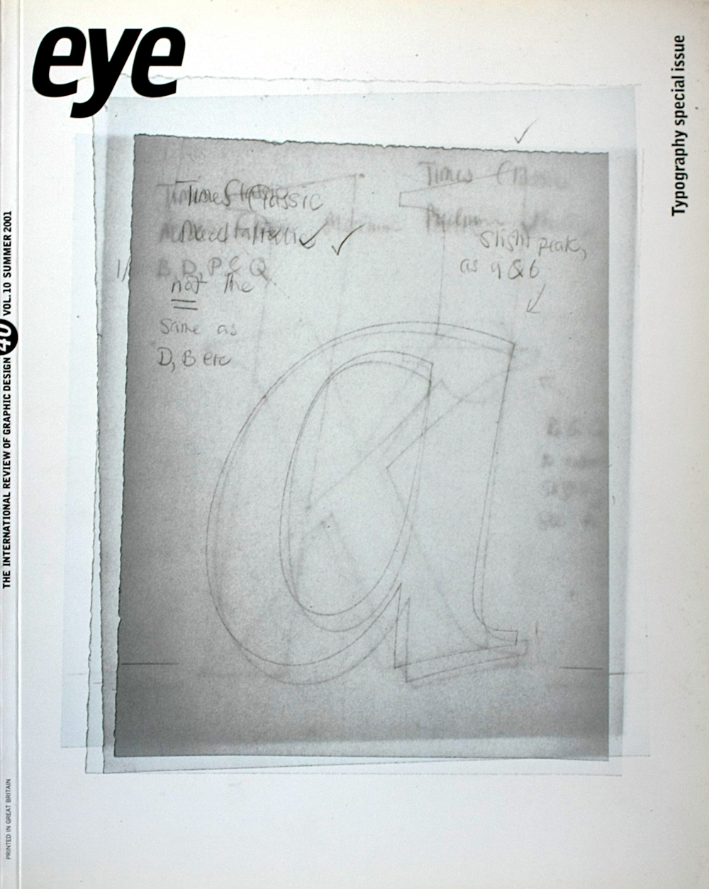
Once the basic ideas for each font variant were worked out, Farey drew up the characters as pencil outlines, which Dawson then scanned and hand-digitised in Fontographer. The pencil outlines, despite being immaculately produced, were not followed slavishly but used as the basis for the digitisation process. Three type design programs were used, each according to its best features: Fontographer for the ease of its drawing tools, FontStudio for spacing and kerning; and FontLab for hinting and final type production as PostScript Type I fonts. (2)
At all stages of the process, the designers worked closely with the systems staff at The Times to ensure compatibility with Hermes. Because the system itself was new, both sides had a certain amount to learn. Originally the whole typeface had to be spaced without kerning, but as this limitation of Hermes was overcome, the typeface was entirely respaced and provided with all the necessary kerned pairs.
When fonts were nearly complete, Wadmore used them to reset pages of the paper, which were printed to check how the typeface performed under operational conditions. Although newsprint today is produced from trees specially grown for the purpose – News International’s supply coming mainly from Scandinavia – maintaining quality is difficult and greatly affects the printed result, as does the speed of the presses. At the time of writing (early May), Times Classic has been tried out in several dummy editions and is currently being used for the masthead titles and bylines in the Saturday sections of the paper, and from Monday 21 May will appear on the title of the new Sports Daily section on weekdays.
The designers’ work was increased when it was realised that the versions of Franklin Gothic also used by The Times had been tinkered with over the years. These have been corrected by referring to the original URW font data, adjusted for newspaper conditions, and a set of Times-specific Franklins provided whose cap-height matches Classic.
The development of Times Classic has been fully supported by The Times’s editor, Peter Stothard; final tests are now being carried out and the typeface will be introduced later this year as part of a continual reappraisal of the paper’s design. A problem with Times Roman was the scale of its use as a commercial typeface, and the variety and often poor quality of its derivatives. These factors had to an extent robbed The Times of its identity. Although future commercial exploitation of Times Classic has not been ruled out, it seems unlikely that another privately commissioned type would attain the ubiquitousness of its ancestor and fail in that same way. (3)
1. Monotype developed the face and its version has always been known as Times New Roman. For use in the paper it was also produced by Linotype for use on its linecasting machines and this version has always been known as Times Roman.
2. FontLab is the only currently available and supported software for type design: Fontographer has had no significant upgrade since Altsys was taken over by Macromedia in 1996, Letraset’s FontStudio has not been supported since 1991, although it still works on the latest Macs.
3. Times Classic may also be used by newspapers outside Britain that are part of the News Corporation group.
Phil Baines, designer, tutor of typography, Central St. Martins, London
First published in Eye no. 40 vol. 10 2001
Eye is the world’s most beautiful and collectable graphic design journal, published for professional designers, students and anyone interested in critical, informed writing about graphic design and visual culture. It is available from all good design bookshops and online at the Eye shop, where you can buy subscriptions and single issues.