
Summer 2017
From punch cutters to number crunchers
In the summer of 1983, a Stanford seminar became a milestone in the long transition from craft to code
In the summer of 1983 the Association Typographique Internationale (ATypI) hosted their fifth ‘Working Seminar’ at Stanford University in California. It was a conference format dedicated to research, education and discourse related to the latest technological developments in typography and type design. Organised by Charles Bigelow, the seminar – under the title ‘The Computer and the Hand in Type Design’ – was aimed at demonstrating new computer-based possibilities in type manufacturing, but also the older analogue skills of cutting and stone-carving. Having witnessed the end of hot-metal type-founding three decades earlier, John Dreyfus felt compelled now to proclaim a ‘second turning-point in type design’ in his opening lecture. He raised two questions, hoping to find answers in the following days: ‘What kinds of type designs are needed now?’ and ‘How ought we to approach the problems of designing new types, taking into account the technical changes of recent years and the altered structure of the services which now create printed matter?’
The conference brochure’s cover image (by Sumner Stone) is a demonstration of letterform definition and resolution, graduating from a crisp outline to a coarse grid of bitmaps. The contents of the brochure embody some of the issues debated within typographic communities at the time, and the list of speakers gives evidence of an impeccable medley of punchcutters, computer scientists, engineers plus leading and emerging type designers.
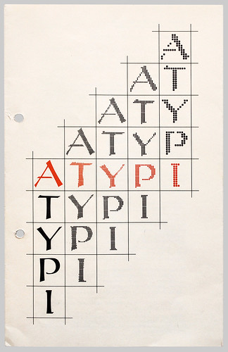
Cover of the brochure announcing the 1983 ATypI working seminar at Stanford University in California. Sumner Stone’s cover interprets the challenges of letterform definition and resolution – a recurring theme at the time.
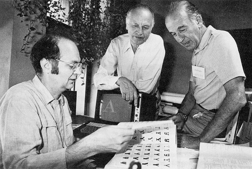
Top: The seminar assembled established and emerging type design personalities. This photo (published in Visible Language, vol. 19, no. 1, 1985), shows (L to R) Donald Knuth, Hermann Zapf and John Dreyfus at the event.
In his opening remarks at the conference, Dreyfus also suggested that the event represented the coming together of engineers and designers ‘for future cooperation in type design’. Type designers had long relied heavily on cutters who could cut letterforms in steel, though this relationship was never entirely equal, with type foundries often reluctant to share credit. However Hermann Zapf was known for crediting his punchcutters, particularly August Rosenberger (1893-1980), who cut Optima, among other faces.
Zapf’s collaborator Donald Knuth, in his talk, expressed the wish that ‘letter designers team up with computer scientists the way they used to collaborate with punchcutters’. In the 1980s the Zapf-Knuth duo was as popular as Zapf-Rosenberger had been in the 1950s, and in both cases the type designer depended on the other half to realise his letterforms. Another example of such a collaboration is that between the lettercutter David Kindersley and the computer scientist Neil Wiseman, both of whom spoke at the conference.
At the heart of the debate were five so-called type design systems presented at the seminar, for evaluation and discovery of new possibilities by designers, educators and management. Their different approaches to creating digital fonts encapsulate an enduring dichotomy between reviving historical typefaces and creating new original designs. The systems Metafont, developed by Knuth (Stanford, 1979) and Elf by Wiseman (Cambridge, 1978) defined letters in terms of ‘the path of a pen’ that could have different thicknesses. While Metafont described letterforms through certain parameters, using a programming language of the same name, letters in Elf were generated by building trapeziums along the path.
Ikarus by Peter Karow (Hamburg, 1975), on the other hand, was a digital vector format similar to that of Bézier curves, which worked through what was called ‘hand-digitisation’, using a digitising tablet and a sensor to ‘trace’ analogue drawings. Equipped with free-hand drawing and interactive editing features, Metafont and Elf were said to be ideal for the design of new letterforms; Ikarus, by contrast, was conceived as a digitising tool appropriate mostly for reviving historical models.
This environment of type design systems was still small, yet rapidly growing and competitive. In one of the few conference reviews, in Fine Print (vol. 10, no. 1, 1984), David Pankow reports a heated debate between Zapf and Kindersley over the respective achievements of Metafont and Elf.
The list of those who did not attend the event is as interesting as those who did. Established font manufacturers such as Monotype or Linotype did not participate in any of the demonstrations. But Matthew Carter, who had co-founded Bitstream with Mike Parker two years earlier, gave a talk. According to Charles Bigelow, Bitstream was the first all-digital type foundry. According to Carter, Bigelow was the first to use the term ‘digital type foundry’. It is possible that the term was first used at the Stanford seminar.
One anecdote says a lot about the challenges of the time, the perception of aesthetics and the handling of technological limitations. In a talk that was not announced in the brochure, Sumner Stone demonstrated the design process behind the ATypI conference logotype. The presentation slides show three different trials, involving pen sketches, Ikarus digitisation, interpolations, and ‘pixelisation’ in various stages. In recent correspondence with me, Stone recalled that, after the talk, Knuth was ‘shocked’ that he had tried different design approaches, saying that he himself would never do that, but would stick with one approach until it worked.
In his own lecture afterwards, Knuth took Stone’s logotype as an example, showing how it could have been created using Metafont: ‘Of course we could simply trace the outlines of the letters; but that would not be any fun, and it would not give us any insights.’
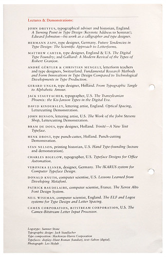
The Stanford speakers’ list reveals a diverse gathering, from punchcutter Henk Drost to computer scientist Neil Wiseman; from established typographer Jack Stauffacher to newly appointed professor Charles Bigelow. Bram de Does spoke about his first typeface Trinité. Matthew Carter, Veronika Elsner and Gerard Unger were part of a new generation of ‘digital type designers’. Image: ATypI collection of the University of Reading, Department of Typography and Graphic Communication.
Stanford 1983 was not the starting point, but a milestone in a long transition. The early years of digital type technology can be described as an environment of stand-alone solutions, very much like the decades of photo and metal type before it, where the typesetter was limited to the typefaces available for a particular device. However, beginning with the introduction of Ikarus in 1975, font formats could be adapted to a different devices, allowing for more flexibility. The ATypI working seminar reflects this period of transition, but another much more crucial turning-point lay ahead. In 1985, the page description language PostScript, a mediator between input and output devices, completely changed the market. Although the seminar appears to have been a meeting of academics and specialists, the perception shifted as many students attended the debates and, with a new generation of type designers, a ‘digital culture’ began to emerge. Many of the issues discussed at Stanford in 1983 are still relevant today.
Ferdinand P. Ulrich, typographer, researcher of type history, Berlin
All quotes are derived from published talks of the 1983 Stanford conference in issues of Visible Language vol. 19, no. 1, 1985 and vol. 50, no. 2, 2016. Recent correspondence with some of the protagonists and files from the ATypI archives at University of Reading, Department of Typography and Graphic Communication helped to reconstruct the events.
This article is a result of Ferdinand P. Ulrich’s ongoing postgraduate research at the University of Reading, Department of Typography and Graphic Communication, supervised by Sue Walker and Gerry Leonidas.
First published in Eye no. 94 vol. 24, 2017
Eye is the world’s most beautiful and collectable graphic design journal, published quarterly for professional designers, students and anyone interested in critical, informed writing about graphic design and visual culture. It is available from all good design bookshops and online at the Eye shop, where you can buy subscriptions, back issues and single copies of the latest issue. You can see what Eye 94 looks like at Eye before You Buy on Vimeo.