
Spring 2016
London Letters
Eye editors
Philip Sayer
Edward Johnston
Harry Beck
Eric Gill
Hans Schleger
Eiichi Kono
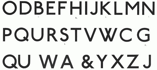
Philip Sayer photographs lettering on the streets of London in this alphabetical compendium
Every city is crammed with words and acronyms – type and lettering – from the familiar outlines of big brands to street signs and traders’ chalkmarks.
But some letters belong to one place and no other: the stencilled nizioletti street signs of Venice, the Art Nouveau script flourishes of the Paris Metro, the scuffed Helvetica medium of New York’s subway – the silent, typographic underscore to a thousand Manhattan melodramas.
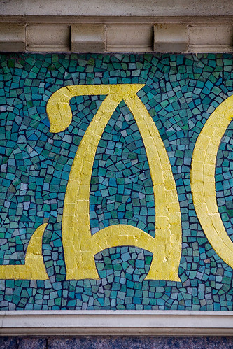
A – The Black Friar, 174 Queen Victoria Street, London EC4V 4EG.
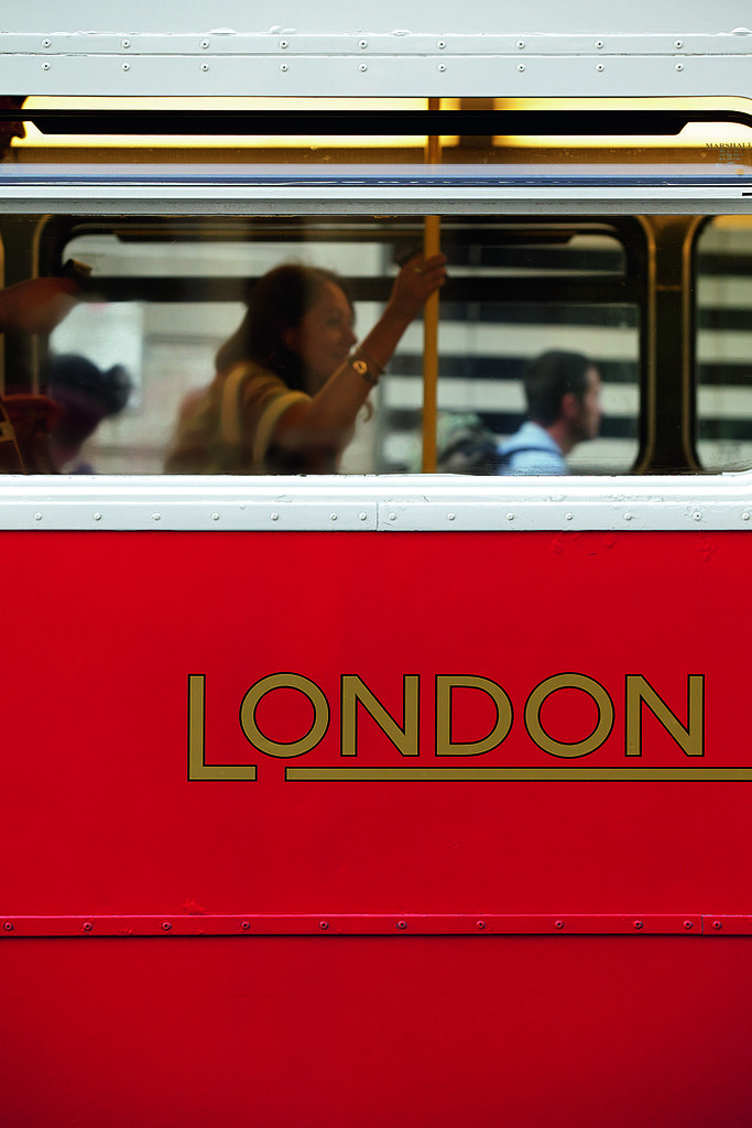
Top: Johnston Sans on the side of a London Routemaster bus serving a ‘heritage’ route. Photographs: Philip Sayer.
But if there’s one alphabet that screams ‘London’ it has to be Johnston Sans, designed for the London Underground, which celebrates its centenary this year (2016). Drawn by Edward Johnston, with some assistance from Eric Gill, and first made as wood type, it has been redrawn by many hands over the years, including Eiichi Kono’s, and you see its traces throughout the city.
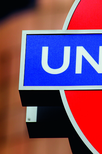
U — Liverpool Street Station, Bishopsgate, Londo EC2M 7QH. Photograph: Philip Sayer.
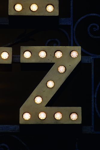
Z – The Ritz Hotel, 150 Piccadilly, London W1J 9BR. Photograph: Philip Sayer.
Except that Johnston Sans doesn’t scream. If it had a voice, it might be that of actress Judi Dench, or the late BBC presenter David Jacobs – a well modulated, not overly class-ridden English accent. The typeface now works equally well for station signs, hard information, warnings, heavily gridded timetables and the unwitting poetry of weekend station closures and engineering announcements.Londoners were reminded of the typeface’s quiet composure during the 2012 Olympics, when the sign system throughout London Transport used big bold Johnston signs – often in white out of cyan or magenta – to great effect. If Johnston played the straight man to the gurning of Wolff Olins’s 2012 logo and its accompanying typeface, it was the older font that emerged with its dignity intact.
Detail of proof of early tests made for the London Underground typeface, now called Johnston Sans. Eric Gill, Johnston’s friend, neighbour and former pupil, collaborated on the design, and was paid ten per cent of the total fee. Image courtesy St Bride Printing Library, London.
Another revelation for Londoners has been the crisp beauty of the Johnston capitals on the Overground system. They complement the architecture of stations such as Shoreditch High Street and Hoxton.
Harry Beck’s famous diagram (or tube map), constantly updated to accommodate reopenings, closures, expansion and wheelchair access, shows Johnston Sans at its hard-working best, labelling each station with quiet flair. It’s the typeface, like the ‘roundel’ logo, that confirms you’re in this city.
London is a sprawling city of villages, of overlapping communities, networks and cultural activities, of extremes of wealth, friendliness, creativity and industriousness that defy easy summation. Johnston Sans, sufficiently calm and neutral to accommodate such diversity, tells Londoners where to go, and where they can get off, every minute of the day.
Yet the typeface has a few quirks that make it instantly recognisable – not least the diamond-shaped full stop. This is echoed in the colon and semi-colon, and in the tittles – the dots on the lower case ‘i’ and ‘j’. The full point has to work even harder now that most Underground posters include the website URL tfl.org.uk.
This oblique mark may derive directly from Edward Johnston’s advocacy of the broad-nibbed pen – many regard Johnston as a calligrapher rather than a type designer. But in today’s obsessively orthogonal, code-driven visual landscape, you might wish to see Johnston’s jaunty, diamond-shaped lozenge as a hint that in London – for all its oppressive overcrowding and regulation – it is possible, even mandatory, for visitors to go off the grid and have fun.
John L. Walters, Eye editor, London
See the exhibition ‘Underground: 100 years of Edward Johnston’s Lettering for London’ at Ditchling Museum of Art + Craft from 12 March – 11 September 2016.
First published in Eye no. 91 vol. 23, 2016
Eye is the world’s most beautiful and collectable graphic design journal, published quarterly for professional designers, students and anyone interested in critical, informed writing about graphic design and visual culture. It is available from all good design bookshops and online at the Eye shop, where you can buy subscriptions, back issues and single copies of the latest issue.You can see what Eye 91 looks like at Eye before You Buy on Vimeo.