
Autumn 2018
Lovable loser
A daring approach to sports journalism earned the short-lived Jock magazine a place in design history
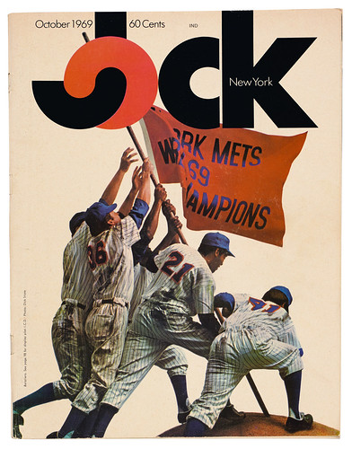
Jock launched in the right place, and at the right time: it appeared on New York newsstands on 24 September 1969, the night of the National League Baseball Championship. The New York Mets (affectionately known as the ‘lovable losers’ for their poor track record), featured on the magazine’s inaugural cover, raising the winning pennant on the pitcher’s mound at Shea Stadium – a witty take on Joe Rosenthal’s iconic 1945 photo, Raising the Flag on Iwo Jima. That night, the Mets unexpectedly defeated the Saint Louis Cardinals and altered their own fate – consequently turning the cover from pun to prophesy, from ironic to iconic; and upending Jock’s intentions as an irreverent magazine for the intellectual sports fan. Jock’s first issue sold out.
[…]
Jock’s first cover, October 1969, a pastiche of Raising the Flag on Iwo Jima. Much like the Mets themselves, Jock appeared as an underdog in the highly competitive climate of magazines that year.
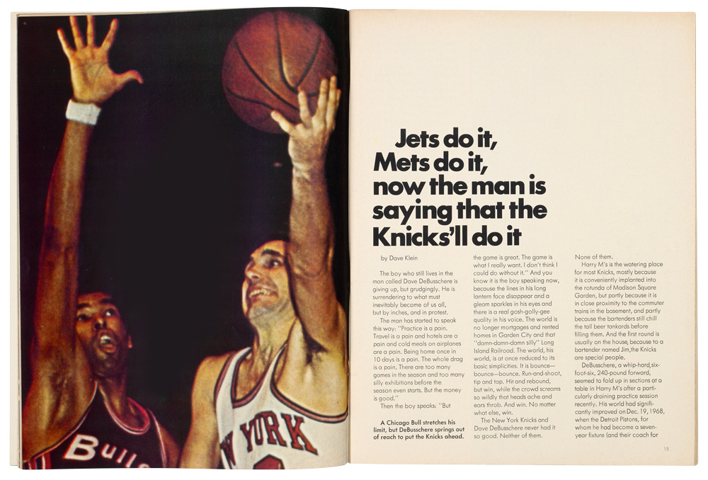
Top: The laconic Futura setting of Helmut Krone’s ‘Lemon’ advertisement for Volkswagen, produced at Doyle Dane Bernbach in 1959, is echoed in Krone’s design of Jock, as seen in this opening spread for an article about the Knicks basketball team in the December 1969 issue.
Marianne Hanoun, design writer, London
Read the full version in Eye no. 97 vol. 25, 2018
Eye is the world’s most beautiful and collectable graphic design journal, published quarterly for professional designers, students and anyone interested in critical, informed writing about graphic design and visual culture. It is available from all good design bookshops and online at the Eye shop, where you can buy subscriptions and single issues. You can see what Eye 97 looks like at Eye Before You Buy on Vimeo.