
Summer 2008
Modernism and monograms
Both artisan and art director, Hermann Eidenbenz was a subtle master of Swiss design.
The Swiss designer Hermann Eidenbenz (1902-93) crossed many of the boundaries that define graphic designers and graphic design history. He taught but did not write extensively in the manner of Tschichold, and he had none of the theoretical fervour of Bill. As a skilled artisan, working in multiple styles, Eidenbenz is much harder to place.
His training was eclectic: he had apprenticed with a lithographic printer, before going to work with Ernst Keller, who was an enduring influence on Swiss graphic design throughout the twentieth century. (One of Eidenbenz’s earliest posters, a simple typographic composition for Basel Poster Art in 1932, clearly recalls Keller’s Das Neue Heim poster of 1926.) He also trained with Wilhelm Deffke and the engraver Oskar Hadank. Through Deffke, Eidenbenz taught at the Kunstgewerbe- und Handwerkerschule Magdeburg from 1926 to1932.
Fellow teachers at Magdeburg included the Modernist designer Johannes Molzahn and the more traditional Austrian poster designer Julius Klinger. While the latter’s work relied purely on illustrative methods, however simple, Molzahn stuck exclusively to the new photographic medium. Eidenbenz would use both, selecting which seemed the most vital and direct.
In 1932 Eidenbenz returned to Basel to set up a design agency something of a rarity at the time – with his brothers, Willi and Reinhold. A 1944 advert for their services shows a broad range of services: lettering, advertising, exhibition, campaigns, photography (Willi and Reinhold were skilled photographers). While the advert maintains the connection between Eidenbenz and the avant garde (it is in a catalogue of modern art designed by Bill), the times often dictated the style he would (or could) employ. And while Tschichold would turn his back on Modernism, for both theoretical and economic reasons (working in the world of book publishing), Eidenbenz maintained a more pragmatic approach.
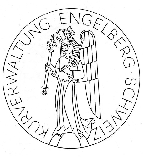
Symbols for Da Verkehrsburo, Engelberg.
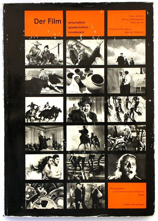
Top: cover of Der Film (Holbein-Verlag Basel), 1947.
 His poster for the Grafa exhibition in 1936 and a 1947 film catalogue fall neatly into the Modernist camp. Yet he would also produce work in the Keller tradition: classical seriffed typography such as his poster for the Swiss trade fair in 1944.
Eidenbenz’s other specialism was in creating monograms. They follow in the tradition of Keller, simplifying the style to a bare minimum, while remaining illustrative and pictorial. The lettering style would be sympathetic to the image, both in style and in weight; it neither overcrowds nor is overwhelmed by the image.
He also designed two typefaces: Graphique (1944) and Clarendon (1953, under the direction of Edouard Hoffmann), both for the Haas typefoundry.
In 1952 Eidenbenz left Switzerland for Germany and turned towards a more classical engraved style, which he applied to both currency and stamp design, to which it is eminently suited. He worked extensively in the tobacco industry (as did Hadank), becoming art director for the Reemtsma cigarette company in Hamburg, and his work at this time draws heavily on Hadank’s example.
The technical quality, the variety of styles and the pure breadth of Eidenbenz’s work are almost without parallel. But these same qualities may have limited his lasting appeal and influence. Because he worked so easily in so many different styles, and in so many different markets, there could be a notion that he was perhaps not a ‘serious’ design figure. The argument that might be made is that to be taken seriously as a designer, it is easier to work in one identifiable style.
The counter-argument is that good design is not about a narrow style applicable for all, but a number of styles for different applications. To achieve this, Hermann Eidenbenz became a master of all trades.
First published in Eye no. 68 vol. 17 2008
Eye is the world’s most beautiful and collectable graphic design journal, published quarterly for professional designers, students and anyone interested in critical, informed writing about graphic design and visual culture. It is available from all good design bookshops and online at the Eye shop, where you can buy subscriptions and single issues.