
Autumn 2019
Normcore inferno
As brand mania reaches new heights the new logotypes of luxury brands become ever more remarkable in their blandness
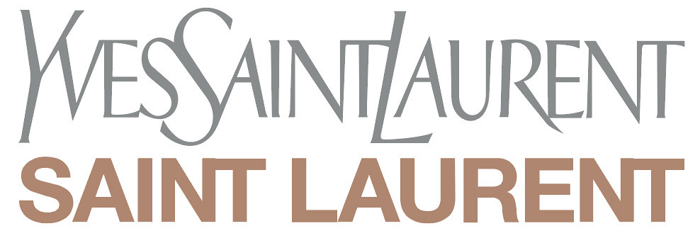
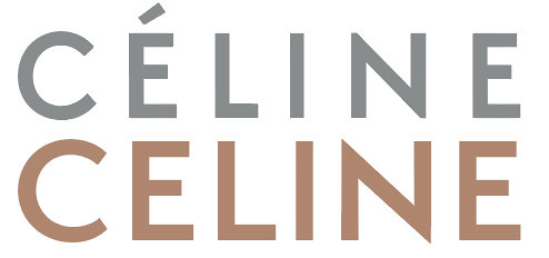
The typographically and sartorially inclined cannot have failed to notice an austere turn in fashion logos. In 2018, luxury houses Celine, Balmain and Burberry stripped their logos of heritage accoutrements. Celine dropped the French acute accent over the first ‘e’; Balmain dismissed its inline; Burberry gave its equestrian knight its marching orders. This wave of redesigns really began in 2012 when fashion designer Hedi Slimane marked his arrival as creative director of Yves Saint Laurent demonstrating no anxiety of influence at all. He quickly announced the name of the eponymous fashion house would henceforth be referred to by surname only – like a school chum. Furthermore, he demoted the monogram often mentioned in hallowed tones by graphic designers: the vertically and diagonally offset uppercase ‘Y’ and ‘L’ bound together by a serpentine ‘S’ – neither serif nor sans serif, neither roman nor italic – the late-career masterpiece designed by A. M. Cassandre. In its place would be a logotype much less intricate or dynamic: a customised version of all caps Helvetica Bold snugly kerned and stating the obvious.
Seven years on and many luxury fashion houses have followed suit. 2017 saw the redesign of marques for Calvin Klein and Balenciaga. What is remarkable about the current crop of logotypes is that they are completely unremarkable. A trained eye might beg to differ – Burberry is all the counters of the ‘B’s and ‘R’s, Balenciaga has verticality in its proportions – but to the average pundit they look the same. They have devolved into a class of trademarks noticeable more for their similarities than for their differences. They offer no-frills rhetoric wrought visually. What are we to make of such concerted efforts at uniformity?
Redesigns of logotypes for both Yves Saint Laurent in 2012 and Céline in 2018, under the creative direction of Hedi Slimane, claim a return to 1960s typography and the International Style.
Top. The Yves Saint Laurent logotype, redesigned under the creative direction of Hedi Slimane in 2012.
Illustrious histories
Luxury fashion brands are strange beasts. Most were founded around a hundred years ago in the name of an auteur designer with a signature style (Balenciaga or Yves Saint Laurent) or to demonstrate a particular manufacturing expertise or artisanal skill (Gucci’s leather saddles or Burberry’s outdoor gabardine coats). Since then, they have garnered illustrious histories. Successive creative directors have taken the helm, trying to make their own mark on the brand while remaining faithful to the ethos of the founder-creator. Other companies known for a particular kind of high-quality manufacture have expanded their product range in an attempt to imbue all their goods with the same reputation.
Such brands must now negotiate a contradictory message. They must be forever old and eternally new, traditional yet fashion-forward. They must maintain an aura of exclusivity but of omnipresent desirability. They encourage you to purchase a quality product that will last forever while at the same time wanting you to replace it next year. It is tempting to see the new generation of trademarks’ betwixt- and between-ness as ground zero in this slew of competing tendencies.
But their blanket uniformity is also a symptom of globalisation. In the beginning, it was clear who owned luxury brands and how and where their products were made. Having established reputations for which their logos were the visual embodiment, they soon discovered the logo had an inherent value that could be transferred to other goods. Many fashion houses, originally small businesses, grew through the practice of licensing, which began in the 1950s. Some relocated production to low-cost countries. The quest for expansion continued into the 1980s when, aided by the banking sector, their ownership changed. Today most high-fashion brands are owned by a handful of conglomerates. The LVMH group (Moët Hennessy Louis Vuitton), founded in 1987, includes Fendi, Celine and Christian Dior in its stable. Kering, founded by François Pinault in 1963, controls Saint Laurent, Gucci and Balenciaga. In their 2016 book Luxury: A Rich History, Peter McNeil and Giorgio Riello assert: ‘Luxury capitalism hides its modern organisation behind a veneer of history.’ It clings to the myth of a pure lineage even as the reality of ownership muddies.
The 1963 YSL logotype, designed by A. M. Cassandre.

Disposable luxury
If the current crop of fashion logos appears uninteresting, it must be conceded that fashion logo design has never exactly been a hotbed of typographic experimentation. In the history of haute couture, innovations in clothing design and the vicissitudes of fashion have been offset by conservative logotypes. Historians map a two-pronged influence on their genesis: one can be traced to the development of the Didone style and its feminine associations through editorial design, and the other to Chanel. In 1925, seeking a logotype for her perfume, Coco turned not to the frippery of the market but to the avant-gardism and machine-age vernacular of Le Corbusier (see Abbott Miller’s ‘Through thick and thin: fashion and type’ in Eye 65). Since then the black sans serif all caps have remained unchanged.
The current logos continue this second trajectory. The PR machines behind them acknowledge as much. The deletion of Celine’s French acute accent came with the following rejoinder: ‘The new logo has been directly inspired by the original, historical version that existed in the 1960s … The modernist typography used dates from the 1930s.’ Even Slimane’s iconoclastic rebranding of YSL was a nod to the brand’s history as a ready-to-wear label. Saint Laurent Rive Gauche, the revolutionary ready-to-wear collection, which Yves debuted in 1966, featured a logo in a sans serif block font and pink and orange squares created with perfume designer Pierre Dinand. It is this essence of the Saint Laurent house, the youthful street fashion, that Slimane was revisiting – subtly, cleverly – in his debut of Saint Laurent Paris’s simple, capitalised Helvetica font logo.
That this legacy is not instantly discernible is perhaps a testament to the enduring relevance of the International Style or to the difficulty of invoking Modernism in retrospect. Such claims to history should be taken with a grain of salt. Logos today are just one expression of a brand. They join a constellation of communication forms that include everything from a retail store’s fragrance to Instagram. These days a new luxury fashion logo is a highly orchestrated social media event in which everything from logo, images and press releases spin a tightly controlled narrative. Viewed this way, the logo – and the historical references – are bit players in the performance of the dialectics mentioned above. They are theatrics in double speak. They acknowledge the ‘h’ for heritage with one hand, while wiping it away with the other. Take Celine again. The launch campaign, marking Slimane’s arrival as creative director, featured an image of disposable luxury incarnate, a GIF of a gently billowing gold foil curtain. It invoked mid-twentieth century references while brazenly signalling a clean slate. Slimane began his tenure by summarily deleting the label’s entire Instagram archive.
Logomania
If fashion logos themselves revel in understatement, never have they been more flagrantly displayed. The fashion press call this typographic ostentation ‘logomania’. Gone are the days when one would look to the seam of a garment for a discretely placed woven tag. Today, even brands built on the aesthetics of minimalism and ideas of stealth luxury proudly display their logos on their goods. To designers, who themselves stereotypically dress in clothes they know to be designed and made well, this can seem somewhat of an affront. From a purely visual perspective, the conventional hierarchy between label and garment has been reversed.
Not since the 1980s and 90s have people been walking around emblazoned with so many letters of the alphabet. That was the postmodernist heyday. The inversion of emphasis between surface and construction was kickstarted by Denise Scott Brown and Robert Venturi when they observed in Learning From Las Vegas (1972) that ‘the skyline of Las Vegas was made of signs not buildings.’ Ten years later, a young Karl Lagerfeld arrived at Chanel to give the fashion house a badly needed revamp. He did so by amplifying the trimmings. He swathed the conventionally elegant ensembles in gold jewellery and more importantly plastered everything with the interlinked double-‘C’.
As the decade wore on, other fashion houses followed suit. The capitalist boom of the 1980s encouraged conspicuous consumption. Luxury fashion brands continued the practice of licensing and franchising with alacrity. Monogrammed T-shirts became all the rage. You wore one to signal your aspirations, your status, your embrace of style over substance and maybe your aversion to those dead-ended stick-in-the-mud lofty ambitions of eternal universality and form following function. In his 1989 book The Condition of Postmodernity, David Harvey writes, ‘The acquisition of an image (the purchase of a sign system such as designer clothes and the right car), becomes a singularly important element in the presentation of self in individual identity, self-realisation, and meaning.’
The real from the fake
The typographic convention of the luxury-brand monogram can be traced to Georges Vuitton, son of Louis. Wanting to protect the authenticity of the high-quality leather goods the company had been manufacturing since 1856, he stamped them with a pattern inspired by the stone quatrefoil of the Palazzo Ducale in Venice. In 1905, he patented the LV monogram that formed part of the pattern.
Ironic then, that the typography is the easiest part of a product to knock off. In 2019, the war against counterfeiting has been resoundingly lost. Harvard Business Review reports that LVMH employs at least 60 lawyers and spends US$17 million annually on anti-counterfeiting legal action. These efforts are not working. Fake luxury merchandise still accounts for 60 to 70 per cent of the estimated US$4.5 trillion total trade in fakes and represents a quarter of the estimated US$1.2 trillion total trade in luxury goods (see ‘How Luxury Brands Can Beat Counterfeiters’, hbr.org, 24 May 2019).
Digital media has helped fuel the spread of the fake like wildfire both practically, as online shopping opens up more and more distribution networks, and also philosophically, as the very means of digital production fundamentally undermines any distinction between the original and the copy. Resistance, it seems, is futile. Any attempt to differentiate the real from the fake has proved pointless. Logos are no longer authenticating markers, rubber stamps of high quality and original design.
What then do they signal? Why are they being paraded with more gusto than ever? Compared to yesteryear’s monogrammed T-shirts, logos today are applied with far more typographical cunning. Never has the graphic designer’s adage that the key to branding lies not in the logo itself but in the rules of its application been more apt. Different brands play different logo games.
Rather than try to defend its authenticity, Gucci, one of the few brands not to have abandoned its serif logotype, operates with an ‘if you can’t beat them, join them’ attitude. Under the creative direction of Alessandro Michele, Gucci style at the moment is an exuberant exercise in luxury excess. To clothes overloaded with embellishments, embroidery, shimmering surfaces, custom-woven jacquards, jewelled lion’s head buttons or gumdrop pearls, even sleeves dipped in mink, Gucci gleefully adds lashings of branding: big gold overlapping G-monogrammed belt buckles, monogram-patterned twills and jacquards, signature red and green-stripe trims. Michele furthermore delights in violating the sanctity of the bona fide Gucci logo: he indiscriminately overlays monogrammed sweatshirts with crystal starbursts and even incorporates bootlegged logos into official collections, on T-shirts, and purposefully pasted on trainers with no attention to the form of the shoe.
The vogue for mainstream
Other fashion houses use more nuanced tactics. In 2013, New York brand consultants K-Hole coined a catchy neologism ‘normcore’. They defined normcore as a sociological attitude which Alex Williams explained in ‘The New Normal’, an article in The New York Times (2 April 2014): ‘The basic idea is that young alternative types had devoted so much energy to trying to define themselves as individuals, through ever quirkier flourishes like handlebar moustaches or esoteric pursuits like artisanal pickling, that they had lost the joy of belonging that comes with being part of the group. Normcore was about dropping the pretence and learning to throw themselves into, without detachment, whatever subcultures or activities they stumbled into, even if they were mainstream.’
In fashion, normcore played out in the vogue for mainstream products, Birkenstocks, New Balance sneakers, non-ironic sweatshirts. It worked on the strategy that the very strategy of trying to be different had exhausted itself. With everyone jostling for attention and trying so hard to stand out, it’s more original and easier to blend in, or even to stand out by trying to blend in.
Normcore was quickly dismissed by the fashion press as obsolete, but not before the high-fashion juggernauts jumped on board. This happened most memorably in 2016 when, in a brilliant act of Duchampian reframing, fashion designer Demna Gvasalia sent a red-and-yellow DHL logo T-shirt, the kind worn by your local courier, down the catwalk, and attached to it a £185 price tag. Since 2014, his luxury fashion ‘collective’, the prosaically named Vetements, has garnered attention by incorporating mainstream products, such as reconstructed Levi’s jeans and Champion tracksuits, and charging fashionistas a premium for the chance to wear them.
In Gvasalia’s recourse to the everyday, logos are not something you turn a blind eye to, make smaller or pretend aren’t there. The fashion machine feeds on whatever might be external to it, and in his embrace of the humdrum, Gvasalia blithely accepts the logo as part of the status quo. In 2019 there is no backdrop, no such thing as life unbranded.
Gvasalia expanded his strategy when, appointed as artistic director of Balenciaga in 2015, he reinvented iconic everyday items, such as the 99-cent blue Ikea tote and the red-and-blue checked Chinese woven polypropylene laundry bag, in premium leather.
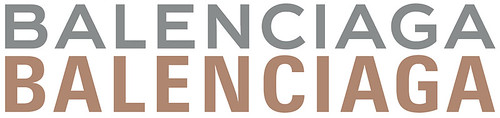
He echoed his valorisation of the everyday in the redesign of the logotype. Designed by Bureau Mirko Borsche in collaboration with Gian Gisiger, the new logotype displaces its predecessor’s twentieth-century classic feel with tightened kerning and condensed letterforms. Public statements about the logo explicitly link it to prosaic rather than luxury sources: ‘Conceived in-house, the development process was inspired by the clarity of public transportation signage. The result is a visually shortened logo which gives a simple, bold stamp to the timeless deluxe Balenciaga signature.’
The 2017 Balenciaga logotype by Bureau Mirko Borsche and Gian Gisiger abandons the extended letterforms and twentieth-century classic feel of its predecessor.
Bricolage and pastiche
Gvasalia launched the logo with a sweatshirt. It sported the slogan ‘New Balenciaga Logo Out Now’, each word typeset one underneath the next and recast in the style of a well known logo from the technology sector. The tongue-in-cheek combination of bricolage and pastiche went even further at Fendi when in 2018, it collaborated with Instagram artist Hey Reilly to redraw its restrained sans serif in the style of the red and blue split ‘F’ bubble logotype used by sportswear company Fila at the height of Swedish tennis champion Björn Borg’s success. Spliced together on bags and boots with Fendi’s traditional brown-on-brown double-rotated ‘F’ monogram pattern, the results verge on outlandish. At Fendi, the inescapable reality of the logo is to be enjoyed.
The new Balenciaga logotype by comparison is disarmingly matter of fact in its application. It appears flush across the width of a handbag or down the length of a scarf, even supplementing a conventional tiny gilt stamp or debossing. It shows up any attempts at brand discretion. Laid in a diagonal pattern over sweaters and other clothes, Balenciaga creates the impression of being a generic home brand, the kind you find in a supermarket. In the contemporary moment, if authenticity is no argument, then the generic is the next best thing.
Make fashion typography great again
In 2018, when Burberry chose to redesign its logo in a similar vein, it added more mix to the message. It entrusted the task to British graphic designer Peter Saville. Saville by now is almost a brand unto himself, notable for being the king of context and for visualising post-punk subcultures in the 1980s. With Saville, Burberry married street to the elite. It infused enduring traditional values with the flavour of radical Britain. The logo’s launch – the first redesign in twenty years – came with the customary blanket rejoinder: ‘The logo allows the company to crossover into all the categories that are required of a big luxury clothing and accessories brand – something to transcend the company provenance without denying it.’ It was unveiled with a screenshot of an email exchange between Saville and Burberry chief creative officer Riccardo Tisci, presumably in a show of transparency: ‘Peter, do you think you can do it in four weeks?’ ‘Riccardo, you must be crazy. You need four months for a project like this!’ The company that had built its reputation over 172 years took pride in overhauling the entire brand in a matter of weeks. It was a pointed display of the graphic design process that undermined the very idea of a designer’s skill and expertise.
The equestrian knight first appeared on Burberry clothing in 1901 before Thomas Burberry registered it as part of the logo in 1909. Peter Saville dropped both the knight and the serif when he redesigned the brand’s marque in 2018.

The new Burberry logo invokes the same unremarkable spirit as the others in the stable. Rather than being designed as celebrated marks of distinction, they announce: ‘Hello my name is luxury brand.’ Purposefully bland in their design yet vulgar in their application, they demonstrate ambivalence about their brand’s history and elitist pretensions. They are designed to avoid statements of conviction and communicate through a rhetorical suite of all-encompassing double-speak. Today, even as the logo wanes in its capacity to vouch for anything, it still advances the supreme power of the brand. This being the case, in acknowledgement of this power, of the brand’s integration into the very fabric, so to speak, of everyday life, fashion design today is drunk on brand aesthetics. Logos have become more essential than ever to the design of clothes. This state of affairs is perhaps most succinctly expressed by Saint Laurent’s 2017 Opyum pump designed by Anthony Vaccarello, a shoe, which in placing Cassandre’s iconic monogram underfoot as an interlocking metal high heel, is at once ornate but structurally integral.
Where type, fashion and generic design is concerned, it is hard not to think of the most successful piece of typographic branding of the era – the Make America Great Again baseball cap. With its serif all-caps and terrible kerning, the red MAGA hat is a typographic middle finger to anyone who ever believed in the refinement of a skill, the existence of an expert or to anyone who deigns to wear Balenciaga.
Spare a thought then for Pentagram’s Michael Bierut and the mea culpa he published about having designed the logo for Hillary Clinton’s 2016 presidential campaign, a simple capital ‘H’, rationally constructed on a nine-square grid, overlaid with an arrow pointing to the right. In his diary-style post article ‘I’m With Her’ (Design Observer, 28 March 2017), Beirut wrote: ‘In many ways, going to design school is all about surrounding yourself with a beautifully crafted bubble … Moving to New York put me at the center of a highly specialized profession practicing what would have seemed to my old friends in Ohio like a hopelessly esoteric brand of black magic.’
What Bierut demonstrates in his analysis, and in his design of the mark itself, is a quality which none of these fashion logos encourage – earnestness is not in vogue. True, with their sans-serif refinement, they are neither as brash nor outspoken as the infamous MAGA cap. And they retain a vestige of professionalism in their kerning. But in their concerted uniformity, their generic leanings, their prosaic associations, they do gesture towards populism. They wave to Ohio from on high. Where does this leave the skilled typographer? Apparently, in order to be in touch – to be normal – one is not supposed to be good at anything. Or at least not let it show. Being a savvy typographer nowadays is not just a question of skill but one of attitude. If you’ve spent a career honing your craft – and your convictions – the best thing you can do is withhold both and act like it all comes easily. Better hope and pray you can hold on to your kerning.
Elizabeth Glickfeld, design writer, editor of Dirty Furniture magazine, London
First published in Eye no. 99 vol. 25, 2019
Eye is the world’s most beautiful and collectable graphic design journal, published quarterly for professional designers, students and anyone interested in critical, informed writing about graphic design and visual culture. It is available from all good design bookshops and online at the Eye shop, where you can buy subscriptions and single issues.