Autumn 1996
Play-centre of the avant-garde
At the Institute of Contemporary Arts in London, design reflects a developing sense of identity and purpose
In the years immediately after the Second World War, a small group of artists and intellectuals in London envisioned a new kind of cultural institution. Their belief that the arts could play a major role in revitalising a society desolated by the experience of war finally led to the opening of the Institute of Contemporary Arts. The key figures, the poet and art critic Sir Herbert Read and the Surrealist painter Sir Roland Penrose, shared a Modernist vision of an attainable utopian future which shaped the mission and programme of the ICA. They sought to reflect the diversity of a living society, rather than reduce it to a homogeneous system. Thus, over the past 50 years, the ICA has established a unique history, and archive, of interaction between design and contemporary art in the constantly changing social environment of the post-war era.
‘Such is our ideal – not another museum, another bleak exhibition gallery, another classical building in which insulated and classified specimens of a culture are displayed for instruction, but an adult play-centre, a workshop where work is a joy, a source of vitality and daring’ read Herbert Read’s accompanying statement to the opening of the ICA’s first exhibition, ‘40 Years of Modern Art’, in 1948. ‘We may be mocked for our naive idealism, but at least it will not be possible to say that an expiring civilisation perished without a creative protest.’
The founding members’ international connections – most notably those of Roland Penrose with Parisian art world figures such as Max Ernst, Georges Braque and Pablo Picasso – made possible the inaugural exhibition, which was crucial in several ways. It set out the ICA’s agenda; it marked the first major meeting between the ICA and the general public; and it tried to create a foundation for the understanding and appreciation of twentieth-century art. It was also a huge success, bringing the ICA to the attention of the general public and, more importantly, establishing its credibility among potential financial supporters.
By the end of the first year, ICA events had included poetry readings by W. H. Auden, T. S. Eliot, Dylan Thomas and Louis MacNeice; a talk on modern architecture by Sigfried Giedion in conjunction with the Mars Group; a contemporary chamber music concert by Dallapiccola, Berg, Stravinsky and Buch, followed by a discussion of twelve tone music; and a premiere of Rossellini’s Paisà at the Academy cinema. Its programme was already eliciting the public commitment and controversy the ICA’s founders had hoped for, but not the financial support, a situation that would continue to characterise the organisation over the years.
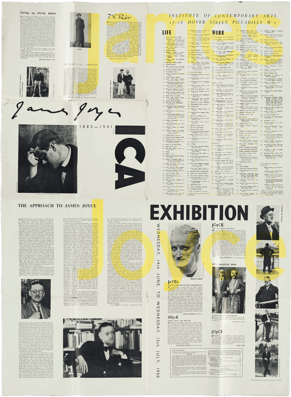
Top: Richard Hamilton’s folding poster / catalogue for ‘James Joyce: His Life and Work’, 1950.
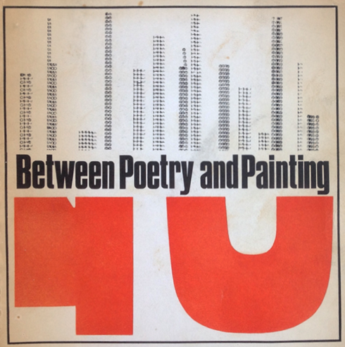
Below: Cover of Between Poetry and Painting comb-bound catalogue, 1965. Design by James Meller.
In 1950, the ICA moved into its first permanent premises, an 800-square-foot house in Dover Street, near Piccadilly, in London. Eduardo Paolozzi, Nigel Henderson and Richard Hamilton, who helped to create a new focus of contemporary art outside the traditional system, decorated the house for the opening party. The first major exhibition at Dover Street, ‘James Joyce: His Life and Work’, was of the Irish writer’s literary ephemera. The event included lectures, readings and radio features, and made clear the ICA’s early ambition to explore the intersections and cross the boundaries between different art forms and media. The exhibition was opened by T. S. Eliot, and Richard Hamilton was responsible for its entire design.
The catalogue – actually a 30in x 40in (76cm x 101cm) folded sheet – combined on its front Joyce’s signature, a portrait of the writer by Man Ray and the three large letters, I, C and A. Semi-unfolded, it reveals a list of all the objects displayed in the exhibition, and completely unfolded it is transformed into a poster featuring photography, quotes and an introductory essay by Eliot. Hamilton now describes it as an amateurish piece of work, but nonetheless survives as an important example of how exhibition and catalogue were being conceived as one coherent unit.
While some events at Dover Street were programmed by committees and individuals, others happened in a more spontaneous way, attracting a broad spectrum of people interested in the arts and providing an informal forum for discussion, criticism and practice. The institute, which Hamilton remembers as a ‘very cliquey, exclusive club’, became a platform for many artists of the post-war avant-garde, where they could experiment in an open yet challenging context. Inevitably, a new group of artists emerged from it.
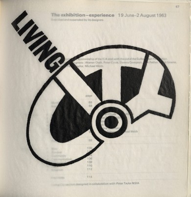
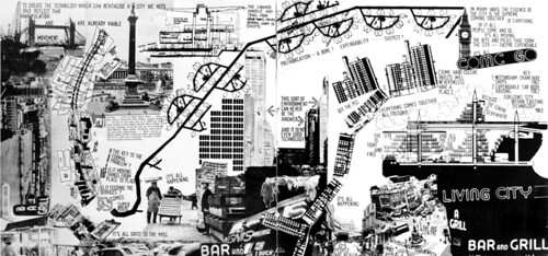
The radical architecture group Archigram put on ‘Living City’ in 1963, describing it as an ‘exhibition-experience’. The Archigram members, with Peter Taylor, designed the catalogue in the iconoclastic collaged style they typically used to present their urbanistic and architectural ideas.
The Independent Group (IG), formed in 1952, was a collection of like-minded artists, architects and critics that included Paolozzi, Henderson and Hamilton, Alison and Peter Smithson and Reyner Banham. The group focused on developments in technology, science, communication and popular cultural forms, and their possible applications in the arts and society. From the resulting discussions, exhibition agendas were formed. Hamilton was responsible for the realisation of several exhibitions including ‘Man, Machine and Motion’ (1955), ‘an Exhibit’ (1957) and ‘The Developing Process’ (1959). For ‘Man, Machine and Motion’, he invited Anthony Froshaug to design the catalogue. ‘I thought he was the best designer around. He taught me what a grid was’, says Hamilton, who describes the production of the catalogue as ‘quite peculiar. We were able to use offset litho printing for the first time, but we had no money for typesetting. So I bought a typewriter, on which Anthony typed all the text, which gave an uneven effect. Then all the corrections had to be collaged in later.’
Hamilton intended ‘an Exhibit’, staged two years later, to represent ‘a new kind of idea. I wanted to design the show as something you couldn’t conceive on paper, and make the exhibition into an artform in its own right – an exhibition about an exhibition. It was about playing games with structures. It wasn’t just about architecture or sculpture or interior design’.
The catalogue introduction describes how, ‘Visitors to ‘an Exhibit’ are involved in a game: the game is the structure of the exhibit . . . The visitor is asked to look for neither separate works of art nor for symbols but to inhabit, for the duration of the game, a real environment.’ Another poster-style design, it had an initial size of 5in x 10in (12.5cm x 25cm) and involved the audience in a playful unfolding until they reached its final size of 20in x 30in (50cm x 75cm). The exhibition’s multi-layered Perspex panels mirrored the folded tracing paper of the catalogue. ‘Right from the start, the fold is important,’ says Hamilton. ‘Each field is designed for itself and creates a kind of excitement. The folding and unfolding of the poster keeps creating something different.’ The Independent Group’s agenda had a lasting impact upon the ICA, and on British art in general, and its exhibitions put into practice Herbert Read’s vision of modernity.
Its members’ overriding enthusiasm was to create an image of the new and to redefine the image of the avant-garde, combining popular cultural forms, fine art and design in complex systems which paralleled the hybrid nature of contemporary culture. Ultimately, they could even move beyond modernity itself.
In 1968, the ICA moved into the spacious and elegant John Nash terrace in The Mall that it still occupies. The relocation symbolised a new phase at the institute, as well as in the art world. By the late 1960s, a variety of newly established forms had begun to emerge, including performance, video and installation art, creating a demand for greater flexibility in the presentation of work. Its new home allowed the ICA more scope and enabled it to grow into the larger organisation that it needed to be.
Some of the institute’s most successful shows during the early 1970s were the result of an outside group or individual coming up with an idea and then being encouraged to develop it as an exhibition. Peter Rea, a graphic designer and teacher with an international reputation, was one such outsider who organised a number of ICA exhibitions at this time. In 1973, he recorded a journey across North America with photography, film and sound, and later exhibited the documentation as a collage. He recalls how informal the atmosphere still was. ‘One proposed a project and when it fitted in, they put it into their schedule. It was a programme for artists, and had nothing to do with commerce.’
As art practice continued to become more specialised and segmented, with each medium developing into an independent discipline, the ICA required a substantial rethink to deal with the changes, but without losing its original vision. It had to maintain the fine balance between attracting a larger audience and adequate sponsorship, while dealing with the difficulties inherent in providing an ideal context for the latest developments in the arts. Four internally independent departments were gradually established after the arrival of Bill McAlister as director in 1978: Exhibitions, Cinema, Theatre (re-named Live Arts in 1991) and Talks. By the 1980s, arts activities in Britain were marked by the government’s attempts to shift the responsibility of sponsorship towards private businesses. In fact, the ICA had always had to seek out some of its own funds, but had done so in an informal way. ‘When I was asked to organise an exhibition, I also had to raise the money,’ recalls Richard Hamilton. ‘I usually wasted six months asking companies for financial support, and then asked them for products or services instead, and got the job done. Nowadays, sponsorship has become a thing in its own right, but back in the 1950s, it was an unknown phenomenon.’
Since the ICA had never seriously considered its public representation in any other way than through its art, the ICA graphic archive of the 1950s, 1960s and 1970s reveals not so much an identity as a non-identity, exemplified by the absence of an ICA logotype. With the emphasis placed upon the event, and not upon its context, the design work done over the years involved a huge range of styles, approaches and production methods, from messy ‘undesigned’ invitations to elaborately conceived artist-designed books. No one, it seems, apart from the organisers of the exhibitions felt responsible for the catalogues. At their best, they were designed by the artist or curator, or in collaboration with a designer. Lawrence Weiner’s minimalistic catalogue for his exhibition in 1976, for example, is conceptually integrated into the presentation of his artwork. At their worst they are bad typesetting jobs.
By the mid-1980s, the establishment of at least a consistent logotype had come to be seen as essential, to unify the institution and to attract sponsors in a more formal way. In 1986, an ICA logotype was commissioned by Bill McAlister from designers Red Square.
Their chunky sans serif solution was inherited by designer Jane Harper when she joined as publicity director – a role created for her that combined design and marketing – later that year.
‘I couldn’t change the logo because it was so new’, says Harper, ‘but I did amend it, altering the letter-spacing and making the C bigger to suit the scale of the I and the A. It had also been designed always to be reversed out of a bar, which I didn’t adhere to.
‘There was a concern about the variable standard of the ICA’s graphic output then and a huge amount of debate about how we could best produce a coherent identity. We wanted people to see the ICA as a whole – mostly they looked at it department by department – and felt the graphics could help.’
Harper did not introduce a formal house style, but worked with freelance designers (primarily John Mitchell, Lucienne Roberts and David Shing) whom she felt understood what she wanted. ‘We used sans serif faces – often Futura, sometimes Gill or Frutiger – and worked in two colours on uncoated paper. We rarely used black, because I wanted colourful work. We did programmes leaflets and posters. Catalogues were commissioned by the exhibitions department, sometimes to my recommendation. I designed a few, such as the Situationist catalogue in 1989, with John Mitchell.’
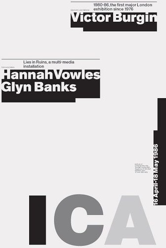
Conceptual art is rendered with rigour in a poster by 8vo, 1986.
In 1988, Harper left the ICA, but continued to work in a freelance capacity for eighteen months. But after further personnel changes and increase in financial pressures, it was decided that the institution’s ‘corporate identity’ needed to be re-thought. In 1992, Tony Arefin was commissioned to design a new identity by Katie Sender, the ICA’s newly arrived director of marketing who was responsible for the restructuring of the ICA’s marketing department. Sender, who has since become deputy director, regards marketing and design coherence as a vital tool for the ICA’s mission. ‘New times require different tools,’ she says. ‘Artists are not necessarily the best people to sell their message.’
A collaboration ensued which demonstrated the importance marketing could have in helping the ICA to fulfil its role in the 1990s. Arefin designed a new, strongly geometric uppercase only typeface, derived from the 1980s ICA logo, which he named Housefont. It was to be used in conjunction with the existing logotype, and the newly launched Meta and Scala which, along with Akzidenz, he chose as the corporate typefaces. He then laid down simple guidelines to be observed by himself and freelance designers: Meta, Scala or Akzidenz must be used in every piece of design work, along with any other font of their choice; leaflets must conform to the new (larger) size of 129mm x 210mm; and the logotypes developed for each department must be used.
Arefin wanted to re-establish the notion of identity through non-identity, as well as using new design ideas to represent the changed organisation the ICA had become over the years. Operating as an art director, he approached his work at the ICA as a corporate project, but treated each separate design commission as a one-off. He still regards the work done during his time there as a successful application of commercial art: ‘I knew the identity was working when other designers wanted to work for the ICA,’ says Arefin, who had to relinquish his involvement with the institute when he left London in 1994. Maybe more importantly, membership increased considerably during that period due to an exuberant campaign using an upbeat range of images based on Smarties and sweet-wrappers that could hardly have been further from traditional art-house marketing.
Since Arefin’s departure, Sender has employed a range of designers, trying each time to match the designer to the project, and trying also to promote the new in graphic design as the ICA does in the arts. In spite of the successes, Sender in convinced that there is a need to re-establish a strong identity throughout the institution. ‘The ICA can give designers too much freedom and some of them forget what they are meant to be doing for us, which is communicating information about a very specific event.’
According to Sender, certain stunning typographic confections have been too indecipherable to do the job. Recently selected designers were invited to submit new corporate identity concepts. The chosen one will be implemented from when the ICA begins its fiftieth birthday celebrations in April 1997.
With that soon to be in place and sponsorship from Toshiba already in its third year (the official logo has been ‘ICA sponsored by Toshiba’ since 1993), the ICA has clearly changed from its early ‘adult play-centre’ days. Now Britain’s largest showcase for contemporary art and one of the country’s primary arenas for cultural debate, it is less of a testing ground and experimental space for emerging artists than at its inception, and has over the years acquired its own history and established its own cultural position.
The ICA today provides a different kind of space, where its own identity has become part of the equation and design is no longer a natural extension of the artists’ work. It is now part of a well-calculated marketing strategy, but there is still room for a designer’s creativity to be employed. This gradual shift reflects the ambiguous position of design, but also highlights its most important aspect – integrity – whether it is being used as a marketing tool or for artistic expression.
Christian Küsters, graphic designer, London
First published in Eye no. 22 vol. 6, Autumn 1996
Eye is the world’s most beautiful and collectable graphic design journal, published quarterly for professional designers, students and anyone interested in critical, informed writing about graphic design and visual culture. It is available from all good design bookshops and online at the Eye shop, where you can buy subscriptions and single issues.