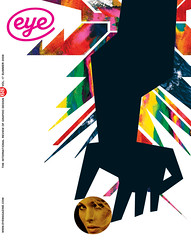
Summer 2008
Polyphonic playground
The world’s first museum of its kind, plus the ‘European Championship of Graphic Design’
To the non-Dutch, it might seem obvious that Holland should have the world’s first museum devoted to graphic design. Yet Breda’s Graphic Design Museum, opened on 11 June by Queen Beatrix, has had a long, rumbling gestation since the 1980s, when Frank Tiesing, the director of local cultural centre De Beyerd, proposed the idea. Curator Esther Cleven has been on board for seven years, weathering changes in director (Tiesing is now retired) while she took on the challenge of interpreting a century of Dutch graphic design for the public.
The new museum aims to avoid the ‘white wall approach’ of art and applied art galleries. Cleven wants to use the walls as little as possible, in fact. ‘Art is such a limited field of visual culture,’ she says. ‘The Modernists took the life out of design, and aestheticised its objects. Graphic design is about communication, not beautiful objects!’ The museum’s approach is polyphonic, with many voices within one building. ‘Graphic design would not be understandable without understanding the changes in society,’ she says.
The narrative begins with ‘the spectacle of the street,’ showing posters, advertising and promotional items by Dutch masters (Zwart and Schuitema) and ends with the promise of new things to see every three months.
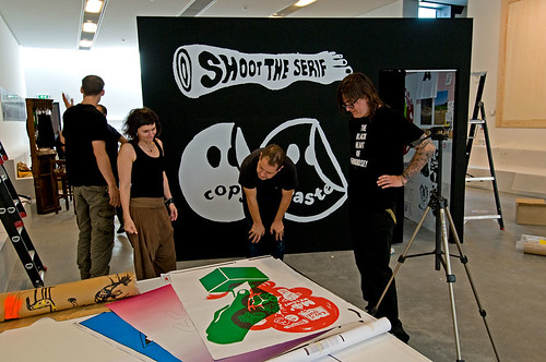
Above: two Happypets chat with Anthony Burrill. Photograph: Peter Cuypers, 2008.
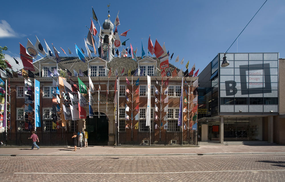
Top: gaudy ‘Artvertising’ heralds Breda’s Royal opening.
Architect Hans van Heeswijk has adapted De Beyerd by retaining the main building, formerly a hospital and an old people’s home, and completely re-building the three wings to make six major spaces at ground and basement levels. An earlier, ‘glass box’ extension has been adapted to house the shop and administration offices. The old building, festooned with Teun Castelein’s sponsored ‘Artvertising’ flags for the opening, acts as a grand entrance and houses Cafe Sandberg, where you can get sachets of Sandberg sugar to shake into your tea.
The lower ground floor charts 100 Years of Dutch Graphic Design, with a substantial mix of posters, books, ads, magazines and multimedia displays. The first of its three rooms (‘Individual Initiatives’) takes the story up to the 1940s, with work by Piet Zwart (including the NKF catalogue of 1933) and Paul Schuitema (a photomontage advert for Nutricia powdered milk). An asymmetric black cuboid, representing the dark years of the Second World War, shows newsreel footage and a single work: H. N. Werkman’s booklet Prière Gedicht Van Charles Péguy, 1941.
The next room (‘Shaping Dutch Society’) tackles the postwar boom time, with work by Sandberg, Dick Elffers (Holland Festival), Total Design, Jan van Toorn, Wild Plakken and editions of Hollands Diep. Documentary photography of the time (from the 1950s to the 70s) is projected on the walls, while the objects are in vitrines and display cases that light up as visitors approach. It is not all approved ‘great design’ – Cleven was keen to include examples of branding and identity systems (for supermarkets and TV) that regular Dutch visitors would recognise from everyday life. The third room (‘Graphic Design In Process’) features several ‘big’ projects, including Anthon Beeke’s Globe theatre posters, Paul Mijksenaar’s signage system for Schiphol Airport (exploited by a host of cute products in the museum shop), LettError’s Beowolf, Dept’s eponymous website from the turn of the century and Studio Dumbar’s identity for the Dutch Police Force. Large horizontal touchscreen displays show video interviews with the designers in question, organised like Hypercard stacks. A projection by Lust fills one wall.
Above: Browns’ Jonathan Ellery and Nick Jones. Photograph: Peter Horree, 2008.
Museum director Peter Rijntjes explains that they had decided to target three groups of visitors: children, young adults and ‘museum-goers’, older people interested in culture. This division is made explicit by the contents of the three ground floor rooms: an activity room organised by Richard van der Laken and Pepijn Zurburg of De Designpolitie (famed for the daily Gorilla panel in De Volkskrant) features big vinyl magnetic letters and icons that young visitors can attach to the walls and freestanding frames to make posters. A barrel-shaped hideaway houses several monitors and keyboards where computer-literate kids can dream up their own designs. Rijntjes explained that a gallery specialist will always be on hand to help and guide.
The third ground floor gallery deals with contemporary design and its context, with a section that enables visitors to design sneakers, a video-editing display, installations about branding and identity and a window display of Ji Lee’s blank speech bubbles.
The most substantial new statement is the European Championship of Graphic Design, convened by Erik Kessels of KesselsKramer, which features new work – some of it devised within a few days – by eleven practitioners. Kessels’ quirky choices reflect the disruptive, provocative and humorous stance of his own agency: by including a final-year student (Anna Szilit) and three bloody-minded Brits (Anthony Burrill, Scott King and Jonathan Ellery / Browns) he steers the show away from the crispness of the lower ground floor’s archives towards . . . what? Arty design (or design-infested art) made by designers, I guess.
Happypets recreate the walls of their studio in a little bunker; Pixelgarten fill one corner of the space with arresting images on a variety of surfaces. Berlin designer Fons Hickmann fuses Catholic guilt and relational aesthetics in the form of a ‘design confessional’. In two wooden booths, a ‘confessor’ and a ‘priest’ operate laptops linked by bespoke software that enables them to design collaboratively, and then print out posters bearing anonymous confessions: ‘I used Comic Sans once’, and so on.
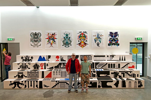
Above: Manuel (left) and Antoine stand in front of their installation, with ‘Gods’ posters on the wall behind. Photograph: Peter Cuypers, 2008.
Hinkmann and his team paste posters on his bit of the ‘playing field’ where they made a garish contrast to the grimy, grainy silkscreens and found objects of Belgian trio Cum*, whom Kessels described as ‘very young guys, very horny.’ Their most prominently displayed work, however, is an elaborate type collage commissioned by FontShop, a pleasing counterpoint to Dennis Eriksson’s illustrations and Antoine+Manuel’s exquisite ‘Gods’ posters and wooden steps, which look like the most carefully prepared exhibit, but which in fact they had made from scratch in less than four days.
Kessels’ own contribution was modest – variations on the format of an old-fashioned ‘bad’ trade advertisement, re-used for bizarre, imaginary products and services. Funny and engaging, the framed ads draw on the vein of bathetic humour we know from famous campaigns such as those for the Hans Brinker budget hotel.
Burrill, of course, worked for Kessels on some of the Brinker posters, and the illustrator’s tower of sticker-encrusted cubes provides one of the most graphic images of the Championship. Kessels points out that designers collaborate and work alongside each other all the time at college, but rarely get the chance to do so once professional life kicks in. His curation of this show fosters some memorable social gatherings.
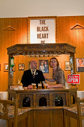
The Browns installation is an fictional London pub – The Black Heart Of Bermondsey – with framed pictures of the Royal Family, custom beer mats, real beer and Browns’ Jonathan Ellery and Nick Jones, dressed up as landlord and missus respectively. After they leave, the costumes will hang as part of the installation. Scott King’s contribution is even more Fluxus-like – a stage set with drums, bass, guitar and amps for an imaginary band called The Fisters, turning the gallery into something between a music shop and a Spinal Tap out-take.
Kessels is upbeat about the museum’s potential. ‘Nowadays, everybody has grown up with graphic design. My mother can name maybe five typefaces – it’s unbelievable. There is more general awareness of design.’
For Cleven, it is a hard challenge to please the museum’s myriad stakeholders: historians, designers, local people and the international audience that will eventually beat a path to Breda.
‘It was tough to decide not to show the beautiful book. That is where the Dutch usually begin their story. But you can look back or you can look forwards.’ In the end she chose the latter. ‘You will see some icons from the canon there because you can’t ignore them! But I felt a responsibility to put things in the exhibition that are not usually seen.’
First published in Eye no. 68 vol. 17 2008
Eye is the world’s most beautiful and collectable graphic design journal, published quarterly for professional designers, students and anyone interested in critical, informed writing about graphic design and visual culture. It is available from all good design bookshops and online at the Eye shop, where you can buy subscriptions and single issues.