
Spring 2013
Reputations: Chris Dixon
‘I sometimes liken art direction to film directing. They start with a script, basically just words on white paper, and they read it and start to imagine and visualise it. You can do it a thousand different ways.’
Chris Dixon is the quiet man of contemporary editorial design. He has worked on some of the most prominent North American magazines – Adbusters, The New York Times Magazine and New York – and alongside some of the most creative editors (Kalle Lasn and Adam Moss) and designers (Janet Froelich, Luke Hayman) of our times. But his appointment as creative director of Condé Nast’s flagship title, Vanity Fair, in 2011 saw him finally emerge in his own right as a key figure in contemporary magazines.
Since its revival in 1983 (the original Vanity Fair was folded into Vogue in 1935), Vanity Fair has developed a rich mixture of in-depth general interest features and high-concept celebrity photographic stories. Yet its page design and typography struggled to attain the same sophistication and polish.
‘Dixonise it!’ was his brief from the editor, Graydon Carter, and since he started in October 2011, Dixon has been quietly doing just that. Opting to avoid a complete one-off design overhaul, he has made his mark with a carefully planned section-by-section re-invention of the entire publication. It took twelve issues to complete this first stage, but the result is a highly detailed design that has sympathy for what is otherwise a well oiled machine of a magazine, while also repositioning it as a contemporary piece of publishing design. Dixon has made Vanity Fair more itself.
By his own account, Dixon (born 1967 in Saskatchewan, Canada) ‘stumbled’ into magazine design. After studying psychology at the University of Saskatchewan, he took part-time art and design classes. ‘Then I discovered what graphic design really was,’ he explains. He was accepted into Vancouver’s Emily Carr Institute of Art & Design, completing a three-year programme in 1997.
His graduate project (an exhibition for Amnesty International) caught the eye of visiting teacher Kalle Lasn, founder of the ‘culture-jamming’ journal Adbusters, who was looking for a new art director. Dixon started the job a month later. ‘I didn’t specifically pursue a magazine job but this was a unique opportunity to evolve the visuals in a new direction, and it was a somewhat high-profile magazine,’ he says with typical understatement.
Under Dixon’s art direction, Adbusters found a new design-oriented audience. Highlights of the period include the revival of the First Things First manifesto, a special designed by Jonathan Barnbrook and Dixon’s supermarket-pastiche ‘Magazine’ cover. Working with Tibor Kalman on First Things First 2000 led Dixon to Manhattan and stints at The New York Times Magazine as well as a brief period running his own studio.
Dixon’s next full time role was at New York magazine, where in 2004 he joined a newly appointed team led by former NYT Magazine editor Adam Moss. Luke Hayman was the new design director, Jody Quon (also ex-NYT Magazine) the picture editor. As art director, Dixon was effectively Hayman’s deputy. This group went on to execute one of the most highly regarded redesigns in recent years, taking a tired, ailing magazine and rebuilding it completely using its own history. The editorial and design ideas it developed still reverberate through the magazine world, not least in the new Vanity Fair.
With Hayman’s 2007 departure for Pentagram, Dixon became design director. Editor and design director were content to manage a smooth transition. ‘If you have to redesign a magazine again after three years you really did a bad job in the first place,’ Moss says. Dixon kept the ethos of the original redesign but developed it, bringing in new collaborators and producing some of the most memorable images of its 9/11 era.
One reference point for the redesign of New York had been the 1980s satirical magazine Spy, which specialised in the use of diagrams, cutouts and other visual devices. Vanity Fair editor Graydon Carter had been one of Spy’s founders, which makes Dixon’s arrival at Vanity Fair and his introduction of a more detailed design approach and increased use of infographics and devices seem a natural step.
‘There is an elegance and sophistication to Chris’s work that sets him apart in the design world,’ Carter says. With stage one of the redesign completed, and the design tools in place, it is fascinating to watch Dixon and Carter make the most of a design that at last matches the scope and glamour of Vanity Fair’s content.
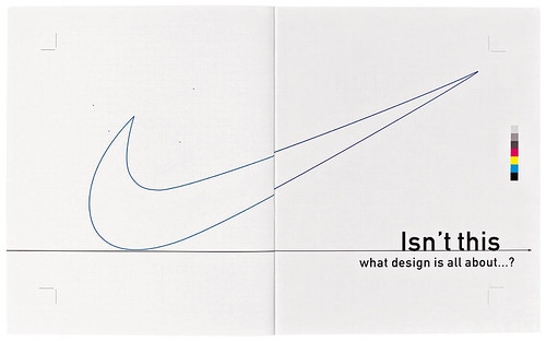
Spread from Adbusters no.27, Autumn 1999, which also contained the First Things First 2000 manifesto simultaneously published in Eye, Form, Emigre and other design magazines.
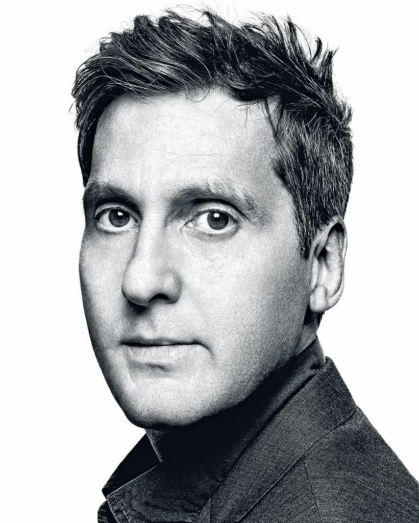
Top: portrait by Platon.
Jeremy Leslie talks to Chris Dixon
Jeremy Leslie: How did you come to join the New York magazine redesign project?
Chris Dixon: I remember reading somewhere that Adam Moss was being hired from The New York Times Magazine and thinking it was a bold move. At the time New York was just another city magazine. The covers would be like ‘Cheap Hamptons getaways’, ‘Weekends upstate’, things like that. Then I heard he’d hired Jody Quon as photo editor, whom I’d worked with at The New York Times Magazine. I’d worked with Adam, too, he was the editor when I was there. And then he hired Luke Hayman as design director. I knew Luke socially, and he’d interviewed me when he was at Brill’s Content. I emailed him asking if he needed a deputy. We talked a few times, then I met with Adam, and I started soon after. Luke had been there two weeks and Adam about four.
JL: That was an impressive team, built to carry out what turned out to be one of the most significant redesign projects of the past decade. How did you go about achieving that on a weekly magazine?
CD: We’d split our time half and half between the magazine we had to put out that week and doing redesign explorations. We were finishing the magazine each week and also having separate meetings to discuss the change with Adam and the editorial team he’d brought in. All the sections had new names, so they were throwing up ideas for those sections.
We brought in two freelance designers whom we briefed on types of articles and our visual ideas and we all just prototyped for two or three months.
We rolled the redesign out a different section every month, starting with ‘The Strategist’, a whole new section editorially and visually. Meanwhile the rest of the magazine remained the same, with maybe a few little tweaks. Then [we did] the Culture pages, then the rest of the magazine. It was a very intense, exciting and hectic time. There were many, many late nights, working until two, three in the morning every week.
JL: Adam Moss clearly had strong ideas about what he wanted to do with the magazine visually.
CD: He had a very clear perspective on the project. Growing up in New York City in the 1970s-80s his bible had been New York. He wanted to take it back to those great roots. A lot of the page architecture came from that original New York magazine, the 1968 version. The whole front of the book, the Egyptian typeface, the rules. It also gave us a certain style of illustration, again a lot of attitude and tone, a bit of humour.
JL: What else did you look at in the research phase?
CD: Early US Esquire featured in our research for the covers; for general design it was a mix of things, including Mark Porter’s then new Guardian redesign. It made great use of graphics, the front page combined great news photography with silhouetted entertainment images. We looked at classic sources of infographics like Edward Tufte, but Adam loved Spy magazine.
Spy subverted the language of infographics; they were satirical infographics. Their tone matched what we wanted, our content wasn’t serious, we weren’t doing weather graphs. The claim has always been that Spy invented the floating head, the cutout head floating on a chart. We embraced that a lot, especially for the Intelligencer section.
On a weekly basis the new magazine had a really good flow to it, it didn’t feel too broken up, with some features really designed and others not. We just wanted it to flow as one great experience.
JL: You described the redesign as an intense process but producing weekly issues to that degree of detail and finish must also have been very intense.
CD: It was, but Adam’s passion for the magazine and the city was the driving force. He has no end to ways of talking and writing about New York City. Every week there was something new to get caught up in and make you excited. The content was so good, the writers and photographers we were working with so talented, we could just feel the quality getting higher and higher and nobody really wanting to let anyone down on any aspect of it. So you live with the last-minute changes and the late nights. We just had to hunker down for that first year, if not first two years. Looking back I don’t know that I could do it again.
JL: Some designers get frustrated by process and timing. You always seem very calm.
CD: People have always said I’m calm, and appreciated that in the middle of certain situations. I work well with slightly crazier people, I balance them out. I like seeing how things can get better, not fighting things for the sake of fighting them but listening to things that people suggest. You reach a point where you realise you’re not always right, in fact, there really is no right or wrong, you just keep trying stuff until it clicks. I’ve never gone at it like ‘this is exactly what it needs to be.’ I’ve learned to go with the journey and see where we land.
JL: Moss is a visual person. Is that rare among editors?
CD: He’s one of the more visual editors. He would develop a story but unless there was a visual solution that brought it life it would be dropped. He saw it as a 50-50 relationship. He understood design would skew the story a certain way. He would say we have a ten-page story on some topic and we would do a design system for it and he would say this looks too dry and essay-ish, it should be fun and have energy. So we would change the whole mood. Other times we might start out crazy and fun, with lots of colours and design, and he would say, no no, these are our best writers, we need a bookish feel.
JL: Any magazine is about team work; at Adbusters you and Kalle Lasn were a team. But on New York there was a different scale of teamwork. How many people were you working with day to day?
CD: There was Luke, me, Randy Minor (who’s still there now) and Kate Elazegui … I guess a total of seven in the design dept. Another six or seven in the photo dept. Then the production dept. About fifteen in terms of photography and design.
JL: In a non-US context that seems a huge team.
CD: There was a lot to do. We were each responsible for a section or feature; we would design it, flow in all the text, style the text, and tweak it till it was done, approved, then we would turn it over to production who’d sort pre-press and proofs. We did the hi-res files. Friday mornings we’d get a giant stack of Kodak proofs. It printed Friday evening and would be on sale Saturday afternoon.
JL: The role of Jody Quon seems very important.
CD: Definitely. It is all teamwork but she was hugely important to the magazine. She guided all the photographers and their photographs. That crossed everything from still life shoots and food to architecture and portraiture, we shot everything. We worked really well together when I was producing all the covers. She had her perspective on design and I had mine on pictures. A great collaboration.
JL: Many of your colleagues would have studied design straight from school while you majored in psychology. Did you ever feel different to them?
CD: Maybe the first five years I felt that way. I don’t feel that now.
It was the ideas behind design that first interested me rather than the formal stuff. Graphic design – layout – seemed such a surface profession. I remember finding an issue of Eye magazine in Canada and reading about design as a tool for social means, and not just a tool for capitalism. Tibor Kalman was in the issue [Eye 20] and I think he came at graphics from a non-design angle as well.
After I graduated in psychology I was taking classes in different things and I did photography. I remember thinking maybe this is the thing. I was shooting a lot and enjoying the classes. Then I did some illustration classes and that’s what brought it all together. At the Emily Carr Institute there were classes in art direction and photography, art direction and illustration. And there was typography, and editorial design, and I could see this was the one profession that accessed all those other things. You weren’t dependent on one.
That appealed to me, being at the centre of all these things with a team of people to collaborate with. You’re not on your own – you have your skills as a graphic designer but you’re building something, working with other people to develop ideas. That was a bit of a breakthrough, I think.
JL: Did you really have no interest in design before then?
CD: My mother did an English masters and my father taught theatre direction. That was the kind of household we had. I was surrounded by the arts but I don’t remember feeling any one part was mine. As a teenager I was obsessed with cartoon strips, and a friend and I used to draw classic four-panel strips and submit them to magazines and newspapers. One got accepted by a church newsletter.
My brother is a film director and I sometimes liken art direction to film directing. They start with a script, basically just words on white paper, and they read it and start to imagine and visualise it. You can do it a thousand different ways – if you take the same script to different directors they’re going to visualise it in very different ways.
In editorial design we do a similar thing. You read a manuscript and it’s got a certain mood to it, a certain tone, and we work to communicate that. You can pull out certain words in the headline, or reduce the headline down to one word alongside a photograph and you get a tension between word and image.
I like to try three or four different approaches to a feature, emphasising certain words or photographs that would change the meaning. We show these options to the editor and it’s always an interesting discussion. It’s not a one-sided journey – seeing words and images together enhances that process. It’s an iterative, collaborative process.
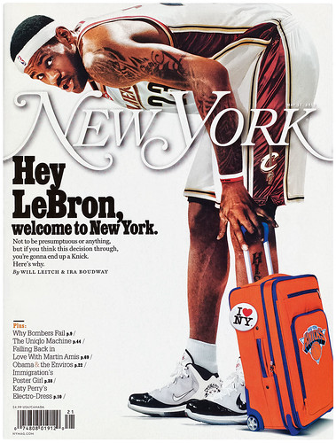
For the 17 May 2010 issue, photo-illustrator Darrow exaggerated basketball star LeBron James’s height for comic effect.
JL: Did you automatically get the design director position at New York?
CD: No, I was put in charge temporarily. I had a bunch of conversations with Adam about whether I was interested or not. Adam saw it could be an opportunity but said take some time and think about it. I’m sure he thought other people might be out there, but within a month or so we came back together and I decided to go for it and he offered me the job.
JL: And then there was a big decision to be made about whether to retain the same design, the same aesthetic, or develop a new direction…
CD: I think one of the reasons Adam considered keeping me in the job was that he knew I had helped build what was there, and he and everyone really loved it at that point. When you bring in a new person they’re gonna want to put their own stamp on it quickly.
It wasn’t right for the magazine to head in a new direction, it had really only just settled down, so that was basically the brief: keep doing what we’re doing and just continue to evolve it. If you look at the issues, at the end of each year a new aesthetic would take hold. We figured we would keep growing that way.
JL: That’s one of the advantages on a weekly, you have more opportunity to gradually change stuff.
CD: Right, and with it being a vehicle that could change for a special issue, we would regularly develop a whole new design, then switch back to the regular design the following week. At least once a month you could rebuild a whole section and try a different direction. And also you could experiment with the cover, take a chance, and if something doesn’t work you just move on to the next one.
JL: As well as your internal team, there were many external contributors: illustrators, type designers. Do you find you have to have relationships with increasing numbers of people who contribute on very particular parts of a project?
CD: It’s the advantage of being on a magazine people respect and like and are excited about. You can reach out to all these people from different disciplines and have them contribute.
We built a great team of people that did all this work with us. Type designers developed bespoke headline treatments for us, just the headline, not a whole typeface. Matt Willey was a regular typographic contributor. People from Wieden & Kennedy and Ogilvy & Mather worked with us on concept covers. We did a lot of work with photographic collages because as well as the great commissioned photography we were also working with news images that all the magazines had access to, so we used illustrators to colour and collage them to make them our own. It became kind of expected of the magazine.
We had such a wide variety of stories and the wider the team the better the magazine looked.
JL: One of my favourite New York covers was the ‘Reasons to love New York’ one with the heart.
CD: Book jacket designers often came up with great cover ideas, and Rodrigo Corral did a lot of great work for us, like that cover. His book jackets are the same – simple, clever simple, images that convey the whole essence of a story. When we had a bit of lead time on a cover I would run a competition, calling in people to come up with ideas. Rodrigo submitted several hand-drawn ideas and we shot that one with him.
JL: By that stage had you stopped designing and started editing other people’s work?
CD: The good thing about New York was I did the covers every week, and those were always design intensive. Each week we would turn out ten, twenty or 30 cover designs, and the type was never just a line across the bottom as an afterthought; it was always integrated, as our covers were rarely just a famous person with a headline. They would more usually be something conceptual, and every week was different – business, media, an essay. Often there was no apparent quick visual solution.
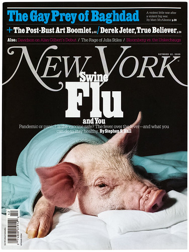
The swine flu cover (12 October 2009) started with the idea of Muppet Miss Piggy with a thermometer, but the final image, shot by still life photographer Horacio Salinas, reflects the seriousness of the story.
JL: That’s a huge number of designs. How did the cover decision-making process work?
CD: We would usually have a meeting on the Friday before the week, and Adam might have a sense of what he wanted the cover to be but a lot of the time he didn’t, because the story hadn’t come in or he was waiting because we needed to be as topical as possible. We’d go through the ideas with Adam and the other editors, then we’d go away and commission a few things. I’d ask an illustrator to play around with an idea for Monday, Jody would talk to photographers and pull in some existing pictures or think of some ideas for a still life.
We did a cover on swine flu where we ended up with a still life of a pig, sick in bed. Things like that would develop.
Someone at the cover meeting said we should just do Miss Piggy with a thermometer and an ice pack. So we were thinking comically, like that, but then Jody got hold of this conceptual still life photographer, Horacio Salinas, so we ended up with these real pigs. For the final photograph, the pig was on a pillow with a blanket, sick in bed.
JL: So the picture desk is searching for images of Miss Piggy, Jody’s setting up a shoot, and perhaps you’ve commissioned an illustration.
CD: We might also have done a typographic cover. We always wanted different approaches, and by Tuesday or Wednesday we’d come together with Adam and look at them all, and some would be working and some not. Then on Thursday morning Adam would sit behind me in my office and he’d have all these different cover lines from different editors. We’d go through each of the mocked-up covers on screen and he’d say, okay, on that one, let’s try ‘The swine flu and you’, and the next one he’d say, ‘Piggy’s got the flu’. We’d sit for four or five hours trying things, with Jody coming in and out.
The next stage was to take the ten to fifteen remaining covers and print them out and mount them on boards. Adam would line them up in his office and we’d call in ten, fifteen, twenty people from the office to come in and say what they thought. From that we’d get a sense of what worked and what didn’t, it would be narrowed down to two or three, and we’d work those up on Thursday night. We’d all get attached to one or other – Jody would say: ‘We’ve got to do this’, and Adam would say: ‘I don’t know …’ Then at some point on Friday Adam would decide. For the most part it was pretty obvious what the best cover was.
JL: When you look at your role as a design director, where do you think your heart lies? Are you typography-led or photography-led?
CD: I’d say I’m typographically led. For me, to solve a problem or make the thing special it’s the typography. Vanity Fair didn’t necessarily have that as one of its key strengths, so that’s what I’m mainly trying to do here now. I work on the photography, too, but I think that’s much more successful than other visual parts of the magazine; it’s a great big machine here that works really well. So it’s the typography and the general page design here.
JL: Your analysis of Vanity Fair would be shared by many. It has always been very assured editorially and photographically but the design has left something to be desired. Was the design and typography a clear part of the brief?
CD: Design was in the forefront of our conversations. Graydon Carter has a passion for design; I’ll sit with him and he’ll show me binders of stuff he has collected over the years – subway signs in Berlin, restaurant logos from Paris. He collects design and typography, and loves to talk about it.
The reason Graydon approached me in the first place was he was excited about the design of New York. It wasn’t over-designed, there was a wit to it. It made sense in terms of his background at Spy – he liked to talk about the ideas behind the images and the type treatments. He was hoping to bring that same level of craftsmanship.
JL: The Spy connection is interesting. Was that explicit?
CD: Yes, obviously he created Spy and did it for five years. Not that New York was exactly like Spy, but it was a similarly ambitious, witty, clever magazine and, as you know, we’d looked at Spy during the redesign process.
JL: Did you hope to carry out a full redesign of the magazine?
CD: In our early conversations Graydon was excited about tackling the whole magazine, but tackling it slowly, carefully and considerately. Trying things out, looking at things and slowly bringing them into the magazine. Which is basically what we’ve done for the past year. Every few months we’ve brought out a new section or treatment. I hope people feel the magazine is evolving rather than changing. Unlike New York, there was no editorial rethink or redesign, no new sections.
I think my predecessor as design director had a different mandate, a different set of priorities. He had a passion for illustration and he spent a lot of time on that. I just don’t think the design aesthetic was a part of the goal. It was an area of opportunity to develop. And you don’t want to change too much – it’s a very careful process but it’s an exciting one.
JL: Different in many ways to New York. And also for the fact you’re leading it now. Have you been enjoying the process?
CD: Very much. I knew Vanity Fair would be very different to New York but there are many similarities, too. They’re both general interest magazines, which is what I’m comfortable with. But there’s more time to put it all together!
It flows differently as a magazine. There’s a really big features well; there are seven, eight, nine features in an issue and some of them can be fourteen pages long. New York had fewer, shorter features so it was a lot more choppy. Here there’s a bigger flow to the whole magazine.
The photographic aspect is fantastic here. We work with the greatest photographers. There’s a level of execution that I’ve not encountered before. Seeing the stuff that gets produced – ideas for shoots come together, the producers that work on them. We have things being shot all over the world. It’s eye-opening to see that process in action.
JL: And the budgets are there to match the ambition?
CD: Yes [laughs]. The same budget for type design, but a much bigger photo budget, yes.
JL: You’ve been at the magazine just over a year. How far through the redesign are you?
We’ve completed stage one, the different departments and some tweaks to the features well. We’ve worked page by page through the regular parts – the contents page, the contributors page, the editor’s letter. We’ve tackled the Vanities section, making it a lot more dense with more sidebars, and I think we all acknowledge here that it’s very Spy – it’s almost a little Spy magazine within Vanity Fair. It’s got the politics and the humour, and we had copies of Spy out when we were working on that.
Fanfare has a new bespoke logo, a stencil version of Didot. I’ve also been able to bring people in like Triboro, who designed the colourful, flowery type opener to September’s Best Dressed List.
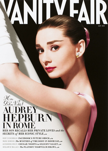
My first cover was the Lady Gaga one, and I think we got some nice type done there. We squeezed a little more type above the masthead and generally played with scale – I was pleased with the graphic quality of the ‘LADY GAGA’ 4 x 4 graphic across the really bold Annie Leibovitz portrait. There are subtle tweaks but overall a more crafted finish.
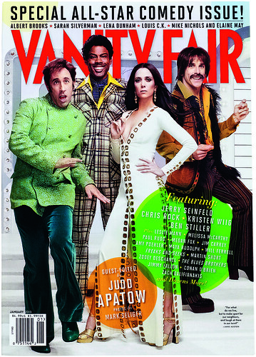
The feature well is becoming simpler. We’ve standardised the pull quotes with January 2012’s ‘Comedy Issue’. Before, each story would have a different style. It’s one approach, but I remember Adam getting frustrated when different designers would use varying styles for quotes at New York. Standardise them, just have them simple and bold, and it helps hold the whole issue together.
Dixon’s brief at Vanity Fair was to apply some of the design craftmanship he developed at New York.
The ‘Comedy Issue’ portfolio was a big step, I was really happy with that. Traditionally, that has always been a ‘portfolio’ of full bleed photographs for twenty pages. For this one we mixed it in with words. We had a nice type opener, then we tried to break it up and give it a bit more energy than a usual portfolio. Obviously we still have the photographs, but we ran a few interviews and the captions were done a little differently and we brought in some illustrations. We paced it so it’s more like a mini magazine than a straight photographic portfolio. That’s going to be the approach to portfolios now. You get some design, some editorial and the photographs.
JL: What can we expect from stage two?
CD: We’ve just been working with Christian Schwartz [see Eye 82] on a new typeface based on Didot. He has a different name for it, possibly Molé, which he’s drawing up as a new principal typeface with different italics and a slight stencil version for features and drop caps. We’ll be using that in the magazine in 2013. It’s based on Didot, so overall it’ll have the same flavour as the current headline face but a little more refined. We’re also getting bolder and lighter versions, which will help the cover.
Something Graydon’s excited about is having someone here who can handle the extracurricular things that Vanity Fair is involved in design-wise. So I’m working on backdrops for interviews for online videos and carpet designs for the Vanity Fair Hollywood party. And there’s invitations to all the different events… there’s a lot of stuff we can get involved with.
JL: You’re almost becoming a brand director?
CD: To some degree, yes. We do the iPad version, we have a smaller team that focuses on that. I’m thinking about what we can add to that. And we’re just finishing up our iPhone app. We have a prototype that’s ready to go ahead in summer 2013.
JL: Your first job at Adbusters seems a long way from what you’re doing now.
CD: At the time I saw Adbusters as an opportunity. I found its design amateurish, so it wasn’t appealing to me, then I realised that was the point. I wanted to get in there and make it better, make it my own. It was the challenge of making it better that appealed. It had an audience among environmentalists, but it didn’t have any visual sophistication at all. I saw the potential in the kernels of content that weren’t being communicated properly.
JL: Did you have sympathy with its political standpoint?
CD: I did. Some of it was radical, but ultimately it was really straightforward ideas about the environment and consumerism. The general ideas and essays were all of interest to me. I liked the idea of getting a positive message out to more people.
JL: But very different to the content you’re working with today …
CD: Some of the content is different, yes, and some of it is ... I think I’m drawn to general interest magazines. They all have essays on culture, essays on what’s happening in the world. That’s what The New York Times Magazine specialises in, too. The high-low culture mix. That’s where I’ve always stayed.
The first issue of Vanity Fair I worked on had a long column about Occupy Wall Street, an oral history of the protest, and we had Kalle Lasn included. I remember passing a designer’s screen and there was Kalle looking out at me. He was interviewed about his part in starting Occupy from Vancouver, with a photograph of him as part of the column. So it came full circle on my first issue.
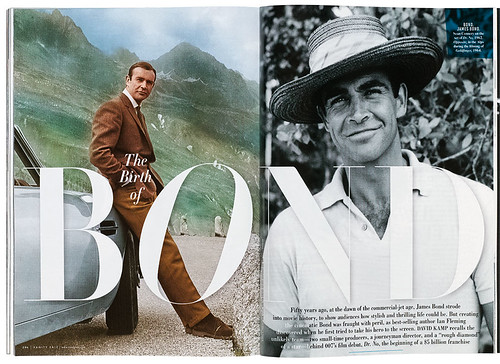
Monochrome typography with coloured overlays give a new look to archive photos, including early James Bond stills (October 2012).
Graydon Carter, editor of Vanity Fair, on art director Chris Dixon
Jeremy Leslie: Can you highlight the key aspects of Chris Dixon’s work at New York magazine that led you to employ him at Vanity Fair?
Graydon Carter: There is an elegance and sophistication to Chris’s work that sets him apart.
JL: To my eye there are significant links between the design aesthetic you and your colleagues developed at Spy magazine in the 1980s and the Adam Moss / Luke Hayman / Chris Dixon redesign of New York magazine.
GC: Yes, the Spy aesthetic appears to be in evidence at New York, and with Chris on board, I wouldn’t mind infusing a bit of it into Vanity Fair.
JL: What was your brief to Chris as he took up his new role at Vanity Fair?
GC: Dixonise it!
JL: There has been a clear shift of emphasis at the magazine toward a more design-led approach. Are you enjoying the process of reinvention?
GC: It’s been amazing to watch Chris work. Page by page, section by section. We’re now going to really go to work on the cover – perhaps even the logo.
JL: Are there any further thoughts you wish to share about Chris?
GC: Chris walked into an office where most of us have worked together for more than two decades. He is such a considerate and calming presence, and fitted in faster than anyone has in many a year. With a couple of exceptions at Spy and Vanity Fair I can’t remember a professional relationship I value as much.
Dixon’s typographic detailing was immediately evident on the front covers, with fewer colours and typefaces, and improved heirarchy and legibility. A new playfulness can be seen in the large coloured lozenges on the All-Star Comedy Issue (January 2013).
Jeremy Leslie, editorial designer, writer, curator, London
First published in Eye no. 85 vol. 22 2013

Eye is the world’s most beautiful and collectable graphic design journal, published quarterly for professional designers, students and anyone interested in critical, informed writing about graphic design and visual culture. It is available from all good design bookshops and online at the Eye shop, where you can buy subscriptions, back issues and single copies of the latest issue. You can see what Eye 85 looks like at Eye before You Buy on Vimeo.