
Summer 2016
Reputations: Stuart Geddes
‘I am interested in exploring different archetypes of books … I like to create friction between design conventions and juxtapose them to make something new.’
Stuart Geddes (b. 1975 in Sydney) has amassed an admirable body of work while quietly establishing himself as the go-to guy for niche Australian publishing, with his purposefully maverick-professional approach. He studied graphic design at RMIT University, where he was taught by New Zealander Lisa Grocott. In 1998, Grocott invited Geddes and three others to start Studio Anybody, which endeavoured to explore an alternative model of practice within Australian graphic design.
After Studio Anybody disbanded, Geddes completed a master’s degree, collaborated with Jeremy Wortsman on the hybrid bill-poster magazine Is Not (2005-08) and worked as art director of the architecture magazine Monument. In 2007, Geddes and Wortsman went into partnership as Chase and Galley; Wortsman left two years later.
Geddes has designed many publications for both independent and commercial publishers including literary magazine Meanjin, Australian Poetry Journal, the motorcycle zine Head Full of Snakes, a series of books on Australian surfing, including Brendan McAloon’s Deep Water and Tony Edwards’ comic strip Captain Goodvibes and titles on Australian architecture.
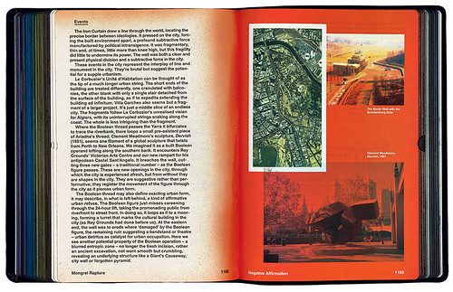
One of his most extraordinary designs is the 1616-page, leather-bound Mongrel Rapture, printed by a Chinese Bible printer, that covers the work and thinking of Australian architects and provocateurs Ashton Raggatt McDougall (ARM), whose buildings include Storey Hall and the Shrine of Remembrance in Melbourne and the National Museum of Australia in Canberra. In its sheer monumentality, it is tempting to compare Mongrel Rapture (and Geddes’ role in it) to such examples of graphic authorship as Bruce Mau’s 1344-page orchestration of Rem Koolhaas’s S,M,L,XL, and Irma Boom’s five-year commission for Dutch conglomerate SHV. Geddes certainly sees Mongrel Rapture as a turning point in his own practice. Published in the year of his fortieth birthday, it crystallised much of how he has worked in the past and opened up new paths for exploration.
We met at his studio near the busy intersection of Smith and Johnston Streets in Melbourne’s inner-city suburb of Collingwood. Geddes’ career has grown in tandem with the central business district’s ‘laneway revival’, a phenomenon synchronous with the flourishing of boutique creative industries that began in the early 1990s. A quarter of a century later, the tendency has spiralled out to adjacent suburbs. Today, Collingwood is full of converted industrial warehouses and, increasingly, vacant shops. It is one such disused shopfront, next door to one of the boutique cafés Melbourne is famous for, that houses Geddes’ studio, where his desk is strewn with a rich and varied collection of recent American, European and British independent publishing. Passers-by can see him in the window. He cuts a distinctive profile, with a beard as long as a bushranger’s, toiling away on his own, yet in every way at the junction of Melbourne’s creative economy.
Cover and spread from Mongrel Rapture, 2015, published by Uro Publications, Melbourne, Australia. Book design: Stuart Geddes and ARM Architecture. Principal typefaces Radim Peško’s Union and Larish Neue.
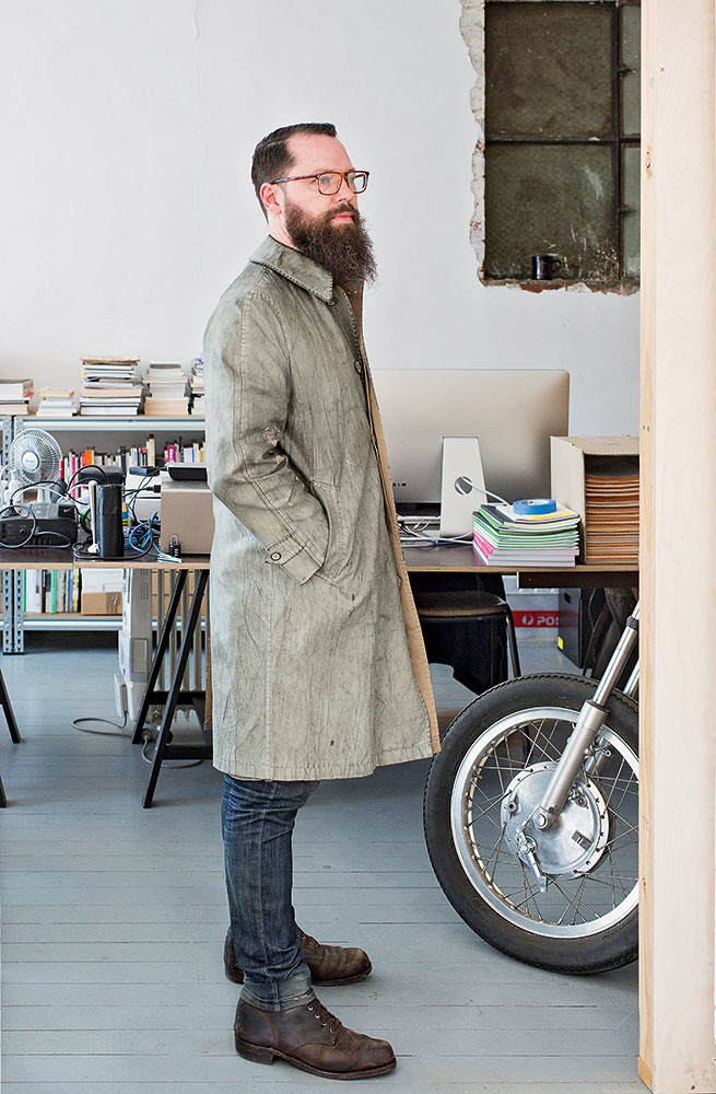
Top: Portrait by Tobias Titz.
Elizabeth Glickfeld: What is the first piece of design you remember making?
Stuart Geddes: I didn’t think of it as graphic design at the time but I remember making a series of illustrated adventure books at about the age of nine with a friend. We wrote them together and I illustrated them. They were crazy sci-fi fantasy, other-dimensional stories; I’d recently seen Star Wars. My dad’s secretary typed them up and then we photocopied or spirit-duplicated them.
EG: When did you become serious about becoming a graphic designer?
SG: I got through high school not knowing what graphic design was. I was good at art and English. I thought I would go to art school. I really wanted to draw comics, or at least write and draw. Then after school I did a year 13 folio [preparation] course and got a sense that design was something I was interested in. I applied and got into graphic design at RMIT [formerly Royal Melbourne Institute of Technology]. After the first year I took a gap year and travelled around Europe. Then I came back for second year and took a theory course with Keith Robertson. He taught graphic design through a semiotic lens. That’s when I realised design could be a bigger, more important thing.
EG: What was the Melbourne design ecology like when you co-founded Studio Anybody in the 1990s?
SG: When I was an undergraduate student, there were a lot of medium and large studios. They seemed to be run autocratically by a head designer, and they pumped out a particular flavour of work. People I studied with at university would go and work for one of those studios and produce work in the studio’s style.
Studio Anybody was partly named that as a negation of this tendency. I’m not suggesting we spearheaded a shift but that the conditions were ripe for it. Since then there’s been a really healthy proliferation of micro studios in Melbourne. They’re more collegiate, open and friendly: before, the culture was secretive and competitive. I think the change is linked to the rise of the internet, and to the internet’s qualities and the working practices it entails. Having worked in many shared spaces with web design and development people, and having observed the way that community works to share information – and how that pushes the profession along – this has seeped into the graphic design industry here as well.
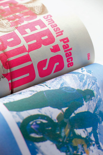
Detail from Head Full of Snakes, an annual, independent magazine about motorcycle culture, edited and designed by Luke Wood and Stuart Geddes. This is from the opening spread of an article about ‘The annual Smash Palace Shearer’s Run’ in HFOS no. 3, 2014, printed in three colours on a Risograph MZ 1070A digital duplicator. Photo: Philip Sayer.
Big, weird and messy
EG: Were books like S,M,L,XL influential on Mongrel Rapture, or is that an overly Australian question?
SG: Because so much of my work has been in close proximity to architecture and a particular local architecture scene, it is impossible for me to broach the issue of Australia and the question of influences without mentioning ARM. My understanding and my thoughts on this are really tainted and influenced by theirs. They’ve come from the angry-young-men fringe to being the establishment, but have remained properly radical in a way that their work is still able to really upset people. They epitomise a kind of antipodean postmodernism which is where a lot of my work comes from, even though I didn’t realise it before doing this book.
There was an aspiration for it to be different kinds of books at once. From the start, we knew it was going to take as long as it needed to take. We expected it to be big, 600-ish pages; we always suspected it was going to be bigger and weirder and messier than that.
EG: When did you decide what form it would take?
SG: There was a point when we specified it with a printer at somewhere between 600 and 800 pages. We had a dummy made up, a big obnoxious thing. It was then I suggested I investigate using a Bible printer because we knew it was still going to grow. I started Googling Bible printers in China (ironically, because there is no Google in China). When the idea came up, it changed the trajectory of the book. It’s one of those instances where a material idea really shifted our thinking because the Bible reference is so provocative, both in terms of its religiosity and its bombast.
EG: What is it about the architecture of ARM that chimes with your own concerns as a graphic designer?
SG: There is a sense of historicism in their work, but it is not nostalgia. They are history nerds of their discipline, but they make new things from their knowledge.
EG: How does this manifest in your graphic design?
SG: There’s what I think of as a particularly Australian or antipodean way of being influenced that rings true in how I think about type and design and that’s with these inherited -isms: inherited modernisms and postmodernisms and poststructuralisms. A lot of these architectural practices that came of age in the late 1970s and early 80s had this idea at the time that Australia was so derivative, particularly of European culture and of Anglo-European modernism; but they thought the fact that Australia was so derivative was what was so distinctive about it – how much and how poorly it copied. That’s why a lot of ARM’s early work involved actively copying – and photocopying – Venturi and Libeskind …
EG: Is that why the image of a page on the page and the photographed double-spread features so much in your work?
SG: I am interested in exploring different archetypes of books … and I like to create friction between design conventions and juxtapose them to make something new. I guess the work I did on the Design Research Journal from 2005 – where different sections of the publication took on a different publication logic and genre – was formative. It became a research project about journal design. Each story was closely designed around an existing journal: an art, mathematics or computer science journal, a 1950s women’s magazine or National Geographic. For me, this has spiralled into a series of larger ideas … the Classic Houses issue I designed for Monument magazine took cues from different forms of publication design, from the period of the house in question.
EG: Are there specific influences on your practice?
SG: There are a lot of local people I have dialogue with, such as Brad Haylock, Dominic Hoftstede and Warren Taylor, but I would say the strongest influence on my work in the last ten years or so would be Stuart Bailey. Earlier on, I was inspired by Emigre. And when I started Chase and Galley with Jeremy [Wortsman] – who is a New Yorker – he brought a more East Coast American editorial design flavour to things. You can see that in the design of Meanjin.
EG: Maybe imported cultural product takes on a special or slightly altered significance here. A decade or so ago, Dot Dot Dot [founded by Bailey and Peter Biľak] seemed to resonate in the Australian context …
SG: It felt a bit outsider-ish or on the periphery … It had an uncertain amateur semi-expert quality! I always got a sense that it was concerned with the things around graphic design rather than about graphic design … That gave it a sense of the periphery, which made perfect sense, particularly to the antipodean experience … Australia and New Zealand are still really interesting anomalies. There’s so much about their colonial history and where they are geographically, which is why people here know so much about Europe and America, and people in Europe and America don’t really pay any attention to what’s going on here – there is a super-interesting tension in that.
EG: Australians are known for spending long periods living and working abroad. But you haven’t …
SG: I toyed with the idea for a while. But when I thought about it, I decided if I did move I wouldn’t know where to go. Culturally I’m much more interested in Europe, but I would probably prefer to live in New York. Also, I find that Australian / antipodean fringe-ness fruitful and interesting, both creatively and socially. Melbourne is under the radar. It is ripe for improvement. There’s more to do here with both the cultures of graphic design and of publishing. In a smaller place, smaller players can have a bigger influence.
Is Not magazine came out of a set of circumstances that are very Melbourne-centric. It is a real literary town, it loves a new magazine or cultural project … and it has a really good music scene. This context made the cross between a literary magazine and the street press pertinent. We also had no money, so we began thinking about Melbourne’s street-posting culture. It offered an infrastructure that hadn’t really been looked at for a while other than for big music festivals … so the bill poster idea came out of a pragmatic imperative to produce the magazine cheaply; it meant we only needed to produce one or two hundred copies and would still potentially get a substantial readership. And then its being on the street enabled a bunch of other shopfront vernacularisms to come into the design.
EG: You manage to achieve more with less, working with tighter budgets …
SG: At the moment I am collaborating on the Australian Poetry Journal. Essentially we’ve made this system to cut down on my typesetting time. … it’s a nice pragmatic system. The editing is done in the back end of the website and it spits out XML, which largely typesets its own file, formats it, styles it, everything; then I go through and refine it. It has thrown up issues about the complexity of typesetting poetry but I’m interested in where these ideas are going.
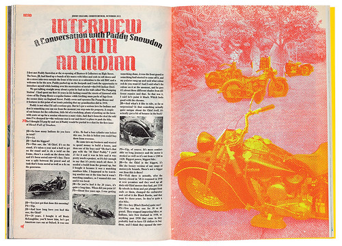
Spread from the first issue of Head Full of Snakes, 2011. The ‘Indian’ of the title refers to interview subject Paddy Snowdon’s love of Indian Motorcycles, a much-loved US motorbike brand.
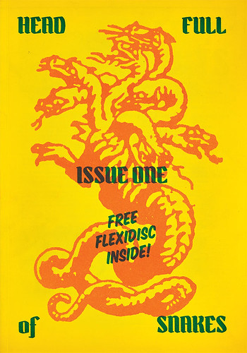
Cover from Head Full of Snakes, issue one, 2011. Edited, designed and printed by Luke Wood and Stuart Geddes
EG: You have also designed publications around specific subcultures or grass-roots communities, such as Head Full of Snakes. How did that come to be?
SG: Luke Wood, a friend and colleague of mine in New Zealand, started a blog to try and unpick the relationship between his various interests, which were graphic design, music and motorbikes. The title comes from Medusa, the comic book character, but having a head full of snakes also means you’re a bit crazy – in our case wrestling too many interests and obsessions!
Luke wanted to make a zine for the local motorbike community in Christchurch, but when we started working on it together it became a much bigger thing. We’d looked at old motorcycle magazines and enjoyed how wordy they were. But when we started Head Full of Snakes four years ago, all motorcycle magazines were as awful as you can imagine, with almost no textual content unless it was a 5000-word piece on how to rebuild a section of an engine. We loved people’s enthusiasm for their motorbikes though; motorcycle people are interestingly tribal yet there’s not really any animosity between the tribes …
Fruitfully careless
EG: You have been working as a graphic designer for a decade and a half. Is the fact that you’re only now starting to officially work under your own name because of your interest in collaboration?
SG: Yeah, totally. I really think of myself as being rubbish on my own!
EG: So are you still interested in collaboration?
SG: Yeah, my interest in collaboration has only strengthened, but my idea of what collaboration is and involves has evolved. There’s a way of working that’s through conversation. Most of the work I do is actually in talking things through and getting my head around them. Most of the work – both generating and refining it – happens in the conversation about a project. Also, as my interest and specialisation in book work has developed, I have become more comfortable with collaborating. I have spent a lot of time learning what I do as a designer, so that I am now more confident with being able to steer a process and of what I can bring to the equation with the writer and the editor.
EG: How does that show in your work?
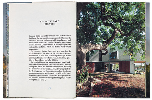
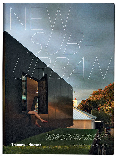
SG: I designed three books by Stuart Harrison on Australian architecture for Thames & Hudson. The three of us – publisher Paulina de Laveaux, Harrison and myself – developed a trusting and productive relationship, and you can see that in the consecutive designs of the books. The first – A Place in the Sun – is on Australian beach or country houses. We organised the projects via latitude so that over the course of the book you go from canopies and courthouses with courtyards in the north to bunkers in the south. For the second book – Forty Six Square Metres of Land Doesn’t Normally Become a House – on architecture in small spaces, we developed a complicated grid and concentrated on the efficient use of the space on the page. The third book – New Suburban – was about contemporary takes on suburban housing, on flexible spaces for families to grow up in and the connection to the outdoors rather than to the urban fabric. We based the book on the archetype of the novel.
Cover and spread from New Suburban (Thames & Hudson Australia, 2013) by Stuart Harrison. Design by Stuart Geddes, working as Chase & Galley. The body text is set in Stanley, a typeface family designed by Ludovic Balland. Display and folios are made using the Rotring NT Scriber. In the book’s (illustrated) colophon, Geddes notes that the temperamental 1980s machine broke down during the book’s production: ‘Some of the lettering in the book is made with the Scriber, and some is a digital reproduction.’
EG: Why the novel?
Because in the suburban setting the most familiar kind of book would be the novel on the bookshelf. The book contains these blown-up versions of a paperback novel on bulky paper– they are blown up to make them unfamiliar – and then we built in a whole lot more complexity by using not just the central text block but lots of marginalia. There are different conventions at play in some of the other sections, which are much more like a conventional architecture book: they use white space, sans serif type and different paper.
EG: You have had a Risograph machine in your studio for a long time. How do you use it?
SG: With Head Full of Snakes, we went into it thinking that the Risograph is familiar territory for graphic design and publishing people, but that it would be really unusual for the motorcycle audience because most motorcycle magazines are usually glossy tabloids. There are certain design things the magazine does which are just about the Risograph printing process. There was four-colour Risograph printing in the first one but then, on the advice of a friend who has some expertise in Risograph printing, we figured out a three-colour separation. So the later issues are actually printed in three colours: fluorescent pink, blue and yellow. There is no black. We produced it very quickly. Careless, but fruitfully careless!
EG: It makes the photos look like they come from another era.
SG: I don’t consider myself to be nostalgic and I dislike the idea of nostalgia. I like to think it’s historical rather than nostalgic.
EG: What’s the difference? Nostalgia is literally defined as a longing for home …
SG: Nostalgia is a fruitless exercise, which is a daft yearning for better days. I don’t think that’s useful and I don’t think we are in an age of decline. There are really useful and interesting things that were done in the past that are worth unearthing and learning from. For me, that’s the difference. I think Head Full of Snakes marries the good senses of what those old motorcycle magazines used to do with a contemporary sense of what small press publishing is capable of.
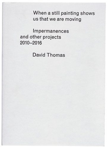
Cover and spread of David Thomas’s When a still painting shows us that we are moving: Impermanences and other projects 2010–2016, published by Surpllus in an edition of 500. The central section (right) is designed according to the conventions of an exhibition catalogue.
Milk bar vernacular
EG: How would you describe your typographical style?
SG: How you would describe it?
EG: The words ‘milk bar vernacular’ come to mind. There is often a hand-drawn or purposefully ‘amateur’ element …
SG: We chose Plantin Bold Condensed for the body copy in Head Full of Snakes. We wanted to emphasise the wordiness of the magazine, as the articles often run between 3000 and 5000 words, sometimes more. But there’s no italic condensed so we used the regular bold italic. It seems happily clunky and unsophisticated.
EG: Tell me about the titles in New Suburban, the book you designed for Thames & Hudson …
SG: We used a Rotring Scriber, which I think I discovered via a tweet by Peter Biľak. It’s a lettering machine that architects used in the early 1980s just before CAD systems. You would screw a Rotring pen into a contraption, then screw that on to your drawing board and render your architectural and engineering drawings with it. They’ve been re-discovered by a bunch of lettering and type people in Europe and Switzerland. We generated an alphabet from it; it produced a lot of errors and glitches, which we retained.
EG: You often purposefully retain imperfections in your work that a professional designer would fix or iron out …
SG: Poetically as well as philosophically, I admire and want to hold on to the idea of amateurism, or being a novice – to that excitement and nervy glee of trying something out for the first time, only to fuck it up a little, but not enough that you start again. The influential Australian architect Peter Corrigan always says ‘More ideas. Less refinement.’ Coming from a discipline that is often obsessed with reduction, slickness, refinement and singularity, I actively try to refute those things.
EG: You often use phrases such as ‘useful tautology’, ‘easy conflict’ and ‘fruitful tension’. What do you mean by them?
SG: Contradictions and conflicts can be really fruitful, being able to set up little knots in a group conversation around unconventional ideas, particularly in commercial settings. There is more than one way to do something, especially in a collaborative setting or doing client-commissioned work. I don’t cling to one idea. I won’t abandon things completely in the face of resistance but I am genuinely willing to explore alternatives that have been brought up through a conversation or working relationship. Maybe that designer stubbornness or dogmatism isn’t there.
EG: You are in the middle of completing a PhD, and you have just taken on a full time position at RMIT University as Industry Fellow. What made you decide to do that?
SG: Despite how much work I have done, I feel most of it has been an apprenticeship. I am starting to use the book as a site for exploration rather than as a capsule for information. I can sense my practice turning a really interesting corner but I also know that it’s going in an even less commercially viable direction than where I have been for the last fifteen years. There is an ideological and practical consideration of thinking that if I’m interested in the culture of graphic design in Australia, then I need to be more fully involved in education. In the commercial sphere, the transition from graphic design to communication design is complete. I see communication design as being about the strategy and branding and whatnot. I have no interest in that. Rather than fighting to reclaim that in any way, I’m thinking, ‘Okay, that fight’s won. You can have communication design.’ What I’m interested in doing is maybe a version of something that might once have been called graphic design; that’s as much a cultural activity as it is a commercial one.
Video demonstrating the sheer scale of Mongrel Rapture.
Elizabeth Glickfeld, co-editor, Dirty Furniture, and writer, London
First published in Eye no. 92 vol. 23, 2016
Eye is the world’s most beautiful and collectable graphic design journal, published quarterly for professional designers, students and anyone interested in critical, informed writing about graphic design and visual culture. It is available from all good design bookshops and online at the Eye shop, where you can buy subscriptions and single issues. You can see what Eye 92 looks like at Eye before You Buy on Vimeo.