Winter 2011
Shock tactics
America’s funky ‘altweeklies’ are a hotbed of zero-budget, attention-grabbing cover art direction.
When Sarah Palin came to Boston in the spring of 2010, the city’s alternative newspaper Weekly Dig sponsored a reader contest to create the best cover image. The winner pictured two elephants, the symbol of Palin’s Republican Party, having sex. After the killing of Osama bin Laden last year, Seattle’s The Stranger printed a cover illustration of the al-Qaida leader with a bullet hurtling toward his head. The Seattle Weekly noted the repeal of the US military’s anti-gay ‘Don’t ask, don’t tell’ policy with a cover photo of two male sailors kissing, a spot-on recreation of Alfred Eisenstaedt’s 1945 VJ-day photograph. Provocative, political, graphic: these covers were hugely successful with the papers’ readers, and at the same time unlike anything being produced on mainstream US magazine or newspaper covers.
The alternative weekly newspapers of the United States are a hotbed of creative cover design. The historical descendants of the underground papers of the 1960s, these papers are tabloid-sized and distributed free in cities big and small across the country. Ranging from giants such as the 200,000-circulation Village Voice to smaller papers such as Vermont’s Seven Days (circulation 35,000), these ‘altweeklies’ are produced fast and cheap, often with an art department of one, and on a very limited budget. And although many covers use glossy stock, the majority of papers are printed on newsprint.
Altweeklies are distributed in news boxes and at clubs, shops and restaurants. It takes a loud, brash, attention-getting cover to drive circulation, and these papers need to do it week after week. Andrew Nilsen, art director of San Francisco’s SF Weekly, says: ‘I’m trying to get the damn paper picked up, so it gets read, or at least gets people interested, intrigued or outraged by whatever we are writing about.’
This is gonzo graphic design, sometimes brilliant, sometimes ragged, but always filled with passion, energy and originality. The covers, reflecting the rich, diverse content and progressive politics within, are explosive and poster-like, filled with provocative headlines and typography and in-your-face illustration. Jay Vollmar, art director of Denver’s Westword, says: ‘I treat the cover like a poster. It needs to be viewable from ten feet away while stuck in an area filled with clutter.’
Tiny budgets and tight schedules create an environment where a lot of the covers are totally created by the art directors themselves. Many of them are talented illustrators in their own right; others are master photo illustrators and typographers. They gleefully distort and manipulate both images and logos, sometimes dispensing with cover headlines. They take their influences largely from popular culture: screenprint posters, comic books, movies, album covers, even children’s game graphics (the packaging of Hasbro’s Operation game has inspired at least three covers). Many of the best covers start with no art and no ideas. It is up to the art directors to create something from scratch, often in just a few hours, and for zero dollars.
Altweekly cover design was long under the radar, due in large part to the regional nature of the papers. Now, thanks to websites such as Coverjunkie.com and Nas Capas (nascapas.tumblr.com), as well as the Society of Publication Designers (spd.org), the best designs are getting instant wide circulation. Village Voice Media, which publishes thirteen papers across the US, including SF Weekly and Seattle Weekly, has a Facebook page (Voice Visual) where it posts the best of their covers each week.
Village Voice Media’s design director, Michael Shavalier, describes his group’s work: ‘Our art directors don’t have much time, so they go with their gut. The work isn’t diluted down, or debated to death, or focus-group-tested. It isn’t always safe or conventional. Sometimes it fails, but I tell all our art directors, “If you’re going to fail, do it spectacularly. We aren’t trying for the middle ground here. That doesn’t turn heads. It’s all or nothing.”’ Or, as Tak Toyoshima, creative director of Boston’s Weekly Dig, says, ‘We try to create culture rather than just reporting on it.’
In the case of The Stranger, the covers are totally off the grid of traditional cover design. The Seattle paper is an altweekly version of the New Yorker, with stand-alone covers that often have no direct relationship to the content or the cover text. Art director Aaron Huffman says: ‘It’s more about capturing something about the feeling of the issue, or the mood of the city, the weather, whatever feels right that week. It’s our own personal art gallery.’ The Stranger mixes brilliant, edgy illustration with graphic typography andhotographs. It has inspired similar cover designs at the Weekly Dig, the Portland Mercury and Flagpole in Athens, Georgia.
Many of the altweekly covers have an added graphic element. For its New Year’s issue Seven Days art director Diane Sullivan produced a cover readers could cut and fold into a child’s fortune-telling game. The Village Voice paid homage to Al Jaffee’s Mad magazine fold-in back covers for a story on Coney Island.
The grandmaster of altweekly art directors is Tom Carlson of St Louis’s Riverfront Times (another member of the Village Voice group), who has been directing the paper’s visuals since 1988. Carlson, who says his goal is to ‘surprise, delight, amuse and engage the reader with visual solutions that communicate well enough to render the words almost unnecessary’, loves to play with pop culture iconography. He designed a cover on the treatment of chickens that referenced one of the torture photos from the Abu Ghraib prison in Iraq, and a brilliant homage to the poster for The Gay Divorcee for a story on same-sex divorce.
As magazines and newspapers, both regional and national, grow more formulaic and conservative in their cover designs, the altweeklies continue to get more creative. Instead of retrenching in tough economic times, they have become more adventurous and more provocative.
‘You’d be surprised what we can make a cover out of,’ says Michael Shavalier. ‘When you have all the resources you could possibly need, there’s no need to find unconventional solutions. This is some of the most pure work that people will ever do. Give us a stick of gum, a shoelace and a paperclip and we’ll MacGyver a front cover out of it for you.’
Mystery Meat, Dallas Observer, 18 June 2009. Art direction and illustration: Alexander Flores and CSA Images.
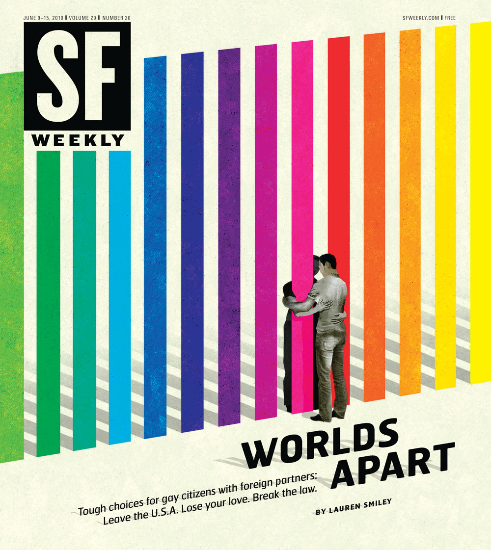
Top: World's Apart, 9 June 2010, SF Weekly. Art director: Andrew J. Nilsen. Illustration: Brian Stauffer.

Robert Newman, creative director, Reader’s Digest, New York
First published in Eye no. 82 vol. 20 2012
Eye is the world’s most beautiful and collectable graphic design journal, published quarterly for professional designers, students and anyone interested in critical, informed writing about graphic design and visual culture. It is available from all good design bookshops and online at the Eye shop, where you can buy subscriptions and single issues.