Spring 1997
Space, time and content
Photomontage allowed Lester Beall to unite art, photography, typography and painting with revolutionary European ideas about layout and form
New York City in the mid-1930s was a heady place for creative people. Lester Beall, a member of a progressive group that included émigré European designers Alexey Brodovitch, Erik Nitsche, Joseph Binder, Josef Albers, Dr M. F. Agha and George Salter, increasingly showed in his work the influence of the European avant-garde. More impatient than ever with the traditionalism of American graphics and advertising, he wrote: ‘My objection is to men thinking, during certain parts of the day, of streamlining trains, sub-stratosphere planes and super-charged autos, and then, during other parts of the day, mentally returning, misty-eyed and reverent, to the aesthetics of yesterday. For me tradition handicaps while experimentation helps the creative artist.’
Beall loathed the gimmicky nature of designs stimulated by the free-market capitalism of the time. He judged European artists and designers as successful in ‘shak[ing] off the shackles of the past.’ He was especially curious about the ‘modernistic French machine aesthetic’ which he saw in the work from the Paris Exposition of Decorative Arts in 1925, which had promoted the design style that became known as Art Deco. Later, reflecting on this new form of Modernism, he wrote: ‘Good modern design in typography, as in the other arts, reflects the times in which we live, and because it does, it is firmly entrenched and is here to stay.’
Montage and photomontage became the major ways which Beall incorporated European influences into a functional visual approach. ‘Photomontage allows subject matter which is widely divergent in time, space and content to be united in a single surface,’ wrote Anton Stankowski. Looking back, Beall also found virtues in the synthesizing properties of photomontage: ‘The desire to meet the challenge of a new period in our economic and social history was reflected by the … search for forms that were strong, direct and exciting.’ During this period he considered himself an ‘absorbent’ designer to whom the avant-garde had opened up ‘a vast new field in which he could roam at random, plucking blossoms haphazardly.’
One of many public improvement projects initiated by Roosevelt to revive a US economy battered by the Depression was to build massive dams and develop power projects for the electrification of America.
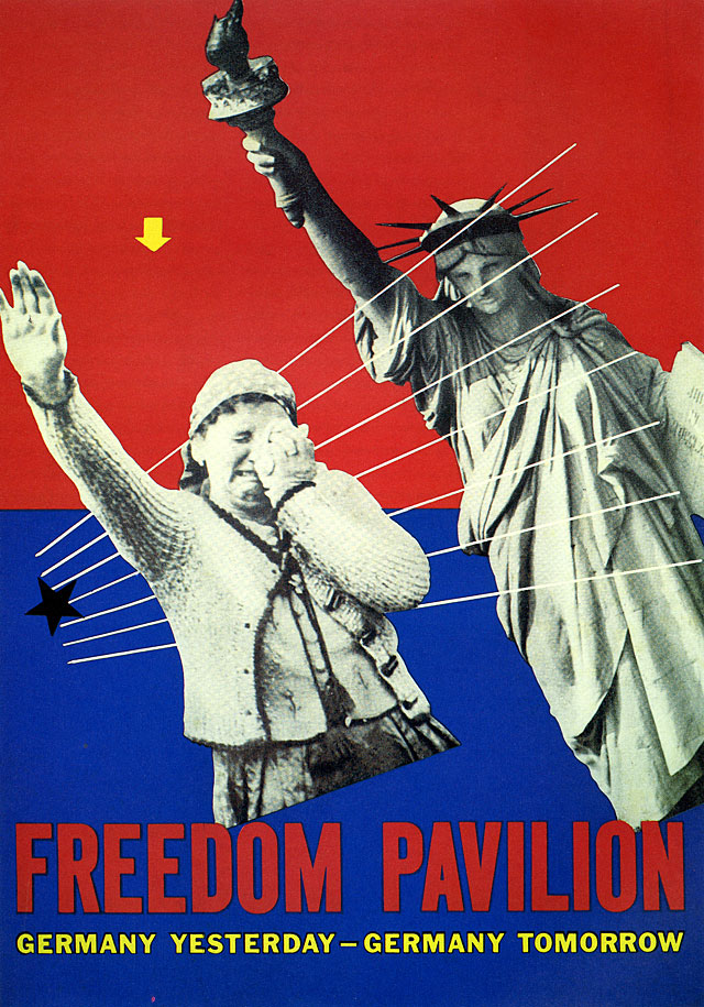
Top: Poster prototype for unbuilt Freedom Pavilion. New York World’s Fair, 1939.

Beall had been interested in photography since his years in Chicago when he most likely first saw a copy of the German book Es Kommt Der Neue Fotograf. He found this collection of avant-garde still photography, published in 1929 when Beall was 26 years old, inspirational because it ‘took the camera off the tripod and introduced to us [the American design community] odd angles and bird’s eye views and so forth.’ Photography offered to Beall another representational imaging form to complement his lifelong love of drawing. A tool was necessary to preserve what he called ‘realism unadulterated.’ Impressed by Moholy-Nagy’s work with the photogram, Beall saw its potential as offering ‘a unique ability to blend the abstract and the fantastic with the real.’ In 1940, he wrote: ‘The development of the camera in achieving organisation and unity, combined with the fact that the photograph per se represents the epitome of 2D realistic reproduction, presents the graphic designer with a powerful and moving instrument.’
Beall was fascinated by the flexibility of the medium, whose combinations, he said, were limited only by the ‘insuperable boundaries’ of creative imagination. Photomontage became a natural way for him to combine his interests in photography, typography, art and printing with the revolutionary ideas about typographic form and page layout being propounded by El Lissitzky, Moholy-Nagy, Herbert Bayer, Ladislav Sutnar, Jan Tschichold and Man Ray. With this new direction, he became one of the major ‘construction image makers’ among America’s emerging designers.
Rural Electrification Administration posters, 1937-1939. The flat, unfussy simplicity of these posters suggested the public posters of the Russian Constructivists twenty years earlier. In Beall’s second REA series, designed in 1939, the visual language, marked by his experiments with photomontage, became more complex.
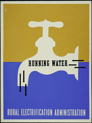

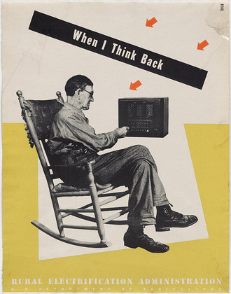
The vocabulary of Beall’s new visual language involved the use of graphic elements (colour, form, texture, lines, gridded frames, geometric shapes); implied spatial structures (receding perspective lines, strong foreground / background relationships); typographic forms (bars, arrows, pointing fists, boldly mixed type styles, angled lines of type, masses of type set to conform to shapes); photographic processes (photomontage, studio photography negatives and prints, photograms, special lighting effects, silhouetted subjects, juxtaposed elements); and integrative effects and processes (collage, montage, simultaneity, spatial ambiguity, bold asymmetric balance with excessive use of negative space).
Of these variables, photomontage was the dominant unifying force because of the ease with which Beall could combine complex ideas. In Europe, photomontage had emerged boldly in the work of the Dadaists Raoul Hausmann, John Heartfield and George Grosz about the time of World War I and was, to Beall, ‘the first graphic reflection’ of a new artistic consciousness. Other influences on the young medium were the cinematic effects of Sergei Eisenstein, new printing technologies that allowed the publication of photographic essays, the powerful visual forces of simultaneity in Pablo Picasso’s Cubist works, Paul Klee’s overlapping transparencies, Wassily Kandinsky’s colour and structure and the emergence of magazine photojournalism.
During this period, Beall experimented with many photomontage techniques in his studio. He glued together pieces of photographic prints, created multiple images in the darkroom, superimposed pre-existing images on new negatives, made double exposures in the camera and created photograms by placing objects directly on top of light-sensitive paper and exposing them. He frequently employed these procedures within the framework of basic integrating visual principles, such as multiple perspective and creative scaling.
In 1936, Beall designed a cork-covered, spiral-bound promotional book for Hiram Walker, called Uncorking, which allowed him to play with photomontage. An outstanding example of the technique is shown in a spread called ‘Modern Pioneers in Peoria,’ which is so memorable that the entire book is sometimes known by that name. Beall’s means of integrating illustration, carefully cropped photographs and type is dynamic and brings interest to the rather dull subject matter: a trip through a distillery. The maturity of his approach makes it distinct from the work of other pioneers of the time, including Alexey Brodovitch, Paul Rand and Bradbury Thompson. Although the printing quality was shoddy, the book design won a medal in the 1936 Art Directors Club of New York exhibition.
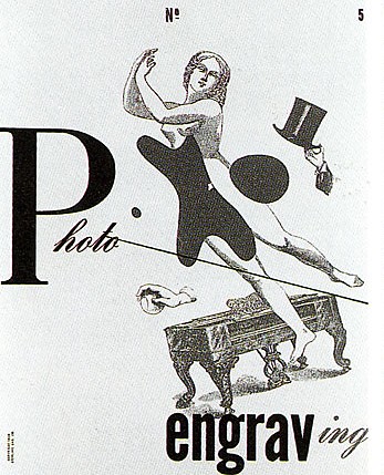
Cover of Photo Engraving no. 5, 1939. This cover exemplifies the designer’s power to synthesise European influences and apply experimental designs to jobs for pragmatic clients.
Beall’s growing reputation in New York owed much to an acclaimed poster series he had begun in 1937 for the United States Government’s Rural Electrification Administration (REA), a part of the Department of Agriculture. Though electricity was first introduced to American homes in 1880, rural areas possessed no electric light well into the twentieth century. Completing the job became a goal of the United States government under President Franklin Roosevelt – one of the many public improvement projects initiated in his administration to revive an economy battered by the Depression and create jobs. The scheme involved building massive dams and developing other hydro-electric power projects, especially the Tennessee Valley Authority (TVA). With available power, the government could complete the electrification of America and provide basic amenities – heat, water and light – to outlying areas.
In 1937, Bill Phillips, an information officer for the REA, hired Beall, whom he had met through George Bijur, to communicate the benefits of electricity to citizens in regions such as Appalachia. The classic series of large format (30 x 40 inches) posters that resulted received national and international recognition. Beall designed three sets of six silk-screened posters for the REA over a period of four years. Series One includes ‘Farm Work,’ ‘Heat…Cold,’ ‘Radio,’ ‘Running Water’ and ‘Wash Day.’ Their graphic simplicity and flat, unfussy, illustrative elements were appropriate for an audience with minimal reading skills and recalled the public posters designed by the Russian Constructivists twenty years earlier. For the second series, produced in 1939, which included ‘Boy and Girl on Fence,’ ‘Here It Comes,’ ‘It’s Fine For Us’ and ‘When I Think Back,’ Beall’s visual language, marked by his experiments with photomontage, had become more complex. The third set, designed in 1941, the year the US entered World War II, makes references to national defence, with titles such as ‘A Better Home,’ ‘A Turn of the Hand,’ ‘Power on the Farm’ and ‘Rural Industries.’ This group is the most visually intricate, with angled typography, patterns of colour bars and dots, and silhouetted photographs.
The posters have since become icons in the history of graphic design. As design writer Jerome Snyder remarked in 1972: ‘Beall demonstrated with these posters that the language of communication was not necessarily bound to timeworn clichés and literal conventions. An expanding world of science, technology and manufacturing had generated rising expectations that called for a new graphic industry, succinct of statement and visually attuned to the increasing velocity of American life.’
Holding Vasari’s belief that design is the ‘annunciating principle in all creative processes,’ Beall felt that the artist should be interested in many creative forms and open to motivation from many sources. Most often his chosen form of expression was drawing, painting pr photography. He loved the female figure as a subject, although he occasionally worked with other forms, both representational and abstract. His visual vocabulary continued to be enriched by the painters whose works he had studied at the Chicago Art Institute and on his own: Klee, Picasso, Braque, Matisse, Miro, Derain and, especially at this time, Arp. He was particularly affected by the graphic quality of Matisse’s canvasses, saying: ‘Picasso is a great artist but Matisse is a great painter.’
Beall’s own painting and drawing was a way for him to get closer to his inner feelings. He treated his personal art very seriously and with intensity: not simply as a hobby or an emotional release, but as a need. He felt that when the designer takes ‘his colour and his form and texture and he feels, in a sense, beneath the surface of these elements, then he has really accomplished something and is on his way to developing a style of his own.’ This form of invention fed his creative spirit and kept him in touch with the earliest roots of his career. Throughout his life, the vitality of feelings that emerged from his art was critical in stimulating his most effective personal graphic design work, and this was especially the case during the 1930s when his design office was small and there was a more distinctive, personal quality to the work it produced. In 1939, Beall wrote that, ‘modern typography and graphic design cannot occupy itself better than through an intensive study of modern abstract painting.’ The fact that much of his work was done in the service of advertising enhanced this process. Beall became troubled later in life with the pervasive notion that the graphic designer is in a world apart from the fine artist. Like Herbert Bayer, the Bauhaus artist who was an important influence on him, Beall was adamant about making no distinction between fine and applied arts in his career.
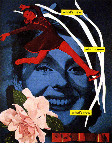
Cover for What’s New, 1939. In this house organ of Abbott Laboratories, Beall again dramatises the subject by making perspective ambiguous. The larger image is relegated to the background while the skater and other elements are placed in the foreground.
In 1938, Beall took on a project that was pivotal in changing his approach from conventional commercial illustration to modern design, particularly through his use of photomontage. Working with the writer L. Sandusky on an article for PM magazine called ‘The Bauhaus Tradition and the New Typography,’ Beall was able to select and format illustrations from Sandusky’s personal collection. This was a chance to work with a scholar of the avant-garde and get close to original artworks that he probably had never seen before. Among the artists, designers and architects featured in Sandusky’s article were Kandinsky, Archipenko, Gropius, El Lissitzky, Moholy-Nagy, Teige, Tschichold, Renner and Bayer. Beall saw their work as ‘only guideposts indicating characteristics which later fused themselves into the artists’ creations.’ He saw this progressive work not as ‘standing out in blatant discord’ to the prevailing styles of the time ‘but rather having a subtle effect as an emotionally digested influence.’
Three years later, Beall wrote an article for American Printer magazine called ‘Design as Applied to Advertising.’ Here he articulated the influence of European modern art on his design process and launched into a theory of design based on planar forms first made popular by the Russian El Lissitzky in the early 1920s and then by Paul Klee in the 1930s. Pointing out that the ‘graphic arts and typography, like modern painting, are concerned with surface or plane design or organisation,’ Beall wrote: ‘contemporary graphic design is dependent upon a visual consideration of three dimensionality, even though it is actually two dimensional. Planes (the illusion of three dimensionality) in graphics are established by form, colour and texture. The receding and / or projecting properties of each design element can be altered by changing its form, texture and colour. To insure the workability of a design, one must take care that no one of the established planes becomes completely disassociated from the others. The reason for this is that properly related planes make a design “work,” while improperly related planes create confusion and a sense of “busyness” that contributes markedly to the inefficiency of the design and therefore of the projected method.’
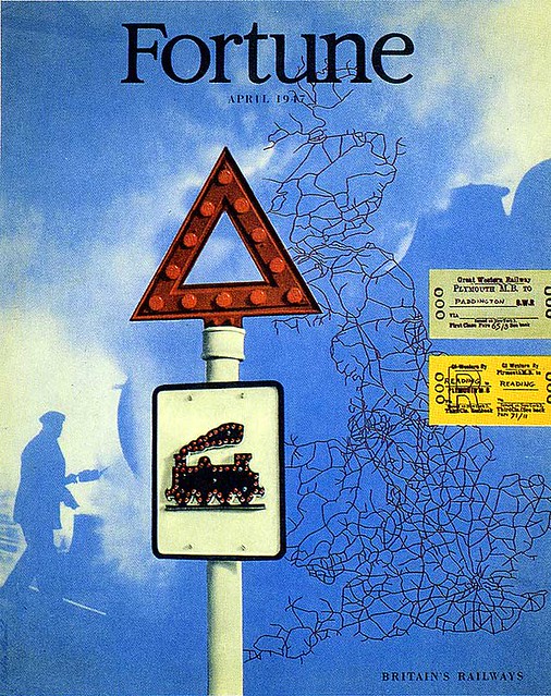
This analytical approach, which Beall found useful as a unifying method for much of his montage work from the period, was not to be understood as an expression of rules or axioms, he said, but as a tool. Seventeen years later, when he designed a corporate identity ‘style book’ for Connecticut General Life Insurance Company in 1958, he offered another description of this approach in a simpler version, illustrated by a diagram. A style manual for a corporate identity might seem like an odd place to present design theory, but the presentation was consistent with Beall’s career-long efforts to represent creative approaches analytically. Looked at in the light of both the American Printer article and the Connecticut General style manual, Beall’s work of the 1930s and 1940s, including his 1947 cover for Fortune magazine, shows a direct application of the theory.
Cover of Fortune magazine, 1947.
The 1939 World’s Fair in New York was a hothouse of progressive design and architecture. Many important designers, who were also Beall’s competitors – Donald Deskey, Paul Rand, Joseph Binder, Ladislav Sutnar and Will Burtin – contributed posters, guidebooks and exhibition designs. Beall was commissioned to create a poster for The Freedom Pavilion, a structure that was to house presentations about Germany, until Hitler’s aggression in Europe on the eve of the Second World War led to the project’s demise. Though the pavilion was never built, the poster, in prototype form, is an outstanding example of graphic design from the event. Beall’s use of thrust and counter-thrust – angled photographs and white reversed line – creates tension. The Statue of Liberty symbolically balances the silhouetted photograph of the crying girl and the strong background colours supplement the imagery.
In 1939, Beall also began the work that confirmed his reputation as one of the century’s most innovative designers and launched a tradition continued by Will Burtin and George Giusti: the design of pharmaceutical promotions for Abbott Laboratories. His first project involved a cover design for the drug company’s magazine, What’s New?, on the topic of fever. Beall decided to photograph a nude model next to a beautiful white-washed branch. The branch, part of an old set-up for a still life, was on loan from the photographer / designer Herbert Matter. To suggest the idea of fever, Beall posed the model’s hand on her head and partially solarised the branch. (His use of solarisation, which involves manipulation of the film in controlled light during development, was experimental for him, and he and his staff were excited by the results). What’s New? was possibly the first house organ produced for a pharmaceutical company, and Beall believed it to be an important development in what was the golden age of pharmaceutical advertising, when companies had generous budgets to produce lavish promotional tools.
Later that year, Gebrauchsgraphik, the German magazine of advertising and graphic design, described Beall as: ‘the typical representative of those definitely intellectual artists whose creative work is based less upon spontaneity than upon reflection. His work displays an almost mathematical accuracy and architectonic clarity: one feels in looking at it that it has been executed with careful consideration and with a feeling of responsibility. Further it reveals a perfect command of the typographical medium and an unerring feeling for the proper arrangement of surfaces.’
One of the signature projects of his professional life was a publication for another pharmaceutical company. In 1944, he began designing Scope magazine for the Upjohn pharmaceutical company in Kalamazoo, Michigan. Published bi-monthly, Scope was distributed to the medical profession and other health workers. The magazine covered a variety of subjects, from specific maladies and the drugs with which they were treated to acupuncture and art. Each issue began and ended with advertisements for Upjohn products, such as Unicap vitamins, which Beall also designed. His addition of colour and arrows to the typography and geometric shapes created tasteful marketing messages that were compatible with the editorial pages.
Beall’s creative freedom was unparalleled in his (and almost any other designer’s) career and was a tribute to the trust he inspired in his clients. According to Dorothy, his wife, he designed issues and sent them off to the printer without even showing them to Upjohn’s management. Scope also afforded Beall opportunities to do experimental work with photography. He continued to show that the versatility of the medium gave the graphic designer a moving and powerful instrument.
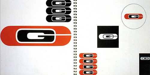
Double-page spread from the Connecticut General style manual. By the late 1950s, Beall had become well known for his work in corporate identity, which he wrote about at length.
Yet despite the freedom it allowed, the job was difficult and demanding. Scope’s editor, Dr A. Garrard Macleod, was slow to organise each issue and get copy to the designer, but demanded it remain on schedule, and it took some time before Beall established any credibility with his editor. He nevertheless looked back on the seven years of designing the magazine as ‘very exciting from so many different angles: the design and layout, the typography and the opportunity of interpreting in terms of photographs, drawings or paintings. It was the epitome of a designer’s desire for freedom of expression.’
In 1940, Beall had a goal to ‘pave the way for a new visual approach … a living dynamic approach that leaves no question as to its position or strength.’ That he realized this goal by extending the influence of the Bauhaus and New Typography movement to America is affirmed by L. Sandusky, who writes that Beall ‘maintained the integrity of these movements for clients of American printing, commercial photography and advertising design.’ A Museum of Modern Art publication stated, ‘The early work of such talented designers as Lester Beall is filled with this mixture of new ideas but soon the ideas were assimilated. An entirely new spirit was infused into American graphic design.’
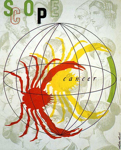
Beall worked on Scope, the house organ of the Upjohn pharmaceutical company, between 1944 and 1953. For the cover, 1948, he indulged his love of layering by integrating the globe and crab on top of a group of antique steel-engraved heads.
This is an edited extract from Lester Beall: Trailblazer of American Graphic Design by R. Roger Remington, published by W.W. Norton.
Published in Eye no. 24 vol. 6, 1997
Eye is the world’s most beautiful and collectable graphic design journal, published quarterly for professional designers, students and anyone interested in critical, informed writing about graphic design and visual culture. It is available from all good design bookshops and online at the Eye shop, where you can buy subscriptions and single issues.

