
Spring 2016
Stamped in the memory
The Gentle Author’s book about East London print and envelope specialists the Baddeley Brothers demonstrates the very crafts it celebrates
The Gentle Author’s handsome book about the Baddeley Brothers is a biography of a family business that can trace its origins to the seventeenth century. This is one of the satellite companies that long served the printing industries, supplying the skills of engravers, envelope-makers, die-sinkers and other craftsmen when such services were vital. They survive to this day in a drastically different market, now dealing with designers and clients directly rather than with big printers, and championing the merits of craftsmanship and hand-finishing now that such things are discretionary rather than the default.
Six chapters trace the company’s activities, characters and fortunes, accompanied by archive photographs and engravings. Vivid ink drawings by Lucinda Rogers show some of the current employees – Jon, Danny, Gita, Wendy, Paul and others – absorbed in the details of their respective crafts and machines. The book was designed by David Pearson.
The Gentle Author’s interest in the company began online, in his rhapsodic blog posts at Spitalfields Life. Since August 2009, when the prolific, anonymous Author declared ‘I am going to write every single day and tell you about my life here in Spitalfields at the heart of London,’ he has written about East End craftsmen, photographers, artists, veteran Playboy Bunnies and more than two thousand other subjects in a florid style often closer to literature than journalism. The Gentle Author first interviewed Roger Pertwee, the current directors’ father, in July 2013, and the book includes a conversation with Roger and his brother David, who ran the company for decades.
As the Spitalfields Life blog has grown in size and traffic over the past few years, The Gentle Author has taken some of his areas of interest into print, first with the anthology Spitalfields Life, and then with The Gentle Author’s London Album (see ‘To have and to hold’ in Eye 88) and books such as Spitalfields Nippers by Horace Warner, as well as slightly more contemporary documentary photography by Bob Mazzer, Phil Maxwell and Colin O’Brien. The books are mostly designed by Pearson, who also devised the imprint’s logotype.
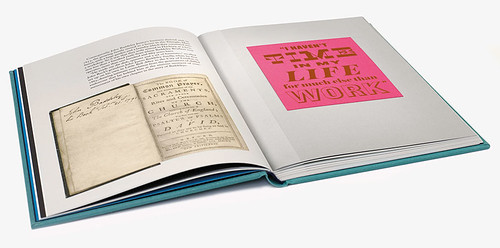
Spread from the end of the first chapter with a tipped-in card displaying fonts designed by Paul Barnes of Commercial Type, based on materials held at St Bride Printing Library.
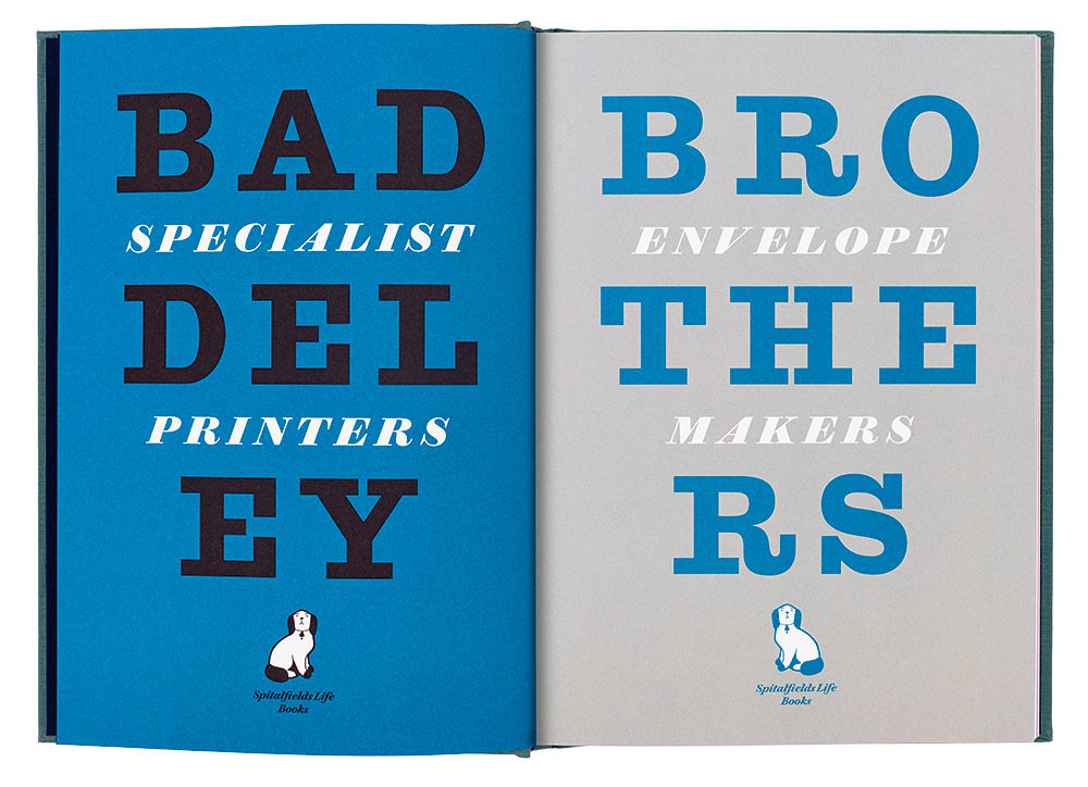
Top: Opening spread from Baddeley Brothers by The Gentle Author, set in Antique No. 6 and Brunel Deck Black Italic by designer David Pearson. The book is typeset in Adobe Caslon Pro, Caslon Doric and Caslon Sans Shaded Number 2.
The Baddeley Brothers book is entertaining and informative, with a story whose key elements – an exploitative Victorian client, a Nazi bomb that destroyed their factory, receivership in the 1990s– are dramatic enough to be told without elaboration. A four-page alphabetical glossary explains printing and paper industry terms such as ‘bottle-arsed’, ‘mackle’ and ‘SCGBE’ (square corner gilt bevelled edge); two more pages focus on envelope-making, still a vital part of their business.
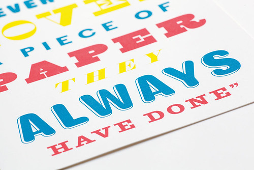
The biggest flourish in the book is the incorporation of six tipped-in cards which demonstrate the Baddeley Brothers’ services. (The main text pages were printed litho at Pureprint.) Each features a quote from the chapter it appears in; they are set by Pearson in a number of different display typefaces from Commercial Type – embossed, foil-blocked, stamped, and so on.
Work on 400gsm Ivory board chapter divider cards to be tipped into page 67 of Baddeley Brothers. When finished, each card will be die-stamped / engraved with the words: ‘Everyone loves a piece of paper, they always have done,’ a quote from director Chris Pertwee.
Regular Spitalfields Life collaborator Adam Dant supplies a hand-drawn map of Baddeley Brothers’ various premises (their early 1990s factory, lost in the recession of that time, is now the Boundary hotel and restaurant on Boundary Street, Shoreditch). A family tree shows the company’s continuity, managed by seven sets of brothers over the years, from clockmaker and engraver Phineas Baddeley, born in 1640, all the way to direct descendants Charles and Christopher Pertwee.
Baddeley Brothers stands both as a monument to a specialist business and an example of its services: it’s a coffee-table book and also a specimen that might inspire designers and publishers to experiment with the arcane techniques it incorporates. Its appeal to some will lie in the deliberately archaic look and feel, incorporating half-tones, engravings and Paul Barnes’s typefaces Caslon Doric and Caslon Sans Shaded Number 2; but Pearson’s design treads a careful line between all-out ‘retro’ and what seems appropriate for the contents. The incorporation of Lucinda Rogers’ ink drawings is a masterstroke. Her drawings of machines, tools and workers engrossed in their everyday tasks evince warm respect for the dignity of skilled manual labour. She depicts the shop floor of Baddeley Brothers’ current premises (in Bayford Street, Hackney) as something both thoroughly contemporary and timeless.
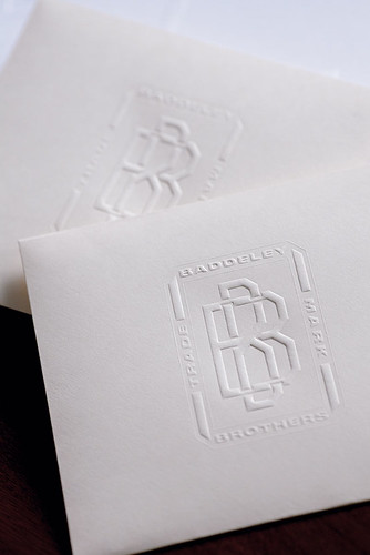
Envelopes embossed with the distinctive Baddeley Brothers marque, originally devised in the nineteenth century.
Andrew Robertson, writer, London
First published in Eye no. 91 vol. 23, 2016
Eye is the world’s most beautiful and collectable graphic design journal, published quarterly for professional designers, students and anyone interested in critical, informed writing about graphic design and visual culture. It is available from all good design bookshops and online at the Eye shop, where you can buy subscriptions, back issues and single copies of the latest issue.You can see what Eye 91 looks like at Eye before You Buy on Vimeo.