
Summer 2012
Street life
Bremen’s street magazine Die Zeitschrift der Strasse is a social project that benefits its student publishers as much as its homeless vendors. By Nick Kapica
Alternative newspapers and magazines that draw attention to poverty-related issues have been around at least since the Salvation Army began publishing The War Cry in 1879.
Cincinnati’s Hobo News, published between 1915 and 1930, featured articles from activists and radical unionists alongside oral history, creative writing and artwork from the homeless and the poor. And the 1989 publication of New York’s Street News has inspired hundreds of papers distributed in the world’s cities by homeless or unemployed vendors, including the rapidly expanding network of The Big Issue in the UK.
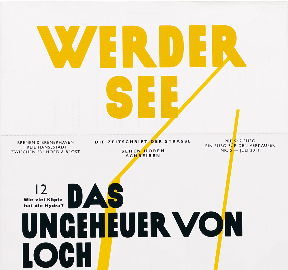
Bremen’s award-winning Die Zeitschrift der Strasse (literally, ‘The magazine of the street’) takes the best elements of its predecessors while radically ignoring the conventions of the genre.
A collaboration between Bremerhaven University and the University of the Arts, Bremen, Die Zeitschrift der Strasse is a social project, a media project and a learning project all in one. Vendors buy magazines for one euro and sell them for €2, much like street magazines elsewhere. But here the similarity ends. For one thing, this magazine is predominantly bought out of interest rather than compassion.
Photography, layout and pre-press are the responsibility of Andrea Rauschenbusch’s design students at the University of the Arts, Bremen; marketing and event planning are down to Michael Vogel’s cruise industry management students at Bremerhaven University. Students from both universities provide the editorial content, and each 48-page issue is intensely focused on a specific street or district in Bremen or Bremerhaven. The first, ‘Sielwall’, was published on 2 February 2011; issues now appear on the Bremen and Bremerhaven streets eight times a year, with a circulation of 13,000.
The student designers commit to two terms on the editorial team, where they create a self-determined working committee. Students get no course credit for this extensive commitment, but the benefits, both practical and social, are enormous. They not only learn about visual communication and responsibility, but also learn to reflect on life and their role as designers. As the Bremerhaven students responsible for the magazine’s marketing, fundraising and promotion are located about 65 km away from the editorial team in Bremen, most communication with them has to happen online, which only adds to the challenge.
The journalists, designers and photographers have realised that people such as taxi drivers, street cleaners and the homeless are often well informed about what is going on in a city, being well placed to observe what happens on the streets. Intensive observation in selected locations provides the students with a starting point for reports, interviews, essays, prose, stories, photo galleries and illustrations. In searching for the overlooked and finding unique stories, the young reporters arrive at a very specific journalism that is true to its subject.
Krana Fat, the striking headline typeface, was designed by Lauri Toikka of the Helsinki / Berlin studio Schick Toikka. Rauschenbusch describes the typeface as neither beautiful nor ugly but ‘rather eye-catching’. With a visual vernacular associated with protest and agitprop, the headlines have a stand-offish, aggressive tone, which is calmed by the use of friendly Gill Sans for the body copy. The designers have avoided the potential ‘Britishness’ of Gill Sans by combining it with an extended Akzidenz Grotesk. The peculiar trio of faces seem somehow to accept each other without necessarily feeling comfortable together: this could also be taken as a reflection of the locations, the protagonists and the readers.
The pages have a distinct grid, which could have been used in a rigid fashion to lock the typography down; but a sense of randomness creeps in through the combination of ranged left and centred typography, as if reminding the reader that we are dealing with the street here, diverse people with their own personal problems and needs. It is not chaotic but also not completely under control. The choice of fonts and idiosyncratic layout give the impression of intentionally irritating, teasing and challenging conventional ways of seeing and thinking. This makes the reading and digesting of the articles a total experience.
The unusual portrait format – 174 mm x 327 mm – has little in common with conventional magazines. The top quarter of each page includes notes on locations and sources – what might be called footnotes – printed at right angles to the body text.
The magazine is perforated so that this top portion can be torn off, leaving the articles to stand alone. The separated notebook becomes, in effect, a diary of the observations that have informed the issue and provides intriguing reading in its own right.
There is a clear programme defining this magazine: co-operation, participation and forced changes of perspective. The visual design establishes its own character: clever journalism translated into clear typography combined with photography that is local, young and contemporary – simultaneously dynamic and focused.
In its brief life, Die Zeitschrift der Strasse has attracted some serious international acclaim: a top ten place in the German interdisciplinary design competition Generation-D (which promotes ideas for projects and initiatives related to employment, economy, environment, education, culture and society); a certificate of excellence in the ISTD International Awards 2011 from the International Society of Typographers; and, at the 2012 TDC Type Directors Club awards, a certificate of typographic excellence, a Best of Show award and Judge’s Choice from Eric Strohl for the ‘Tenever’ issue.
While not achieving the turnover of magazines such as The Big Issue – which in its heyday in 1999 was selling nearly 300,000 copies a week – Die Zeitschrift der Strasse has achieved its own remarkable success. The magazine is bringing students together for a real life experience, it is offering quality journalism and, through good design, connecting readers with real stories.
Bringing citizens closer to their city and its various neighbourhoods, Die Zeitschrift der Strasse contributes to the community and encourages new dialogue. It offers reality, locality and vitality – a refreshing contrast to the dull image of street newspapers bought as a sop to social conscience.
First published in Eye no. 83 vol. 21 2012
Eye is the world’s most beautiful and collectable graphic design journal, published quarterly for professional designers, students and anyone interested in critical, informed writing about graphic design and visual culture. It is available from all good design bookshops and online at the Eye shop, where you can buy subscriptions, back issues and single copies of the latest issue. You can also browse visual samples of recent issues at Eye before You Buy.