
Summer 2016
Take my concept
Boris Bućan’s early posters display an audacity that challenges divisions between graphic design and fine art
Whether we approach Boris Bućan’s posters from the perspective of poster history or graphic design history, his body of work is a special case. The poster, more than any other form of graphic design practice, has always been poised at the interface between design and art, and the term ‘commercial art’, used for several decades before ‘graphic design’ became the norm, makes this explicit. With the shift to graphic design as the preferred term to describe graphic communication, the issue became more problematic. Are the highly expressive film and theatre posters created in Poland or Czechoslovakia in the 1960s the work of individuals we should call poster artists or poster designers? Are such posters art or design, or a mixture of the two activities?
Bućan’s cultural posters, created in Zagreb from the late 1960s, pose the question in a particularly concentrated form. After more than two decades of commitment to making posters as though they were artworks, with periodic side trips into the art world, he abandoned the medium in the early 1990s because the opportunities were drying up and became a full time artist. His Bućan Art series of paintings from 1972 transforming corporate logos – IBM, Coca-Cola, Swissair – into the word ‘art’ was one of the highlights of ‘The World Goes Pop’ exhibition at Tate Modern in 2015. Now in his late sixties, a daunting and uncompromising figure, Bućan is a prolific painter with an unswerving sense of purpose and he puts on many exhibitions. International recognition of his place in Pop has added to his standing in Croatia. In April, the opening of a huge retrospective devoted to his posters at the Museum of Contemporary Art in Zagreb drew an exceptionally large turnout for the gallery. Exhibitions on this scale devoted to single designers are unheard of in London and the show was stunning.
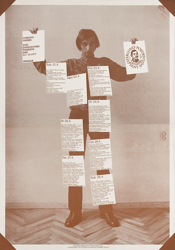
18th Yugoslav Theatre Festival, silkscreen, Sterijino pozorje, Novi Sad, 1973. Photograph: Željko Stojanović. A line at the bottom of the picture reads: ‘The designer photographed in his room, 1973’. The man acting as display stand for the programme is Bućan himself.
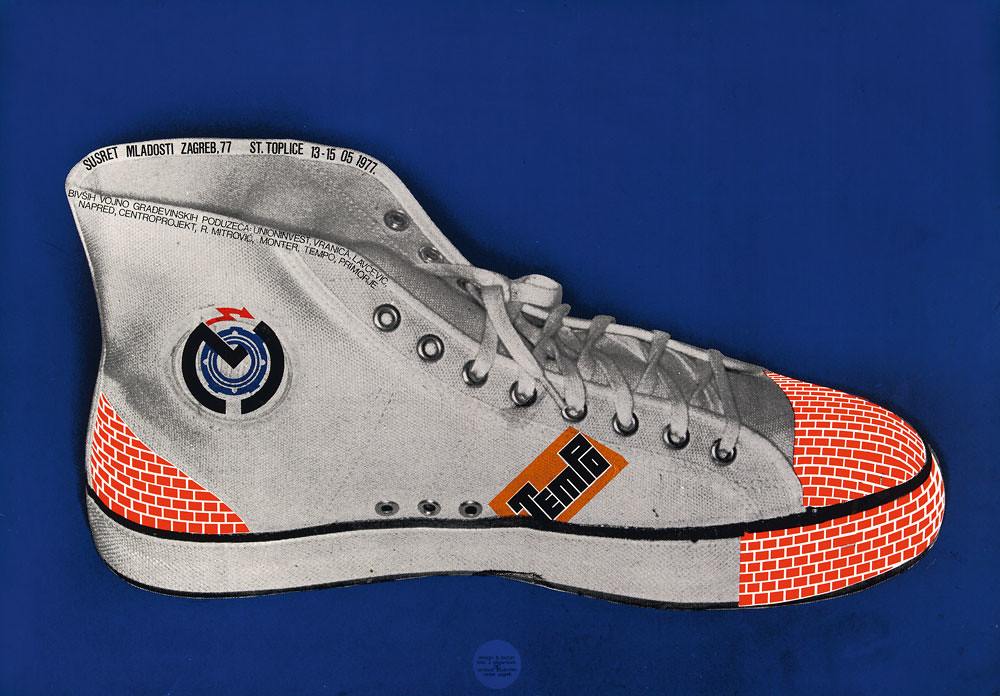
Top: Zagreb Youth Meeting ’77, silkscreen, 1977. In a poster for a youth organisation, Bućan combines an item of footwear favoured by the young with a graphic reference – the brick pattern – to the local construction industry.
I first saw Bućan’s early work in 2002 at an exhibition at the Student Centre Gallery in Zagreb. It was my first visit to Croatia and he was largely unknown to me. I thought the posters, made in the late 1960s and early 1970s (when the country was still Yugoslavia), were remarkable. Bućan’s highly original images proposed a direction that hadn’t been explored anything like as thoroughly elsewhere. Few, if any, poster designs of a comparable nature were produced at that time in Europe and America. Created when he was in his twenties, these works had barely dated, and seemed to anticipate conceptual trends then emerging in international graphic design.
Elsewhere in Europe, the early 1970s were not an especially propitious time for the poster, as Wim Crouwel, subject of one of Bućan’s exhibition posters, later noted: ‘As a medium with which to praise or promote, the poster had lost its credibility … It had found itself in a rut. People had more faith in advertisements and probably also in television commercials.’ This was certainly true in the UK where posters of any kind had become progressively less central to communication and culture, despite a brief period of rebirth in 1967 in the countercultural posters produced by the rock scene. Bućan’s work looked nothing like those psychedelic effusions glorifying the liberating impact of music and drugs. Compared to their explosions of shape and colour, almost everything in his 2002 retrospective appeared to represent a previously unsuspected genre of conceptual design.
When he began designing posters, Bućan seems to have had little acquaintance with what was happening in graphic design in Yugoslavia or internationally. The discipline did not particularly interest him and he was far more engaged by the art scene. A poster design course he took at the School of Applied Art in Zagreb, graduating in 1967, provided him with nothing he could use. In early posters for the Student Centre Gallery, such as ‘Imaginary Museum 3’ (1968) and pieces for the artists Dalibor Martinis (1969), Sanja Iveković, Zmago Jeraj and Group B-1 (all from 1970), Bućan smuggled in visual ideas borrowed from Pop art and minimal art, although he says today that he knew little about minimal art when he designed ‘Imaginary Museum’, which he punched with holes to introduce a third dimension to the image. The posters are enigmatically reductive to a degree that still looks audacious and they rely on a visually educated audience responding to visual cues that refer only obliquely to the art being advertised. In Bućan’s view, a poster that reproduces an example of the artist’s art, which is what often happens with exhibition posters, is not a poster at all. A poster must be a work in its own right, a free interpretation, and should contain elements designed specifically for it. From the outset, he regarded the poster as an artwork, irrespective of its purpose, rather than as a piece of applied art.
In the poster for Martinis, Bućan devises an internal frame that presents an image of pure white nothingness where we expect the image to be. People asked him why he didn’t draw something in the space, but neither the client nor the artist objected to the void. In retrospect, he thinks he was able to make incursions into uncharted territory because, apart from some artists, nobody paid much attention to what was going on in the relatively undeveloped field of design. His clients at the Student Centre Gallery were the same age and gave him carte blanche. Only the Gavella Theatre in Zagreb required much discussion. Bućan enjoyed a freedom that designers were rarely granted once marketing considerations became paramount in later decades.
In such a climate, it would have been possible to continue making highly reductive posters, but Bućan’s restlessness and need to try out new ideas would not permit this. By 1973, the linear constructions of the early posters had been superseded by a more conceptual approach, which could be either verbal or photographic. If developments on the Yugoslavian conceptual art scene were notionally at least his inspiration, Bućan has subsequently expressed scepticism about this dominant area of art and later, working as an artist, he would leave it far behind. In a poster for the fifth Salon in Split, Bućan presented the client, Tonko Simonelli, with a diagrammatic rendition of the poster commissioning process, which reveals that Milton Glaser had been too expensive to undertake the job, Wim Crouwel couldn’t be bothered and Yugoslavian designer Ivan Picelj was otherwise engaged. Bućan has an idea, represented by a wavy line becoming solid, and this idea is ‘gold’ – the colour of the poster. Simonelli was horrified by this graphic explicitness about the poster’s origination and refused to pay Bućan, who never found out whether the printed pieces were used in Split, though it seems unlikely.
In 1975, his concept for two posters for Teatar&TD in Zagreb was similarly extreme, summarising the productions with the words ‘Male poster’ (on a black background) and ‘Female poster’ (on pink). The client regarded this as a slap in the face and it was the last time Bućan worked for the theatre. He took the view that he wouldn’t tell a director how to direct a play so the director shouldn’t tell him how to design a poster. If his ideas were not accepted, then he would refuse the job. He was only prepared to compromise where the essence of his concept would be preserved.
Bućan’s conceptual posters were more often based on photographs and he worked regularly with the photographer Željko Stojanović to visualise his ideas. In a 1973 poster for an exhibition of Stojanović’s work at the Student Centre Gallery, the photographer’s manhood becomes a camera stuffed down the front of his trousers, a Warholian image of creative potency very much of its time. Bućan’s poster for an exhibition of graphic design by his colleague Mihajlo Arsovski, in 1972, spotlights the haphazard conditions in which even the best posters reached the public by showing an Ozehu advertising frame in Zagreb plastered with mediocre offerings by other designers, though nothing by Arsovski. Bućan says now that this was merely because there were no posters by Arsovski present on the day the frame was photographed.
20th International Equestrian Events, silkscreen, Zagreb Equestrian Club, 1975. In two posters for annual riding events, Bućan is seen at his most visually disruptive.
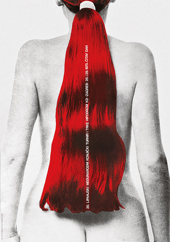
Here, again, we notice the conditions of exceptional conceptual and aesthetic freedom from which Bućan benefited; even a fellow designer tolerates being left out of an image promoting his own show. Bućan took still greater liberties with two posters for Equestrian Club events in Zagreb in 1975 and 1976. In the first, based on his sketch for the photographer, a naked woman wearing an artificially coloured pony-tail wig stands in for the horse that the organiser (and perhaps also the public) might reasonably have expected. The poster looks more like an ad for a hair product. The following year, instead of the horse and rider the client hoped to see, Bućan supplied a horse’s hindquarters coloured by silkscreen to look like the beast is sporting a pair of blue jeans. He readily admits that he sometimes worked against the wishes of the commissioner because he felt that clients should be brought down to earth and not held in such high regard by designers who thought of themselves merely as service providers.
In a number of posters, Bućan makes explicit reference to himself and his own agency as poster designer. In 1973, in a series of four photographic pieces for Sterijino Theatre in Novi Sad, he stands before us, like a kind of Saint Sebastian of the design studio, holding up the pages of the theatre programme, with other sheets attached to the length of his body in place of the martyr’s arrows. A caption at the bottom informs viewers that they are contemplating: ‘The designer photographed in his room.’ In Novi Sad, no one would have known who this man was and it amused Bućan to sell an image of himself to the client. Posters were his life and the self-portrait was a sign of his total investment in the task. In a poster for an exhibition of his work in Germany, he pictures himself striding along a street in a pinstripe suit, and the placement of coloured lines of twisting type over his face, like a kind of floating tattoo, makes the poster more personal and even confessional in mood.
Elsewhere, because it pleased him to do so, he presented a picture of a seated woman in a jumper, with the explanation ‘I made this exhibition for my girlfriend’ curving like a bracelet around her arm. Bućan’s name, picked out in red, slants across her lips: a kind of kiss. Today, we might take the display of intimacy for granted, but in the 1970s, self-referential gestures were not at all usual within design.
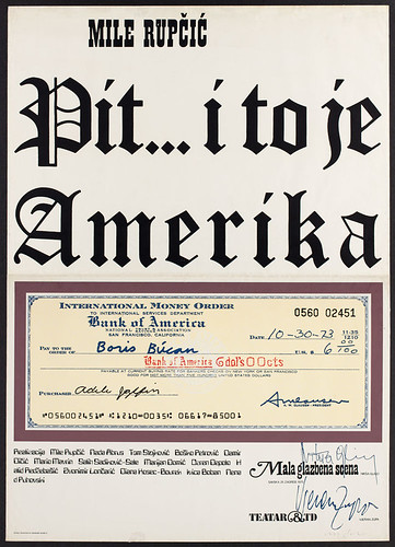
In a series of posters for the Gavella Theatre, using found images of a man snorkelling, Japanese sumo wrestlers and Frank Sinatra, Bućan includes a statement frankly admitting, ‘The poster was made for another show.’ Again, the designer inserts himself between the viewer and the ostensible subject of the poster to remind us that he is present at all times controlling the levers of the communication process. The demystification can even extend to his finances. A cheque for six dollars that he received in the US in return for three posters dominates a poster made in 1975 for Teatar&TD. If Hitchcock could insert self-referential gestures into his films, then Bućan felt free to do the same. He was the creator of the posters and he was never shy about asserting this ownership. These interventions also made it clear that Bućan’s poster designs should be understood as works of art in which he was responsible for every detail. The more the posters depart from the standard procedures and restrictions that designers observe (and that audiences might come to expect) the more they draw attention to themselves as autonomous creations.
Pit … and that’s America, silkscreen, Music Stage Zagreb, 1975. Bućan illustrates a poster for a production based on a well known Yugoslavian song with a personal cheque from America.
For Bućan, the image comes first and type is always a secondary consideration. There is often a feeling in his work that he would like to dispense with typography entirely. He made the type as small as possible to give more space to the image and he paid no attention when clients thought it should be the main element. He employed Helvetica in the early years because the typeface was in widespread use then in Yugoslavia (and worldwide), rather than because he wanted to signal an attachment to the modernism of the International Style. Examined closely, the particulars of type placement and spacing are not as well resolved in his designs as they are in classic Swiss typography; such finesse was never Bućan’s concern. The cavalier treatment of visual detail aligns him with conceptual artists for whom execution was always subordinate to concept.
In the 1980s, he eventually resolved the problem of type by pushing it out to the edges of enormous multi-sheet posters and treating it as a picture frame around the central image. Outside Croatia, the best known example is his vibrantly optical poster from 1983 for Stravinsky’s ballets The Firebird and Petrushka, which was shown in the V&A’s ‘The Power of the Poster’ exhibition in 1998 and used on the cover of the catalogue. When Bućan employed type as a principal device in an early poster, it was because he had devised a novel concept or interpretation that happened to be based on type and not because he felt any commitment to type as a thing of beauty in its own right. In a 1971 poster for the Gavella Theatre, Bućan turned the word ‘Balthazar’ into ‘conqueror’, line by line, with a series of typographic operations. The essential point here is transformation and not the typographic material being transformed. Created around the same time, the ‘Ball of wool’ poster, with its neat columns of type and red ‘o’ formed with a circle extracted from the main disc, might feel like the work of a more purist designer. But for Bućan, this was doubtless less a matter of designer-like fascination with the abstractions of geometry than an interest in the way a matching fragment can be pressed into use and recycled as a letterform.
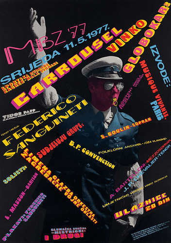
When Bućan designed a series of exhibition posters for the Student Centre Gallery based on numbering, he adopted an extreme position as usual and treated the exhibition number as the primary element, arguing that this alone should be enough to stimulate the viewer’s interest. No gallery would consent to that now. In his attempts, later in the 1970s, to integrate type into the image Bućan sometimes interprets the task literally, forcing the letterforms to become three-dimensional components of the picture. In 1977, in another untypical work – in an oeuvre full of untypical works – for the Music Biennale in Zagreb, Bućan surrounds the gesticulating pink-faced ‘conductor’ (in reality a policeman) with a garish cacophony of typefaces intended to represent the sounds of different orchestras.
As so often with Bućan, there is an element of humour in this image, as well as enough visual implications to sustain a series of experiments by a less multidimensional designer. He moved on, however. A more profound change of direction, hinted at by the Music Biennale poster’s dense, tangled and richly hued surface, was just around the corner. When we look at the later trajectory of Bućan’s career, both the posters-as-art and the fine art practice, it may seem surprising that such a driven and exuberant creative personality was able to confine himself to reductive and conceptually determined visual gestures for so long. By the late 1970s, Bućan’s posters are less decisive in their variety, as though he is seeking a way out of a territory he has fully explored. He soon found a new direction, creating in the 1980s a set of posters unique in the later history of the medium, as his retrospective reaffirmed. The works for the street in this second phase as a poster artist frequently equal the pictorial invention, complexity of composition, sophistication of palette, allusiveness and emotional drama of large paintings. If Bućan’s mature achievements are widely appreciated now, that shouldn’t obscure the fact that his early posters comprise a notable body of work, located between art and design, with enduring lessons for anyone seeking to investigate the full potential of graphic thinking.
MBZ ’77: Vinko Globokar – Carrousel, silkscreen, Music Biennale Zagreb, 1977. With his customary versatility, Bućan responds to the music of the French- Yugoslavian composer, conductor and trombonist with a jangling polyphonic typography not usually seen in his work.
Rick Poynor, writer, founder of Eye, London
First published in Eye no. 92 vol. 23, 2016
Eye is the world’s most beautiful and collectable graphic design journal, published quarterly for professional designers, students and anyone interested in critical, informed writing about graphic design and visual culture. It is available from all good design bookshops and online at the Eye shop, where you can buy subscriptions and single issues. You can see what Eye 92 looks like at Eye before You Buy on Vimeo.