
Winter 2016
The men who fell to earth
In three turbulent years, from 1968-71, the illustration and design supergroup Bentley / Farrell / Burnett helped to define the look of the time
It is the summer of 1968, and a young woman called Valerie Watson is rushing to an interview. Just 21 and a recent graduate of Harrow School of Art, she had noticed a small ad – for a paste-up artist-come-general assistant – in the evening paper. Hurrying through the entrance arch to London Mews, Paddington, she arrives at number 17 and is confronted by large double doors painted bright canary yellow. As she enters, the orchestral crescendo from The Beatles’ ‘A Day In The Life’ blasts from behind a screen.
Three young men are sitting at drawing desks: two to the right, one to the left. Framed on the back wall is a large poster of the classic 1950s Start-rite shoe advertisement featuring two young children walking down a tree-lined avenue with the slogan: ‘Children’s shoes have far to go!’.
The trio comprises Peter Bentley, Michael Farrell and Stewart Burnett. They have been together as a unit for a matter of months and are now in need of their first assistant. After an extremely short interview, Watson is offered the job. She quickly realises that she will not be doing much assisting, apart from covering finished artwork, delivering to clients and getting in sandwiches. But she loves the laid-back atmosphere, the endless music and she is in awe of the collective talent, the three artists huddled over their drawing boards, obsessing with detail, all very possessive of their work. Watson stays with them for two of their three years in existence. BFB will make a huge impact on the British design scene, but they become a graphic shooting star – burning brightly, then fragmenting and fading away.
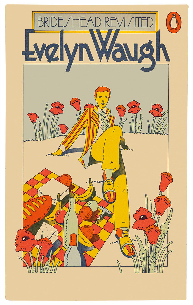
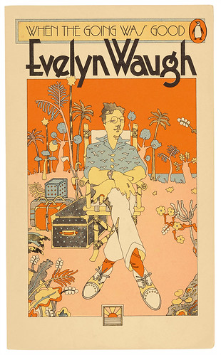
Right and top. Series design for the novels of Evelyn Waugh, 1971. These were the sole domain of Peter Bentley who continued post-BFB.


Early days
Bentley and Burnett had both attended Bradford College in the late 1950s, where they studied three-dimensional design, textiles and commercial art, as it was then called. On graduation in 1960, they went their separate ways. Burnett was at the Royal College of Art for a while but dropped out due to lack of money, and found his way into the world of product and exhibition design. Meanwhile, Bentley spent three years in away from the UK, in Canada and the United States. On his return in 1966, he met up with Burnett again, and they set off for a three-month sojourn in the south of France. Back in London, they worked together and eventually formed Bentley/Burnett. An early project was for Bosies: a fashion boutique near Savile Row; they designed the interior and graphic identity. (A poster later earned them a D&AD Silver Award.)
Michael Farrell was slightly younger and self-taught, and for a time he was a messenger at the advertising agency Collett Dickenson and Pearce. At CDP he met Michael Wade, with whom he formed a short-lived partnership called Farrell/Wade. Farrell ran into Bentley and Burnett, whom he had met a few years earlier, and after a lively discussion about the state of British graphics, Farrell became the third partner: Bentley/Farrell/Burnett (BFB) was born.
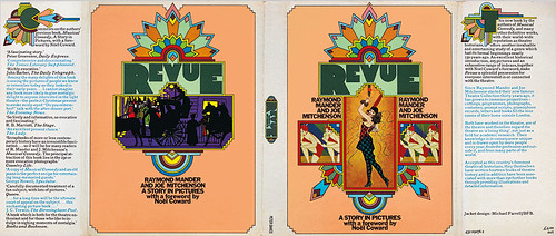
Revue (William Heinemann, 1968), designed and illustrated by Michael Farrell. Art director Mike Dempsey (the author of this article). BFB always insisted on designing every aspect of the jacket, including the inner flaps – all for the handsome fee of 30 guineas (about £450 today).
This was a remarkable time: David Bailey and Terence Donovan were using lightweight 35mm SLR cameras to shoot fashion on the streets. The influential trio of Binder, Edwards & Vaughan had made a name for themselves painting psychedelic shop-front murals (Lord John in Carnaby Street) and painting car bodies in wild designs; their clients included The Beatles, Eric Clapton, The Kinks and photographer Lord Snowdon. Alan Aldridge (see Eye 57) was shaking up Penguin Books, and painting directly onto naked bodies. Fashion, art, cinema and music were in flux. In 1966, Time magazine had described the emergence of this heady creative mix as ‘Swinging London’.
Poster for Bosies, a trendy fashion boutique of the era, 1969. Designed by Peter Bentley, it won a 1969 D&AD Silver Award.

When a travelling exhibition of the work of New York-based Push Pin Studios arrived in London, London’s graphic designers and illustrators flocked to see it. I was one of them – it was a revelation. The sheer inventiveness was staggering in comparison to the sedate Modernism de rigueur in Britain at the time. Everyone left that exhibition at Reed House on Piccadilly supercharged with creative energy and with change in their hearts. The influence of Push Pin ran through British graphics like a virus: the chasm between the old, ranged-left brigade and the new, grid-liberated guard widened. Designer-illustrators such as John Gorham, Tony Meeuwissen (see Eye 89), Michael English (Eye 42), George Hardie, Philip Castle, Adrian George, Alan Cracknell, Justin Todd and Aldridge saw their stock rise. As the new kids on the block, BFB soon joined this elite arena.
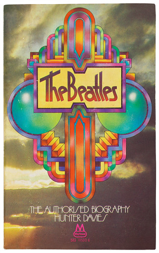
BFB’s design for the Mayflower paperback edition of Hunter Davies’ The Beatles in 1969. This shows their prowess with the airbrush, and makes a connection with the original hardback jacket of a year earlier, designed by Alan Aldridge.
Though equally credited on the BFB projects, the three men worked separately for their own clients, but split their income equally. They shared the same passion for craft and, as with the designers and illustrators mentioned above, all physically produced their own artworks, as the style of the period was often extremely intricate and colourful. Both rough designs and final artwork took many hours of airbrushing, hand lettering and an array of type overlay separations, plus a detailed mark-up for the repo house and printer. (All of this can now be done in a fraction of the time on a laptop without a scalpel cut, or a piece of repro stuck to your shirt.) The ‘less is more’ Swiss-inspired design of the time was out, and ‘more is more’ was definitely in.
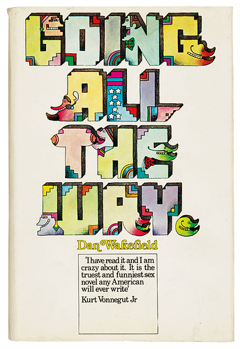
Book jacket for Going All the Way (Weidenfeld & Nicholson, 1970). Art director: John Curtis. An example of Peter Bentley’s illustration work. One can see a resemblance to the look of Heinz Edelmann’s Yellow Submarine, still very much in fashion at the time.
Of the three, Michael Farrell was always immaculately turned out. I recall him coming to my office when I worked as art director for publishers William Heinemann in Mayfair. Standing at 6' 3", Farrell was sartorially stunning, sporting a double-breasted deep blue velvet suit with flares, handmade boots, a tight-fitting waisted cheesecloth shirt and a large knotted tie, along with shoulder-length hair and a Zapata moustache and an ever-present pack of Gitanes.
Farrell was the only one of the trio that I met. Among many designers I commissioned at the time, BFB were the first to insist on designing a book cover from flap to flap. This involved them putting in a lot of extra work, for which there was no additional money. But they were so obsessive about having control over every square inch of the book jacket that they would go that extra mile.
Cinema 1 series for Secker & Warburg, 1969. The styling was originally designed by Michael Farrell prior to joining BFB, where he continued with the same style. It reflects a more minimal structured approach in comparison to the flamboyancy that helped define BFB.

Peter Bentley had a regular flow of work for Penguin Books via the publisher’s equally talented art director David Pelham. Bentley’s beautiful series of covers for the novels of Evelyn Waugh stands up today. Farrell’s Cinema 1 series for Secker & Warburg is surprisingly un-BFB; with simple typography and well chosen, dramatically cropped film stills, it looks remarkably fresh.
When Valerie Watson went on summer holiday, she brought in a friend, Gilly Vogler, to cover for her. Within a month, Farrell and Vogler became a couple. They moved in together. Richard Evans, a client, recalls visiting them at their Notting Hill flat and being overwhelmed by the fabulous interior and their Old English sheepdog, Bow Wow. Each room was painted a different colour, with one being a deep burgundy with a pink velvet chesterfield and an egg-shaped television. In the corner of the room stood a large church statue of the Virgin Mary, complete with candles. Evans had commissioned Farrell to design the identity for his shoe company Daisy Roots. Located in Beauchamp Place, London, it sold trendy, multi-coloured platform boots. (The resulting identity featured in the 1972 D&AD annual, picking up a Silver Award.)
Two examples of BFB’s beautiful book covers for Macmillan, 1968. Art director Nicholas Thirkell.


Stewart Burnett’s areas were three-dimensional and exhibition work, and the latter was the perfect vehicle for the trio, with the graphic aspect being carried out by Bentley and Farrell. Burnett also spent a lot of time working on a speculative project to create a beautiful chess set.
The first two years saw plenty of work coming through the door, and the results of their labour popping up everywhere, from Radio Times and Design magazine covers to advertising posters and exhibitions for the GPO. But the publishing world remained their biggest outlet. The nature of their work and production methods was very time-consuming, so the company was not very profitable. Along with the studio overheads, this started to become a concern. They hired a new business manager in an attempt to turn things around, but when partnerships divide their income equally, there comes a time when one or more feels that they are carrying the others. With money running out, they folded the company in 1971, when it was just three years old.
Come Dancing Finals. A hand- tinted photograph, Art Deco ornamentation and illustration collide in Bentley’s kaleidoscopic cover for the weekly Radio Times, 16 April 1970. Art director: David Driver.

After BFB
Farrell worked freelance with a succession of colleagues, including his girlfriend Vogler (who had formed her own company, Tarts n’ Bows) and designer Keith Davis. Michael Wade and Graham Berney joined to form Davis/Berney/Wade/Farrell and they moved to Covent Garden, in a building that also provided short-lease studio space to designers such as Rodney Kinsman, Ken Carroll, John Gorham and John McConnell (see Eye 81).
When the Covent Garden market closed in 1974, the property vultures started to circle and everyone began to go their separate ways. Within a few years Davis, Wade and Farrell had moved to Australia, and in 1979 Farrell and Davis again joined forces as Davis/Farrell Design Consultants. They purchased an old hat factory building in Surry Hills and both had houses in the sought-after Paddington area of Sydney. But Farrell had always had deafness issues, a result of a childhood perforated ear drum, and would not use a hearing aid. This could cause serious issues with client briefings. Davis recalled many examples, including one problem (on a very big project) where a catastrophic mistake occurred due to Farrell mishearing vital information.
The World of Art Deco. Catalogue cover for the Minneapolis Institute of Arts, 1971.

Shortly after this, in 1988, Farrell left the company. Farrell continued alone, until an accidental fall resulted in a brain haemorrhage that plunged him into a coma. Doctors considered removing his life support after a year, but Farrell suddenly woke up. Wheelchair-bound, he was unable to work, his only solace cigarettes and alcohol. He came back to London in 1995, and he was helped by Vogler, who was shocked to see the once-dashing Farrell – the love of her life – reduced to a shadow of his former self. But Farrell soon returned to Australia, where he lived alone in a small flat. He died in 1996 after an epileptic fit. A tragic end to an amazing talent.
Following the BFB breakup in 1971, Stewart Burnett started a company called Air City Limited, for which Peter Bentley created the graphics. The company designed an indoor, air-supported structure for the Advertising Associations Conference in Brighton and an outdoor, reusable discotheque. As work became thin on the ground, Burnett moved to the US with his girlfriend, but the economy was no better, and they were obliged to work waiting tables, as short order cooks and delivering cars. They found a place to rent in Miami Beach, but were soon robbed of everything – including Burnett’s portfolio and cameras – by a local drug addict. Some time after this, they were arrested for working illegally in the United States and ordered to leave the country. They arrived back at Heathrow Airport wearing their Miami Beach clothes.
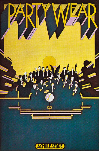
The laundry company Achille Serre (established 1870) turned to BFB for a new identity to mark their centenary. Shown here are examples of letterhead and livery, along with one from a series of promotional posters, 1971. Sadly the company folded around the same time as BFB.


Penniless, Burnett phoned Richard Negus of Negus & Sharland (later to become Negus & Negus) to see if there was any possibility of work. Negus was planning an office move and asked Burnett to take care of the project for him. Burnett continued to work at Negus & Negus on a large range of projects, including the corporate identity for British Airways. He eventually became a junior partner and stayed for eleven years until 1984, when he left to go solo before retiring in 2012.
Design meteorites
The last of the trio, Peter Bentley, freelanced and continued to design and illustrate for Penguin Books. Then, in 1974, he was invited to share space at NTA, the studio founded by Nicholas Thirkell, who had left the previous year to spend time in India. At the time, it was based in Earlham Street in Covent Garden. Here, Bentley briefly worked alongside the formidable talents of George Hardie (see Eye 58), Bush Hollyhead, Malcolm Harrison and Bob Lawrie.
Identity by Michael Farrell for Daisy Roots (cockney rhyming slang for boots), an early bespoke shoe company owned by Richard Evans specialising in the platform look that was to dominate the pop fashion scene during the 1970s.

George Hardie, in his gentlemanly fashion, produced a mailer to welcome Bentley’s arrival at NTA. However, the honeymoon period was short-lived as tensions brewed between Lawrie and Bentley. For reasons that still puzzle Lawrie, who regarded Bentley as a friend, the latter started working in a style (with distinctive zig-zag shadow) that Lawrie thought was copied from his own work. After some discussion, Bentley was asked to leave.
Post-BFB, Peter Bentley joined Nicholas Thirkell Associates (NTA) in 1974, and designed his own announcement card. Bentley’s time at NTA was short-lived.

Bentley continued to design book covers and eventually moved to Wales, apparently to take up carpentry. There were rumours that he then moved to Skiathos, the Greek island, but little more is yet known about him.
BFB were graphic design meteorites, burning brightly for a short time. But they left behind a remarkable, head-turning body of work, echoes of which are now surfacing in generations of designer-illustrators for whom the late 1960s is a distant dream.
Mike Dempsey, graphic designer, writer, blogger, broadcaster, London and Dorset
First published in Eye no. 93 vol. 24, 2017
Eye is the world’s most beautiful and collectable graphic design journal, published quarterly for professional designers, students and anyone interested in critical, informed writing about graphic design and visual culture. It is available from all good design bookshops and online at the Eye shop, where you can buy subscriptions, back issues and single copies of the latest issue. You can see what Eye 93 looks like at Eye before You Buy on Vimeo.