
Opinion
Agenda,
Paul Stiff
Postmodern typography sees the reader as an idler in need of short sharp shocks. But is reading really so passive a process?
Features
Erik Spiekermann
“Type design had been seen as a brave but arcane business that requires a lifetime’s dedication. I’m happy that notion has gone”
Michael Horsham, Rian Hughes
The comic book speech bubble has evolved into a highly expressive form of vernacular lettering
Freda Sack, David Quay
Architype is a new series of Modernist typefaces. Is their reissue as simple as it sounds?
John Belknap
Well dressed magazines wear tailor-made fonts. Eye talks to three of the most sought-after names
Jeffery Keedy
The director of graphic design at California Institute of the Arts challenges received wisdom and offers some ‘rules’ of his own
Rick Poynor
Fuel is a magazine, a design team, and a four letter word. Their style is tough, but ambiguous, too
Abbott Miller
In post-war art the visual and the literary have blurred. Typography is the point at which they meet
Robin Kinross
The work of Dutch designer Karel Martens is rooted in materials rather than the ravishing image
Rick Poynor
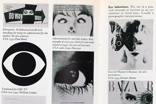
Philip Thompson and Peter Davenport’s visual analysis of the graphic cliche is a design classic
Robin Kinross
Doing up typefaces is not like doing up buildings – more like re-creating the parts from which buildings can be made