
Opinion

Typography,
Editorial,
John L. Walters
When you visit St Bride Printing Library in London, or the living archive that is…

Critique / Photography,
Rick Poynor
Photographs by the Polish designer Wojciech Zamecznik investigate the use of posters as public communication By Rick Poynor
Features

Sarah Snaith
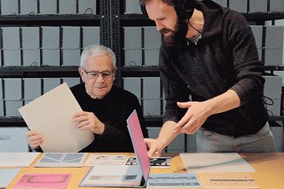
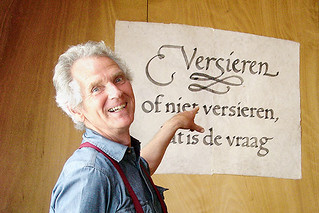
Rubén Fontana devised a system for teaching typography that is grounded in Argentina’s culture and politics

Katie Evans, Gabriela Matuszyk
Podcasts deliver a mini-conference to the smartphone in your pocket
John L. Walters
Working against the clock, with virtually no budget, Greg Durrell made a design documentary that shows how European immigrants created Canada’s visual identity

Jan Middendorp
The fragmentation of the type market has led to new ways of examining, acquiring and enjoying typefaces … and some confusion
Sarah Snaith
The challenges of earning a living from type design, with honest, thoughtful responses from foundries worldwide

Peter Bil'ak
It may be unrealistic to expect that every new typeface will be unique and original, but giving up this ambition leads to stagnation

Silvia Sfligiotti
Like a human algorithm, Hansje van Halem explores a huge number of variables until she finds the right ‘recipe’ for each project

Elizabeth Resnick
This young designer is credited with introducing Swiss typography to MIT

John L. Walters
A chance discovery by some builders led to the adaptation and expansion of a 1930s alphabet by one of Switzerland’s foremost designers

John L. Walters
Drawing on the punches, matrices, specimens and smoke proofs at St Bride Library, Commercial Classics give nineteenth-century typefaces a new lease of life. By John L. Walters

Ferdinand P. Ulrich
Rainer Gerstenberg is one of the few people in the world to cast foundry type, keeping alive a craft that was developed more than half a millennium ago
Mark Thomson
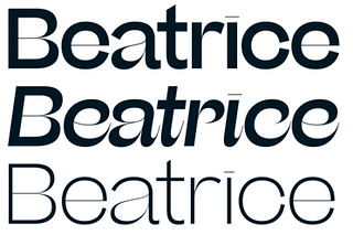
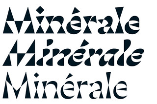
An insistence that technology should match design spurred typographer Bram de Does to create two of the twentieth century’s most beautiful types
Rick Poynor
A two-volume book packed with graphic design history is a visual blockbuster, but does little for scholarship. By Rick Poynor