Spring 2001
Editorial Eye 39
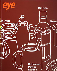
An old German saying claims that the Devil hides in the details. Most designers, aligning themselves with the angels, would sooner quote Mies van der Rohe’s ‘God is in the details’. It would make a good slogan for GTF, our Reputations interviewees, given their concern for the minutiae of design. This is the first issue of Eye in which that regular feature has dealt with a partnership rather than an individual (though iD’s Tricia Jones made a brief appearance with Terry Jones in Eye no. 29 vol. 8), and our conversation with the British practice yielded a plethora of details: collaborators and clients, printing and paper and the endless technicalities of exhibition design. For GTF, technology means lenticulars and embossing methods as much as computer hardware and software.
Yet for most practices, high-tech is about the new skills and ideas needed to deal with the demands of the bubbling market for spectacular websites. The screengrabs we found (pp.70-77) are snapshots of the ways this new visual culture is growing up in public, when a new image can be accessed within days or minutes of the moment its creators deem it ready to go live.
This is a process that’s closer to broadcasting than publishing, and in the enclosed world of New York television and media, the two-woman practice No. 17 is playing that game with their ‘very small films’ for a variety of clients.
The cinema has had to prove that it is bigger and better than television since the 1950s (though Psycho deliberately aped the methods of low-budget TV) and the grand ‘overtures’ to several classic popular films form the central examples of Joel Karamath’s essay about film titles: food for thought for those who consider Herrmann and Bass the auteurs behind Hitchcock’s best work.
The challenges of matching vision to sound are discussed in a thoughtful essay by Jeremy Hall. The disparate images routinely chosen to accompany the most sublime music also provoke thoughts about multimedia theory, and the tests for ‘conformance’, ‘complementation’ and ‘contest’ proposed by musicologist Nicholas Cook. The Penguin covers shown in Critique seem closer to ‘contest’: images that oppose the contents. Pure music may defy literal interpretation, but it is harder to use that excuse for a 100,000-word novel.
Rian Hughes’s Agenda deals with fine art’s appropriation of commercial illustration: what one critic called ‘acts of annexation’ rather than collaboration. Perhaps artists and galleries are out of touch (and profitably so) with the everyday collaboration – the creative give and take – that film-makers, pop musicians and designers have understood for years. The ‘complex simplicity’ of this approach, rather than the old lone hero model, suits practices like GTF. As they say, there are ‘lots of bits’ in what they do, but their instinctive, assured style is expressed clearly in the way they put them all together.
First published in Eye no. 39 vol. 10, 2001
Eye is the world’s most beautiful and collectable graphic design journal, published quarterly for professional designers, students and anyone interested in critical, informed writing about graphic design and visual culture. It is available from all good design bookshops and online at the Eye shop, where you can buy subscriptions, back issues and single copies of the latest issue.