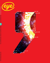
Winter 2008
Riches and embarrassment
A book of Swiss competition winners makes a virtue of its cold and awkward design. Yet if the jury seeks debate, as it claims, it must be prepared to explain its decisions. Critique by Rick Poynor
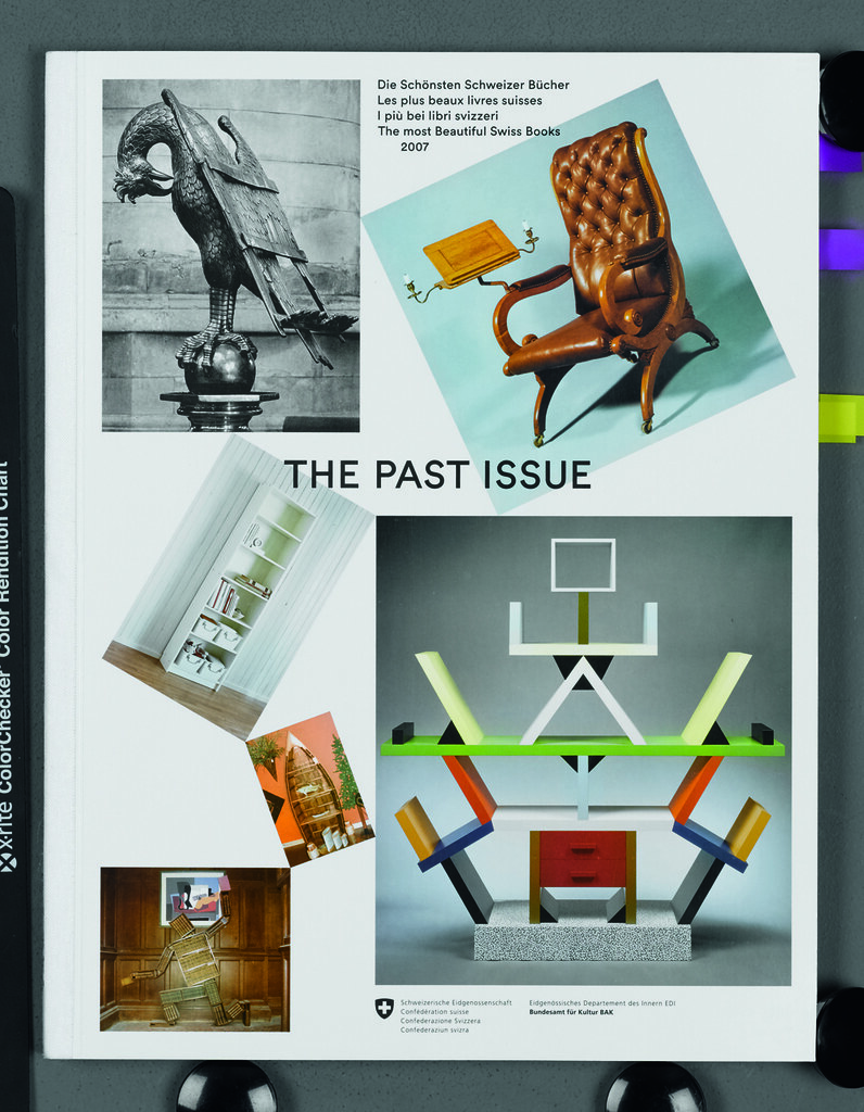
As if embarrassed by its anachronistic title, the cover of The Most Beautiful Swiss Books 2007, a record of the annual design competition, is anything but beautiful. Everything about it grates: the insipid typography, the randomly scattered ‘quirky’ photos, the unattractive cloth tape wrapped around the spine, giving the volume the look of a cheaply bound company report for limited distribution. A preliminary flip through the pages is no more rewarding. The layout certainly looks ‘Swiss’, but in the coldest, most technical and least prepossessing way.
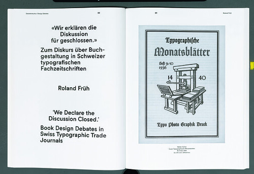
After such a shaky start, I felt little inclination to go further. What made me think again was the presence of six essays by Robin Kinross, Roland Früh and others, dealing with historical and critical issues relating to the medium of the book. There was evidently a purpose behind TMBSB’s dismissal of the tenets embodied in its name, and seen this way the book’s relationship between form and content was undeniably intriguing. As an interview with the five-person jury (chaired by Cornel Windlin) reveals, the competition, inspired by Jan Tschichold in the 1940s, is going through a period of transition. Laurenz Brunner’s design is meant to put the emphasis on ideas. Graphic Thought Facility’s Paul Neale, one of the judges, talks about ‘getting the essence of the content through the physicality and structure of the book.’
The perceptive remarks made by the jury – which also included Dutch designer Linda van Deursen – arouse keen anticipation. Windlin ends by noting the lack of serious design criticism and calls for impassioned debate. The jury selected 27 projects from 408 entries, so I hoped to hear some powerful arguments for these decisions. But on this most crucial point the book fails to follow through. The project summaries are too brief to reveal much, and often resort to gushing assurances of a design’s quality – ‘masterly achievement’, ‘immense success’, ‘unparalleled subtlety’, ‘absolutely astonishing’ – that sound more like the untested professional certainties of a bygone era than the tuned-in, ‘neo-pre-Modern’ thinking the jury interview leads us to expect.
Top: cover of The Most Beautiful Swiss Books 2007 designed by Laurenz Brunner.
Below: opening spread of an essay.
It would have been so much more revealing to hear Neale, Van Deursen or Windlin explain exactly how the structural departures of a particular book conveyed the essence of its content and why these strategies were deemed to be, in Windlin’s words, appropriate or authentic.
Another juror, Käti Robert-Durrer, mentions that they encountered some ‘terrible’ typesetting – ‘but that’s not our prime concern anymore.’ Was this encounter in work selected for TMBSB? What considerations are more important, then? If the competition wants to encourage debate, it needs to zero in on some specifics.
Here, Brunner’s own structural decisions are not an unqualified help. There are some effective ideas, such as opening with the contents-page typography of each of the selected books. (Winterhouse did it better, though, in The Next Page: Thirty Tables of Contents, by showing the edge of the page – how can we assess layout without it?) But the project photos, a recurrently troublesome feature in this kind of survey, perversely suppress the books’ special qualities. Where the covers receive a full page, with the title typography repeated opposite for no clear reason, the spreads are shown frustratingly small in irritating coloured rectangles, making it impossible to assess them fairly. The pictures transmit little sense of the books’ presence and fluency as objects, yet claims about their structural ingenuity need to be supported by sensitively chosen examples shown at a sufficiently intelligible size. ‘Design can block the apprehension of the contents,’ notes Lionel Bovier, the fifth jury member. This is a point the book’s designer and its editor, Tan Wälchli, should have taken to heart.
There is a preponderance of books about the visual arts – mainly fine art, with a bit of architecture and design. Can it be that among 408 entries there are so few ‘beautiful’ Swiss books devoted to subjects such as science, history, technology, gardening, the natural world, or even cooking? There appears to be a narrowing of interests, outlook and taste, a tendency to favour the transiently fashionable. If book design is still as important as everyone involved in TMBSB believes, the debate must extend beyond the corner of the world defined by Peter Saville, Rirkrit Tiravanija and Gary Hume.
Publisher: Verlag Hermann Schmidt Mainz, 2008.
Rick Poynor, writer, founder of Eye, London
First published in Eye no. 70 vol. 18 2008
Eye is the world’s most beautiful and collectable graphic design journal, published quarterly for professional designers, students and anyone interested in critical, informed writing about graphic design and visual culture. It is available from all good design bookshops and online at the Eye shop, where you can buy subscriptions and single issues.