
Summer 2014
Absent insights
L’Écartelage, ou l’écriture de l’espace d’après Pierre Faucheux
Edited by Catherine Guiral, Jérôme Dupeyrat and Brice Domingues<br>Designed by Officeabc<br>Éditions B42, Paris, €28, paperback

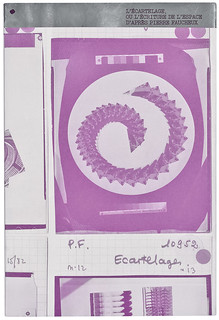
By its title, L’Écartelage reveals its focus on Surrealism in the work of Pierre Faucheux, celebrated as a designer for French book clubs after the Second World War. Faucheux coined the word écartelage to describe the collages that he made in the second half of his career: he cut up several identical reproductions of a painting into multiple parallel strips, pasting them together to produce a distortion of the original image.
Écart means a space. Écarter means to separate or spread, but it also implies a way of behaving ‘outside the box’. The book’s subtitle, L’Écriture de l’espace, derives from the title of Faucheux’s autobiography Écrire l’espace (1978) – ‘Writing Space’. And the spaces in which Faucheux worked were both two- and three-dimensional. He was a graphic designer and also an architect.
Écartelage derived from ‘l’écart absolu’, a term proposed by the early nineteenth-century Utopian thinker Charles Fourier to describe the process of doing the opposite of the conventional and finding something unexpected. As a term and as a principle, l’écart absolu was taken up by the arch-Surrealist, André Breton. Surrealism is introduced here as fundamental to an understanding of Faucheux, who designed a book-club edition of Breton’s Surrealist manifestos in 1955. Ten years later he collaborated with Breton on a Surrealist exhibition, its title ‘Écart absolu’. The book invokes l’écart absolu to characterise Faucheux’s work: governed by neither rationalism nor established practice. That this concept is labelled ‘deterritorialisation’ – a word borrowed from the philosophers Gilles Deleuze and Félix Guattari – gives some idea of the book’s tone.
The notion of écartelage, of thinking in an entirely original and seemingly irrational manner, could describe the practice of a great many designers. Applied to Faucheux’s collages it is portentous. By tradition, a collage is dependent on the juxtaposition of incongruous elements, whereas a Faucheux écartelage, made from repeated elements of the same image, merely provides an optical effect, adding no meaning to the original image. The fact that Faucheux did not give his écartelages a place in his autobiographical account Écrire l’espace suggests that, although he spent a lot of time making them, collage was peripheral to his work as a commercial designer. Catherine Guiral nonetheless titles the first essay ‘The Magic Flow’, which she explains as an allusion to the flow of images in Faucheux’s collages.
This is not a book for designers but for design historians and their PhD students. What a designer sees in Faucheux is an understanding of typographic tradition, playful inventiveness and virtuosity in handling photographs and documents to enhance a book’s period atmosphere or literary character. No mention is made here of the technical constraints on designers in Faucheux’s time. It was these that necessitated the improvisation which gives his work spontaneity and liveliness, quite different from assemblages of type and images generated at the computer. Guiral cites Faucheux’s design for a catalogue of a History of Surrealist Painting as ‘a layout that benefits from the latest techniques, allowing each block of text to be immediately adjacent to the corresponding image’. Reference to the ‘latest techniques’ is meaningless: whatever method was used – gravure, offset or (in 1959) most likely letterpress – would have had no bearing on such a simple layout.
The layout of this 164-page book is far from simple. The five essays, with a heavy dose of typographic eccentricities, are printed in purple and green (for quotations) on uncoated stock. The book opens with sixteen pages of colour photographs of posters and books, randomly displayed on unnumbered pages, awkwardly identified on the flaps. Each contributor is granted a set of colour images, sensibly captioned on the page.
Following Guiral, the second essay deals with film titling. This is an oblique reference to the ‘prelims’ – the introductory pages of Faucheux’s book-club titles, a method that has been described as their ‘déroulement’ (‘unrolling’).
Such pages are also the focus of the third essay. Thierry Chancogne, in spite of some gratuitous word-play (‘typography, topography, topology and typology’), usefully discusses other designers’ contributions to the book clubs. And he raises, but fails to deal with, another topic, namely the relationship between the central European avant-garde and French typographers. Tschichold’s name appears, but not his French exposition of the New Typography in 1930.
It is left to the fourth contribution, by Sonia de Puineuf, to take up the relationship between Faucheux and possible Dada and Constructivist influences. Still, her accomplished, well documented account of Modernist precursors makes no reference to the special issue of Art d’aujourd’hui in 1952, which Faucheux designed and which included examples of Dada typography – evidence that he was aware of the more anarchic tendencies of the avant-garde.
The final contribution is a ‘visit to Pierre Faucheux’s universe’: almost 100 images, nine on a page, arranged by his son Jérome. In this small format, little more than thumbnails, they give some idea of Faucheux’s vast output. Faucheux recorded that his studio dealt with 6000 commissions between 1962 and 1976, and admitted that the quantity was not always matched by the quality of graphic ideas. Indeed, compared with other book covers of the time – Paul Rand’s or Roy Kuhlman’s in the United States, Penguin Books in Britain – their typography is crude, the images predictable. The Jérome Faucheux commentary is useful, but the catalogue listing each item reproduced, while giving dimensions and date, omits the relevant print process.
This book is full of ideas, but few of them are Faucheux’s. The reader can find those in Écrire l’espace, mentioned above, and in Pierre Faucheux: Magician of the book (1995) – both in French only and hard to find. A further account is now available: the film PRR FCHX, made by the designer’s grandson, Adrien Faucheux.
There is still a place for a critical, detailed account of the work which gives Faucheux the serious attention he is due. For now, we will have to wait.
L’Écartelage, ou l’Écriture de l’espace d’après Pierre Faucheux, designed by Officeabc.
Top: A spread from the book reproducing two of Faucheux’s ‘écartelages’, both circa 1980.
Richard Hollis, designer, writer, London
First published in Eye no. 88 vol. 22 2014
Eye is the world’s most beautiful and collectable graphic design journal, published quarterly for professional designers, students and anyone interested in critical, informed writing about graphic design and visual culture. It is available from all good design bookshops and online at the Eye shop, where you can buy subscriptions and single issues. You can see what Eye 88 looks like at Eye before you buy on Vimeo.