
Spring 2013
Design history disciplined
Wim Crouwel
Chermayeff and Geismar
Adrian Frutiger
Pentagram
Vier5
Massimo Vignelli
Jean Widmer
Design history
Graphic design
Reviews
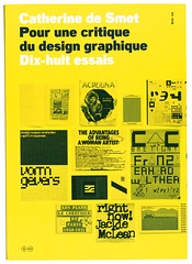
Pour une critique du design graphique: 18 essais
By Catherine de Smet<br>Designed by deValence<br>Editions B42, €24<br>
What kind of discipline is graphic design history? Catherine de Smet provided one answer in two studies of Le Corbusier’s books: Le Corbusier: Architect of Books in 2005 and Vers une architecture du livre in 2007 (like the current book, available only in French).
Trained as an art historian, de Smet has brought to the critical history of graphic design an academic rigour that is rare. In this new collection of essays from a ten-year period, she notes that ‘the body of knowledge and theoretical consideration is slim by comparison with art or architecture, or even with other branches of design’. How can we at the same time write graphic design history and also take a critical view? She cites Roland Barthes: we have to interpret, not judge.
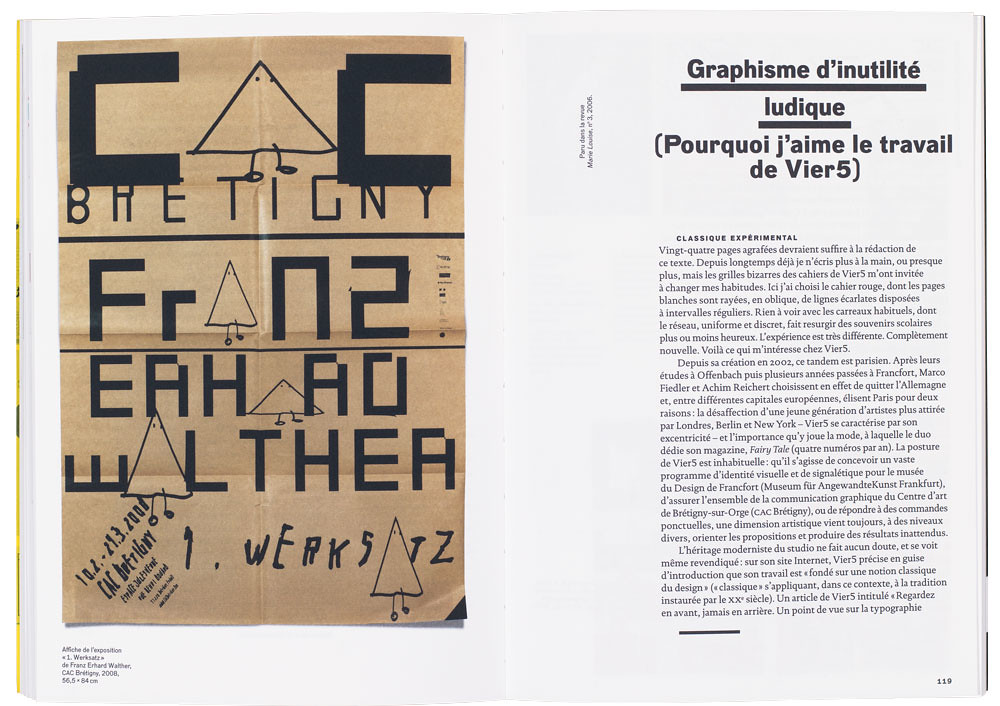
Although de Smet begins with theory – the first two essays are concerned with the relationship of art and graphics, and with women and design – her focus is down to earth. One essay, ‘The graphics of playful uselessness’, is disarmingly subtitled ‘Why I like the work of the group Vier5’. Subtitles are given to almost all the eighteen essays, even when their subject is clearly defined. ‘Histoire d’un rectangle rayé’ is the subtitle to an article on Jean Widmer’s design of the Pompidou Centre logo. Now a classic (reprinted from the journal Les Cahiers du Musée national d’art moderne in 1994), the essay is important as a rare case study of a graphic design commission.
De Smet first reflects on the transience of corporate symbols, and contrasts this with the survival of the Pompidou symbol, saved thanks to public support. The reader is taken through every step in the development of the symbol. We are also shown Widmer’s earlier work for the CCI (Centre de création industrielle), which placed him in a privileged position when it came to the competition for the overall identity of the Pompidou. Twenty designers or agencies, the well known names of the time, European and American, were invited to participate (Chermayeff & Geismar, Massimo Vignelli, Pentagram, Wim Crouwel, Adrian Frutiger among them), to show how they would tackle the problems of signage; the presentation of any solution was not a requirement. At the first stage the list was reduced to five. Finally Widmer and his Visuel Design Association colleague, Ernst Hiestand, were selected.
De Smet lists the Swiss designers’ approach in detail, and illustrates the proposals made in the original reports on the signage, which included Frutiger’s typewriter-based letter design. All this (plus sketches made by Widmer before the emblem’s final design), gives the reader the sense of eavesdropping, of being at the designer’s elbow as he worked.
The Pompidou identity has survived better than the work of Crouwel, where de Smet clearly identifies ‘several different types of aesthetic’. Indeed, the illustrations show him blown in several directions by the winds of graphic fashion, anchored only in his typography by Swiss formulae. Typically, de Smet cross-references to history: in the case of Crouwel’s New Alphabet it is to her grandfather’s petit point embroidery of the words of his favourite authors, constrained by the same orthogonal grid as Crouwel. Connections made in the same context are to the equally grid-limited typographical work of the Dutch architect J. L. M. Lauweriks.
More unlikely but equally relevant is the density of allusion in her examination of the Rem Koolhaas / Bruce Mau book S,M,L,XL. Her architectural and art-historical interests allow her to make better critical use of big names – Le Corbusier, Palladio, Frank Lloyd Wright, Frank Gehry, Mondrian, Moholy-Nagy – than the book’s authors.
It is the width of reference, as well as the clear description of the work itself, that makes the essays enlightening. Those that deal with more recent work, in their avoidance of judgment and their brevity, are less convincing. Historical analogy or precedent cannot be usefully invoked in discussing work such as that of the Swiss studio Norm (see Eye 70) or the jokey ‘visual identities’ of Wim Delvoye. And it is unusual, in illustrating the signage designed by the Paris group Vier5 for Frankfurt’s Museum für Angewandte Kunst, that she fails to mention its relation to the cubic grid of the building, designed by Richard Meier. But with a book of this richness and originality, well designed and illustrated, it is churlish to complain.
There is not enough of Catherine de Smet’s writing available in English. Design journalism needs more of her type of informed and disciplined engagement.
Cover designed by deValence.
Top: spread featuring a poster for Franz Erhard Walther’s ‘1. Werksatz’, 1963-1969, exhibited at CAC Brétigny, 2008.
Richard Hollis designer, writer, London
First published in Eye no. 85 vol. 22 2013

Eye is the world’s most beautiful and collectable graphic design journal, published quarterly for professional designers, students and anyone interested in critical, informed writing about graphic design and visual culture. It is available from all good design bookshops and online at the Eye shop, where you can buy subscriptions, back issues and single copies of the latest issue. You can see what Eye 85 looks like at Eye before You Buy on Vimeo.