Winter 2011
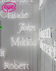
He put his stamp on Dutch culture
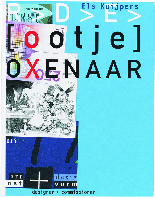
Ootje Oxenaar: Designer and commissioner
By Els Kuijpers (translated by Peter Rose)<br>Designed by Jan van Toorn and<br>Mart Rozenbeek<br>010 Publishers, £46 / €29.50 <br>(English and Dutch language versions)
R. D. E. ‘Ootje’ Oxenaar (b. 1929) was a key figure in the modernisation of Dutch society through innovation in professional design – a creative entrepreneur, as graphic designer and commissioner, in his role as aesthetic adviser at the art and design department (Dienst voor Esthetische Vormgeving or dev) of the Dutch post office (PTT).
Els Kuijpers’ book Ootje Oxenaar tells a complex story in which at least three main strands can be distinguished.
First there is the biographical account, over five chapters, of Oxenaar’s development as a designer through five decades of change in design and in the Dutch cultural climate, beginning in the mid-1950s.
Another strand uses Oxenaar’s career to explain developments in postwar Dutch design. Here Els Kuijpers leans rather too much on Pierre Bourdieu’s analysis of the specific value of cultural production, taking it not as a critical tool but a fundamental divide, reducing it to simple oppositions of black and white, good and bad.
The third strand focuses on Oxenaar’s qualities as a designer and commissioner, his desire for visual experiment and concern for public communication. Trained as an illustrative designer with an eye on narrative expression, he gradually changed his visual repertory through the application of photography and the use of collage techniques. This led to a more analytical approach and strengthened the editorial skills needed for more complex commissions. The combination of individual artistic engagement with a rationalised analytical approach has contributed much to the freedom in Dutch culture.
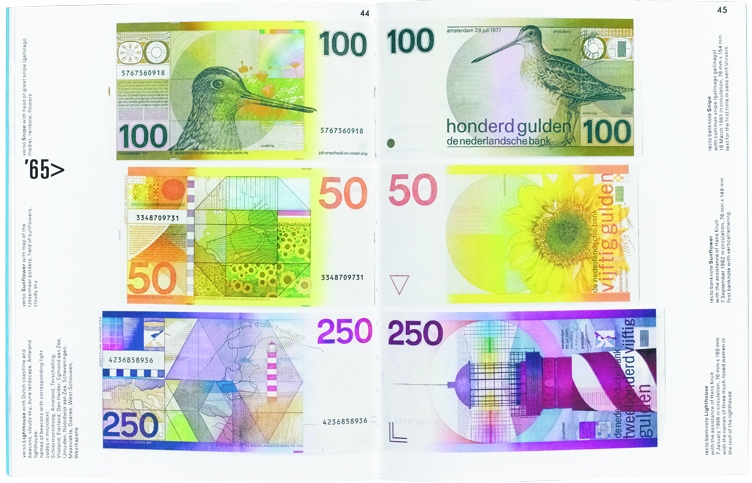
Take Oxenaar’s banknote designs. Following a 1960s series with portraits of figures from Dutch history, he produced three more notes in the early 1980s, based on images of the natural world of the Netherlands: a snipe, a sunflower and a lighthouse. These can be seen as a homage to a people continually struggling to keep their land above the waters.
Oxenaar always kept a certain distance from the proclaimed collective engagement of the design avant-garde of his generation, although he shared their wish for broader cultural emancipation. Kuijpers points out that he always had an eye for ‘a poetic effect that was politically neutral and more or less naïve in communicational terms’. She represents this here in a chapter completely dedicated to Oxenaar’s visual diaries, where the images speak for themselves. ‘His mentality as a designer had its roots in fine art,’ she explains.
Oxenaar’s particular success lay in communication for public clients, such as the national bank and the PTT. From the moment he was appointed to the PTT in 1970, he invested in challenging visual forms of expression for the state institution, above all in the special stamp issues which he commissioned from a wide range of artists and designers, such as Peter Struycken, Wim Crouwel, Gert Dumbar, Jan van Toorn, Max Kisman, Walter Nikkels, Karel Martens, Irma Boom and many, many more. And by guiding the PTT’s house style he had a huge impact on the cultural climate of the Netherlands, where his approach to visual communication for the public domain was to become the standard for Dutch graphic design in the 1980s and 1990s. Its influence can be seen in other public operations such as NS (Dutch railways), the house style for the police and many corporate designs for state departments and ministries.
The book’s designers, Jan van Toorn and Mart Rozenbeek, try to catch something of Oxenaar’s strong-minded playfulness. Images and reproductions are laid out on the table as elements for further inspection. Things that call for attention are shown in series or repetition.
For the typography, however, straight confrontation is favoured over the subtle preciousness that also forms part of Oxenaar’s design strategy, and the mise-en-page is perhaps too vernacular for a designer who knew his way about the court of Queen Beatrix.
Nevertheless the visual quality, as in the chapter with Oxenaar’s diaries, is strong. Images are shown next to each other, with only the most basic captions. There is always something rather subversive in these collages, obviously inspired by children’s books, forcing the viewer to pay attention to all levels of information.
Like many other monographs on Dutch designers, Ootje Oxenaar depicts the double success of bringing experimental design into the institutional realm. But, more than that, because of the position its subject took as commissioner, Kuijpers’ book also contributes to the debate about the role and status of culture, and the changing meaning of creative production and entrepreneurship in the 21st century.
Cover shows a jumble of items designed by Ootje Oxenaar, including one of the banknotes shown in the spread (top).
Top, top to bottom: Snipe (1981), Sunflower (1982, the first banknote with vertical lettering) and Lighthouse (1986).
Ewan Lentjes, design critic and researcher, Arnhem, The Netherlands
First published in Eye no. 82 vol. 21 2012
Eye is the world’s most beautiful and collectable graphic design journal, published quarterly for professional designers, students and anyone interested in critical, informed writing about graphic design and visual culture. It is available from all good design bookshops and online at the Eye shop, where you can buy subscriptions, back issues and single copies of the latest issue.