
Summer 2012
Square pegs
Kwadraat-Bladen: A series of graphic experiments, 1955-1974
Unit Editions, £16.95

The postwar reconstruction era of 1950s in the Netherlands is usually viewed as a dreary time of hard work and obedience to state, church and nation, particularly when compared to the 1960s. However, if you consider the dynamic cultural production of the time, a lively scene of artists and designers was in fact contributing to the development of an open, prosperous society. There was an atmosphere of co-operation in which Dutch designers and the print industry shared an interest in the development of professional communication.
One of the most inventive printing firms of the time was Steendrukkerij de Jong & Co., whose manager, Pieter Brattinga Jr, came up with the idea of commissioning leading designers to make promotional items, such as business gift cards, to raise the firm’s profile as ‘a quality printer in the cultural field’. Eventually this led to monthly exhibitions of artists’ and designers’ work being held in the company canteen. The idea that designers should work closely with printers to help ‘develop accuracy and the best quality of printing the designer could have wished for’ was new. Brattinga and his team had a good feel for quality printing and invited the most challenging designers of the time to take part.
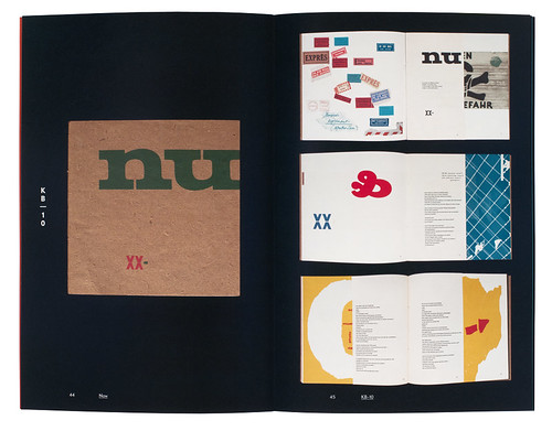
Spread from Unit Editions’ Kwadraat-Bladen: A series of graphic experiments, 1955-1974 showing issue no. 10 (1959), written and designed by Willem Sandberg.
Top: Timothy Epps’s ‘Alphabet’, shown in the spread from no.27 designed by John Stegmeyer of Total Design in 1969.
To share their work with the public, Brattinga developed one of the most impressive formats in Dutch postwar printing: the Kwadraat-Bladen (‘Square Magazines’), which were to play a vital role in what has become known as Dutch graphic design.
Unit Edition’s small book, Kwadraat-Bladen: A series of graphic experiments, 1955-1974 (£16.95), is a neat homage to the visual experiments the printing firm stimulated.
An interesting range of Dutch and international artists and designers took part in 35 unique editions, restricted only by the 25x25 cm format.
Issue no. 10 (1959) was written and designed by Willem Sandberg. No. 23 (1967) was dedicated to the New Alphabet developed by Wim Crouwel in the 1960s, which made use of electronic parameters in first-generation computer technology. This provoked creative responses in subsequent issues, including Gerard Unger’s ‘A Counter-proposal’ (no. 24), Anthon Beeke’s notorious ‘Nude Girls Alphabet’, a homage to classical Baskerville type (no. 28), and Timothy Epps’s ‘Alphabet’, shown in the spread from no. 27 (above), designed by John Stegmeyer of Total Design in 1969.
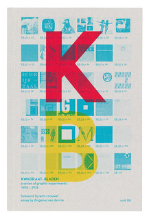
The design of the book itself, by Spin, references Dutch design in a subtle way. The cover is an exemplar of beautifully printed graphic design, reminiscent of the work of Dutch designers such as H. N. Werkman or Karel Martens. It shows a blueprint of all the magazine’s covers as thumbnails, upon which the capital letters K and B in red and yellow are overlaid vertically.
The typography in the book may look a little bold, but the mise-en-page of other elements is treated with great subtlety. A treat to browse again and again.
First published in Eye no. 83 vol. 21 2012
Eye is the world’s most beautiful and collectable graphic design journal, published quarterly for professional designers, students and anyone interested in critical, informed writing about graphic design and visual culture. It is available from all good design bookshops and online at the Eye shop, where you can buy subscriptions, back issues and single copies of the latest issue.