Summer 2003
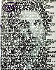
The New Typography
The New Typography: An Interdisciplinary Symposium
London, 13 March 2003The statement in the publicity for the one-day event organised by Kingston University promised much: ‘The new Typography is not just about type, it is also about colour, texture, lighting, three dimensionality and motion. It blurs the boundaries between language and image creating new visual identities and a new visual syntax for words and phrases. The new typography expresses ideas and feelings – on pages, screens and all around us in the everyday environment.’
The speakers included Lucille Tenazas, Mikon van Gastel and Elliott Peter Earls from the US, who all have some connection to Cranbrook Academy; also Gunther Kress, Sue Walker and Paul Elliman, all based in the UK.
Organisers Teal Triggs and Theo van Leeuwen opened with ‘The Newness in New Typography’. Accompanying himself on the piano, Van Leeuwen expanded the issues surrounding the interdisciplinarity of the ‘new semiotics’ (his description) – which are concerned with ‘putting things together’ and are an attempt to ‘cross the traditional boundaries of semiotics … enveloping all forms of human communication’. These ideas need not take the form or words, they can also take the form of images. Gunther Kress, a collaborator with Van Leeuwen on the book Reading Images picked up this theme later on adding that theory and practice are different actions of the same process.
Still contemplating the information that the new semiotics and typography are concerned with the ‘relation between words and pictures’ – hardly a surprise to anyone engaged in graphic design – we were treated to a series of presentations which did little to expand on what these new forms of typography might amount to. Lucille Tenazas, a former president of the AIGA (who like Mikon van Gastel graduated from Cranbrook during the 1980s), described the theme of her talk as concerned with typography and the language of culture and she showed examples of her own work and that of her students which dealt with autobiography and narrative. A reaction to the standardisation brought about by industrialisation and the typography of earlier generations this work is a celebration of the unofficial and the vernacular. Sounding familiar to anyone aware of the debates and work that emerged from Cranbrook during the early 1980s, this undermined any real sense of newness claimed by the conference theme.
Paul Elliman, responsible for some of the more astute graphic design over the past decade (see Eye no. 25 vol. 7) provided a highlight. Discussing his project ‘Invisible Language’, he explored the idea of typography extending to the human voice – a form of acoustic writing.
He described his own practice as ‘a split between designing and writing’ and as a dialogue with technology – a product of our ‘networked culture’. Referencing recent events in the Middle East, Elliman discussed the forces of invisibility that shape our age – citing the example of the war in Iraq as a process of visualising the invisible (the US war on terrorism). Pursuing the theme further he explored ‘an invisible that we know’ – which he titled ‘acousmatic space’ – made up of sonic landmarks such as announcements and audible information in public spaces.
Mikon van Gastel, a partner in the US design practice Imaginary Forces and former collaborator with the late P. Scott Makela, presented work which included film title sequences, commercials and branding projects. With a client list that includes Nike and IBM, the projects, such as an impressively large-scale multimedia façade for an investment bank in Times Square, provided a refreshing ‘commercial break’.
Sue Walker from Reading University explained the approach to the teaching of typography at the institution – an integration of theory, history and practice. The final speaker of the day was Elliott Peter Earls, ‘designer in residence’ at Cranbrook Academy, who presented his 55 minute DVD Catfish. This ‘fictional documentary’, which owes a debt to the visual language of the pop video and computer gaming, explores the role of typography and motion graphics within a performance environment is described by Earls as a ‘total artwork … a synthetic piece built up by accretion’ over his career to date. (See Eye no. 45 vol. 12.)
The event promised much, and should be applauded for its ambitious scope. However, its potential to provide a serious alternative to the portfolio- and personality-based talks which have become the mainstay of conferences of late was to a large degree compromised by a number of flaws. Like many members of the audience I spoke to, I was left feeling disappointed – we had not been offered any real sense of newness in the issues raised during the day – and confused – why was the event biased so much towards the US and Cranbrook in particular? And though audience members were encouraged to submit written questions, they were ignored in favour of a discussion of what is was like to be either a student or an Artist in Residence at Cranbrook. This is not a criticism of the institution, but an observation that the event felt somewhat skewed in its favour.
The organisers should take heart in the fact that there is a ready audience for this type of event and that there is certainly room for further discussion of what constitutes a new typography.
Eye is the world’s most beautiful and collectable graphic design journal, published quarterly for professional designers, students and anyone interested in critical, informed writing about graphic design and visual culture. It is available from all good design bookshops and online at the Eye shop, where you can buy subscriptions, back issues and single copies of the latest issue. You can see what Eye 84 looks like at Eye before You Buy on Vimeo.