
Autumn 2013
We made this: A life in artefacts
Dixonary
By Tom Dixon<br>Violette Editions, £35
Tom Dixon’s Dixonary (Violette Editions, £35) is a big book (632 pages) that is beautifully simple – it is effectively a series of slides with narrative captions telling the product designer’s life in objects. It’s like a series of rhyming, wordless spreads (reminiscent of Stefan Lorant’s Lilliput magazine) divided by text pages.
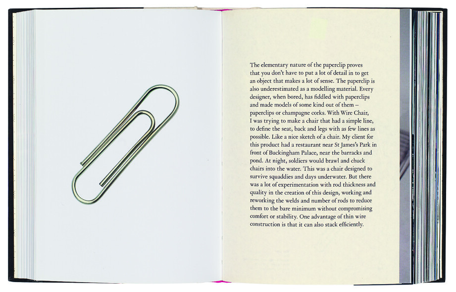
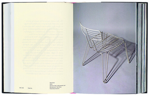
First in each four-page grouping is an object – a piece of art, engraving or other form of visual reference, such as a pin-up girl, or a paper clip (see opposite), followed by a page of text with an image caption on the back. The fourth page is a full bleed image of one of Dixon’s own creations that in some way relates to the earlier object in its materials, shape or function. Dixon’s text – hard facts and brief anecdotes – is entertaining and full of insights, informed by a self-deprecating surprise at his success and the excitement of making something new – whether that be a chair, a chandelier, a manufacturing process or an entire company.
Andrew Robertson, writer, London
Spread from Dixonary, designed by Matt Willey.
The new book Dixonary is a remarkable collaboration between author Tom Dixon, publisher Robert Violette and graphic designer Matt Willey.
Dixon is a self-taught product designer, whose back catalogue encompasses chairs, lights, sex toys and cast-iron flatpacks. His CV includes a seven-year stretch as design director of Habitat and a stint playing bass in Funkapolitan.
Violette’s company Violette Editions, founded in 1997, specialises in what he calls ‘individualistic books’. His back list has work by Sophie Calle and Joseph Beuys, and Paul Smith’s You can find inspiration in everything. Forthcoming publications include a book about fabric manufacturers Kvadraat, designed by GTF (see Eye 77).
Willey, a former principal of Studio 8, is founding art director of Port (see Eye 77). Dixonary is his first project with Violette.
Dixonary is printed on two paper stocks. There is a thin, slightly translucent uncoated paper, pages trimmed around a centimetre narrower, for the text. And a sturdier coated stock for the colour images.
Although it might look like a dictionary, or even a child’s picture encyclopedia in places, there is no obvious alphabetical organisation by initial letter or by category, no index and no folios.
Despite (or perhaps because of) such strategies, Dixonary is an easy book to read, whether browsing or reading sequentially. Broadly speaking, it is an illustrated lecture in print, loosely chronological, with digressions in time and space juxtaposed with vivid images.
Publisher Robert Violette became involved when Dixon sought his advice. The designer wanted to make a self-published book based on his talks, and he already had the title, used for a cast-iron bookend that looked like a book, with the punning label ‘Dixonary’ on its spine. Violette persuaded Dixon to make a more ambitious book.
‘Product designers can be quite esoteric when they talk about their work,’ says Violette. ‘One of Tom’s great gifts as a communicator is that he can express complex ideas in a simple way that non-professionals can understand.’
Violette immediately envisaged the book as a substantial, mass-produced volume that would echo the materiality of the bookend ‘Dixonary’. ‘It was obvious what the book had to be,’ says Violette.
Willey spent some time searching for a design solution that would give Dixonary the look and feel that Violette sought, trying different paper stocks and binding options. ‘The interleaved papers gave us the heft we wanted,’ says Violette.
‘A lot of my books work as printed books, and are best as printed books,’ says Violette. ‘The digital world is still underdeveloped. Books are real – they have a human scale.’
Dixon, despite his initial reluctance to work on a book he thought better to be published posthumously, was involved in all aspects of the design. He was keen for there to be a contrast between the ‘spoken’ text pages and the captions, which he wanted to be like an instruction manual. Willey chose François Rappo’s sans typeface Theinhardt for the short captions, and Van Dijck for the text, which gained the author’s approval for its ‘poetic’ appearance.
‘The typography is everything I wanted it to be,’ says Willey. ‘It’s like the way Tom speaks – unflowery.’
John L. Walters, editor of Eye, London
First published in Eye no. 86 vol. 22 2013

Eye is the world’s most beautiful and collectable graphic design journal, published quarterly for professional designers, students and anyone interested in critical, informed writing about graphic design and visual culture. It is available from all good design bookshops and online at the Eye shop, where you can buy subscriptions, back issues and single copies of the latest issue. You can see what Eye 86 looks like at Eye before You Buy on Vimeo.